Interactive Marketing Dashboard

A marketing dashboard prominently displays the funnel and other related metrics to help marketing decision-makers allocate campaign spend. It’s important that each lead, web visit and win is assigned a tangible value in order to help marketers correctly gauge the success of key campaigns.

Good points about this dashboard.

  1. The dashboard conveys all the important KPIs for the audience in a very simplified manner.
  2. It has a summary on both the sides of the dashboard and a section at the top which means the user gets an overall view of what is happening in the data. These important KPIs are displayed with aid of appealing visualization.

Improvements:

  1. No single color legend across the dashboard.
  2. The ‘Conversion by Form’ visualization can be shown as a bar graph as the current graph is difficult to understand as what amount has been converted to for each page.
  3. Color legends are not defined anywhere on the dashboard. The user has to hover over the chart to understand what color belongs to channel market in case of market channel breakdown or page in case of landing page success rate.
Reference:  https://dashdemo.sisense.com/app/main#/dashboards/582a26af0ff585080700002c?r=false&h=false&t=false&l=false&volatile=true


Interactive Investor Dashboard


CrunchBase is one of the most widely-used databases of technology companies, people, and investors.  Financial companies and entrepreneurs use this dashboard to analyze investments, acquisitions, and start-ups all in real-time, and make the smartest investments possible.

Good points about the dashboard.

  1. The dashboard conveys all the important KPIs for the audience (Investors) in a very simplified manner.
  2. It solves the purpose of being interactive. Investors can filter by country, categories, type of investment, investment rounds, etc for global crunchbase data in a comprehensive manner.
  3. It has a summary on top of the dashboard which means the user gets an overall view of what is happening in the data. For e.g. Here, the important factors like total money raised, the number of investments, Median raised and No. of startups and their percentage growth which gives us an overview of the yearly change in the data.
  4. One color legend for the entire dashboard.

Improvements:

  1. Instead of representing the Funding by round graph in a pie chart, the user can use a different idiom like a bar chart which gives a comparative idea for each funding by round.
  2. Instead of mentioning the color legends at the bottom, the user could have defined color legends at the right-hand side so that the user of the dashboard is not required to scroll every time he wants to see what color is represented by what category.


Reference:  https://www.sisense.com/dashboard-examples/investor/


Customer Segmentation using RFM Model


While planning for marketing spend, or formulating a new promotion, retail marketers need to be careful about how they segment and target customers. The idea is to identify customer’s needs or issues and use them as a solution via various campaigns and promotions. One of the techniques for targeted campaign is to do RFM Analysis (Recency-Frequency-Monetary)

Recency: Recency of who is more likely to respond to an offer. Customers who have purchased recently from you are more likely to purchase again from you compared to those who did not purchase recently.

Frequency: How frequently these customers purchase from you. The higher the frequency, the higher is the chances of them responding to your offers.

Monetary: Amount of money these customers have spent on purchases. Customers who have spent higher are more likely to purchase based on the offer compared to those who have spent less.

How it works:  Divide each parameter into various ranges depending on your data and assign scores to each parameter. By combining 3 scores, we get the RFM scores.

Steps: http://gain-insights.com/solutions/retail-analytics/customer-segmentation-using-rfm-analysis/

Insights:

  • Customers with overall high RFM scores are loyal customers and need to provide loyalty points and offers to continue their engagement.
  • Customer who have high recency but low frequency score are ones who look out for offers. For these customers, the company needs to run different discount offers.
  • Customers who have a high frequency score but a low recency score are those customers that used to visit quite often but have not been visiting recently. For these customers, the company needs to offer promotions to bring them back to the store, or run surveys to find out why they abandoned the store.

RFM analysis is one of the most powerful technique to help you identify your best customers and create better targeted campaigns.


Mental Model for Home Health Care providers

Before we create dashboard, we must endeavor to learn the process by which our internal and external customers use data to make decisions about the work they do. This done by asking questions on what is needed. Using below questions as discharge manager’s mental model as a guide three interactive dashboards to display, highlight, and clarify data are created. (Refer example)

  • are patients who might be at increased risk for readmission within 30 days – receiving referrals?
  • which providers are geographically closest to a patient’s home?
  • how well do different agencies perform by quality-of-care measures?
  • how do patients rate different agencies on satisfaction surveys?

First dashboard filters for a hospital and desired date. The top section displays summary metrics that drill down by hospital service line. The map pinpoints the ZIP code locations of home health agencies with referrals, while a bar graph quantifies referrals per agency.

Second dashboard shows concerning patients who may be at risk for readmission and for whom home health care may help reduce that risk.

Third dashboard shows how HHA’s perform on publicly reported quality metrics.
Often, we blame ourselves when we can’t make any sense of the information given in a dashboard Most of the time, the data analyst has failed to understand the mental model.

Reference: http://www.healthdataviz.com/gallery-transition-of-care/

How to D3JS a Line Graph

Steps to D3JS a line graph:

  1. Scale Functions: To make a scale function, you have to know the maximum and minimum data (domain) and output(range).
    • Use this to Position in following manner:

var width = 500;

var xScale = d3.scale.linear().domain([0, 100]).range([0, width]);

  • Use it for Reversing the Y-axis:

var height = 400;

var yScale = d3.scale.linear().domain([0, 10]).range([height, 0]);

  1. Selection Functions: select() selects the first matching element whilst the d3.selectAll() is ‘greedy’ in that it’ll select everything that matches. Once we’ve made a selection we can manipulate the elements using functions such as

style()- Add/modify CSS style declaration

attr() –  Add/modify element attributes;

  1. Data Joins: In our example, we are plotting a line graph. Plotting in line graph is different from others that we learnt in class because data is continuous unlike other discrete idioms that we learnt in class. To make it continuous use ‘Data Joins’.

In our example, We are appending the path to our group for each data point. Then, datum() joins a single entity to a  selection. Attr(“fill”) should be none as it is a line graph and no fill is required Attr(“stroke”) will be the color of the stroke and you can set the width by attr(“stroke-width”).

Reference: https://bl.ocks.org/mbostock/3883245

Visualization learning tips from Hans Rosling video


  1. Dividing the data: Hidden insights are obtained when your data is segmented more. The more you segment your data, the better insights you obtain. In the video, the story of African sub-Saharan region having the lowest GDP vs Child Survival rate is completely different when the data is segmented country wise for that region. We realize that after segmentation, countries like Mauritius has a much higher ratio (than average) as compared to other countries in the same region.
  2. Treating each data point separately: Each data point can be associated with a different problem and after carefully analyzing the data point, you can provide solutions accordingly. For e.g. the same solution can’t be applied to the poorest of Nigeria v/s the richest of South Africa.
  3. Usage of Idioms: The idiom you use for visualization should immediately provide you the information that you are trying to convey and what your chart is measuring.
  4. Checking your legibility: Run it by someone who has never seen your visualization, and ask them to tell you what the chart is supposed to be illustrating. The longer they take, the worse you’ve done.

Reference: https://www.ted.com/talks/hans_rosling_shows_the_best_stats_you_ve_ever_seen

http://online-behavior.com/analytics/effective-data-visualization


Rules of constructing a good argument

Rules to keep in mind to devise a strong argument:

Claim is the point an arguer is trying to make and wants another to accept. When a claim is made, the question to be asked is “What is your point?”

ExampleThe Ravens will win the Super Bowl this year.

Visualization refers to the proof or evidence an arguer offers.   Grounds answers the questions, “What is your proof?”. It can consist of statistics or reports via physical evidence of reasoning.

Example: They have the best defense in the league.

Warrant is the inferential leap that performs a “linking” function by establishing a mental connection between the grounds and the claim

Example: The team with the best defense usually wins.

Backing consists of evidence to support the type of reasoning employed by the warrant.

Example: The team with the best defense has won each of the last five years.

Qualifier states how sure the arguer is about his/her claim

Example: The probability that the Jets will win the Super Bowl is 80 percent.

Rebuttal admits to those circumstances or situations where the argument would not hold.

Example: Anything could happen. The Ravens defense might have a lot of injuries.

Reference: http://commfaculty.fullerton.edu/rgass/toulmin2.htm

Diversity in Tech

http://www.informationisbeautiful.net/visualizations/diversity-in-tech-static/

The visualization is appealing and gives the percentage of people working in tech according to gender and their ethnicity. But does it really realize its purpose of visualization?

Every good visualization should have the following:

  1. Clarity: the ability to quickly understand what data the visual is displaying, and how it is displaying it.
  2. Connectivity: The ability to connect different parameters of the data and get useful insight
  3. Concentration: Whether your visualization focuses on solving the underlying problem statement (Prescriptive analysis) or it focuses on describes the current problem (Descriptive analysis)

It is difficult to understand the visualization because it displays the data in percentages and not numbers. Moreover, it gives an overview about the gender and ethnicity across different domain.  If I wanted to redesign this, I would have different visualizations for tech, social, top 50 US companies, most female company and last one for overall. By comparing data across each of the domain, I would have more clarity, connectivity and concentration to the relevance of the data.

The American Energy Spectrum

large


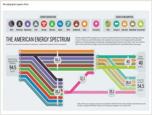
The visualization is about amount of energy generation, consumption and energy wasted in US in 2009.  Each energy generation and energy consumption source is represented pictorially using different colors and symbols.

The visuals on the left-hand side shows all different sources of energy generation with help of different colors. The total energy generation for US is 94.5 QBTU.  This energy generation is segregated to – energy used and energy wasted which is 40 QBTU and 54.5 QBTU.

Takeaways from this visualization:

  1. Coloring segregation: There are around 14 source of energy generation and consumption. Each source has been assigned a different color to distinguish visually.
  2. Simple to understand: All the complicated details have been shown in a simple manner. For example, Total electricity is generated from 8 different sources of energy. This has been clearly captured in pink line in the visualization.
  3. Highlights the problematic area: The most important point to keep in mind whether your visualization clearly depicts the underlying problem or motivation to make the visualization. This visualization clearly shows that out of total energy generated, 54.5 QBTU is wasted which is more than 50% and this needs to be addressed to utilize energy efficiently.

References: http://www.informationisbeautifulawards.com/showcase/444-the-american-energy-spectrum


Twitter Sentiments Analysis

Today, businesses want to know what buyers say about their brand and how they feel about their products and the best way to do so is social media where users can express their opinion freely. Whether it is a launch of a new product or feedback of an existing product, user opinions or tweets are used to gather critical feedback to provide Brand Management and Customer Satisfaction.

Blog1

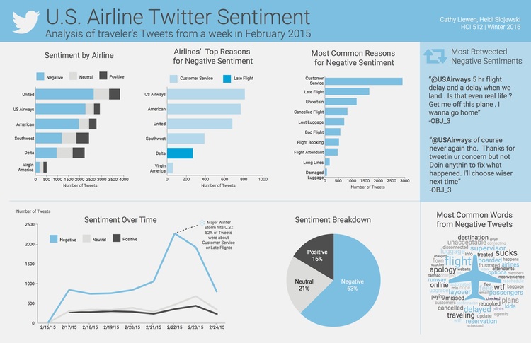
This dashboard consists of US Airlines twitter data. First graph shows which US airlines received the best to worst sentiment as well as the most tweets. In this case, United Airlines have been most positively tweeted about. The second graph shows distribution of top reasons for negative sentiment across each airline. The third graph shows the most common reasons for negative sentiment which are Customer Service and Late Flight. The line graph shows sentiment over a period. The pie chart helps us to understand distribution of tweets by sentiments. The word cloud of Most Common Negative Words further supports the reasons for the high frequency of negative sentiment in the tweets in the data.

Hence, based on this dashboard, one can understand common reasons for customer dissatisfaction and take corrective measures.

Reference: http://www.heidislojewski.com/blog/