How Visualization Fool You

Abstract: Evolutionary pressure has made us visual beings. Because we respond so strongly to visual cues, charts and graphs have the power to move us in a way that other ways of presenting data can’t match. Therefore data visualization as one of the most important tools we have to analyze data can be misleading as well. In this blog post we’ll take a look at 3 of the most common ways in which visualizations can be misleading.

Charts can mislead us into believing things that aren’t true. Sometimes this is accidental, but other times we are being deliberately manipulated. Sometimes it’s easy to spot what’s wrong, but other times the sleight of hand is very subtle.

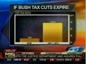
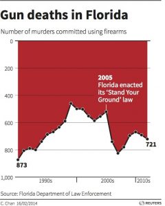
Dodgy Diagrams: The most notorious of the data visualization deceiver’s tricks is to use chart axes that don’t start at zero. We’re very good at comparing the lengths of objects, so choosing a non-zero axis can greatly magnify small or meaningless differences. Taken to an extreme, this technique can make differences in data seem much larger than they are.

misleading1_fox


Cumulative Graphs: Many people opt to create cumulative graphs of things like number of users, revenue, downloads, or other important metrics.

Ignoring Conventions: One of the most insidious tactics people use in constructing misleading data visualizations is to violate standard practices. We’re used to the fact that pie charts represent parts of a whole or that timelines progress from left to right. So when those rules get violated, we have a difficult time seeing what’s actually going on. We’re wired to misinterpret the data, due to our reliance on these conventions.

misleading3_deaths

Conclusion: Here are some simple rules we should use to keep our work virtuous.

    • Always start your plots from zero, unless doing so would be misleading.
    • Use a linear axis scale – avoid different sized categories and log plots unless there are good reasons to do otherwise.
    • Never, ever forget that correlation is not causation. No matter how tempting it is, don’t do it. Bear in mind that your audience will almost certainly see correlation as equaling causation, so be careful.
    • Maps are beautiful, but they can be powerfully misleading. Never use them alone and always consider the unintended message you might be transmitting.

References:

http://data-informed.com/whats-wrong-picture-art-honest-visualizations/

http://www.cs.tufts.edu/comp/250VIS/papers/chi2015-deception.pdf

http://avoinelama.fi/hingo/kirjoituksia/misleadingvisualizations.html

http://www.citylab.com/design/2015/06/when-maps-lie/396761/


How to define KPI in visualization

Abstract: While KPIs are critical for every organization, they are often misunderstood or misrepresented, leading to inefficient decisions. In this blog post we will discuss about different types of KPIs that can help your visualization.

What is KPI:

A Key Performance Indicator (KPI) is a measurable value that demonstrates how effectively an organization is achieving key objectives. Organizations use KPIs to evaluate their success at reaching targets.

Various types of KPIs:

  1. Quantitative KPIs are straightforward, since they are made up of measurable numeric metrics and help you track clearly measurable progress.
  2. Qualitative  KPI: KPIs aren’t always about measuring quantitative aspects of your organization. You may also want to track some qualitative aspects.  quantifying qualitative data using the Likert scale or other similar tools, greatly helps in measuring and tracking qualitative KPIs.
  3. Process KPI: sometimes, when different processes feed into each other, a funnel view is a better way to understand the overall flow than tracking individual KPIs for each process.
  4. Combined KPI: when you have too many interdependent metrics to track, you can use statistical models to combine a bunch of similar metrics into a score and then visualize them in the form of scorecards. Scorecards give a quick snapshot of what is going right and what isn’t. Your dashboard could then have drill-downs into each scorecard to help you dig deeper into the root causes of the problems that need fixing.

Conclusion: KPI visualizations are becoming an essential part of the way organizations track their metrics and use those to develop nimble strategies for the future. Categorization of KPIs and finding what kind of KPI you are dealing with will help you make sure that you are getting the most value out of your KPI visualizations.

References:

https://www.klipfolio.com/resources/articles/what-is-a-key-performance-indicator

https://www.socialcops.com/kpi-visualization

http://unilytics.com/5-steps-to-actionable-key-performance-indicators/

http://unilytics.com/top-7-tips-for-dashboard-visualization/

Programming Platforms for Interactive Visualization in Web Browser Based Applications

Introduction:

Browser based application are very popular wherever interactivity with users is a requirement. However, most of application use classical user interfaces (UIs). In Information Visualization (InfoVis), there are several powerful and versatile applications that are well known among experts, but designed to run natively in operating systems (OSs) only. In this post we compare 3 most popular programming platforms for developing browser-based InfoVis applications.

Java Applets

Strength:

Java requires the application to do the rendering on its own, targeting the client area in pixels. However, among the free libraries available for Java, several renderers exist which free the developer of this work. Some renderer libraries for Java provide features supporting animation. When providing user frame selection, it is possible to fire a manual drawing event. Java on its own has reached a very stable state.

Weaknesses:

The installed version of the VM differs among clients. Incompatible versions can prevent the Java applet from running. There are also problems embedding applets in some operating system or browser configurations. The use of Java applets has declined during the last years with the increasing flexibility of Flash.

Flash

Strength:

While the Flash drawing functions are similar to those of Java, they do not actually perform the drawing directly. In fact, they cache the graphics primitives and the drawing is performed in a renderer thread independent of the user code. Flash not only supports timer events but also has timeline support already built in the platform. Flash is very stable inside the browser.

Weaknesses:

For Flash debugging is more complicated because the compilation does only run in the plugin and a special debugging plugin is needed. ActionScript is a language based on the ECMAScript, which causes several compatibility weaknesses, like poor type safety.

Silverlight

Strength:

In Silverlight graphics primitives are defined in a description language. They can also be modified or complemented with additional graphics primitives using code. In Silverlight, there are no timer events but timeline support. Drawing separate frames is possible as in Java and Flash, but you can also modify existing objects instead of drawing new ones. 

Weaknesses:

Like in Flash, caching the renderer output is not possible, so user frame selection requires firing a manual draw event. For each site that requires Silverlight, there are thousands of sites requiring Flash. This is due to the fact that it is very difficult to introduce a new technology into an established medium, especially, if something has to be installed that normally is not part of the environment.

Conclusion:

No technology is superior to all others in all situa- tions. Developers need to consider the environment and user group they address as well as their requirements. These prerequisites define the priorities. Therefore, even the platform-independence of web applications is limited.

References:

E. Burnette. Is Flash better than Java?, April 2007. URL http://blogs.zdnet.com/Burnette/?p=286.

http://www.oddhammer.com/ actionscriptperformance/set4.

https://publik.tuwien.ac.at/files/PubDat_217968.pdf

Data Visualization in Political and Social Science

Abstract: In this post I will briefly discuss data visualization in political science and how use of visualization in social science can be risky.

Data visualization in political science takes advantage of recent developments in computer science and computer graphics, statistical methods, methods of information visualization, visual design and psychology.

There are two main types of numerical tables that can be a subject of data visualization. The first one is called “object-feature” table, where every row represents an observation or an object and every column correspond to a numerical feature or indicator commonly measured for the whole set of objects. An example of such an “object-feature” table is a factbook for a set of countries, where the objects are countries and the features are numerical indicators such as GDP per capita.

Screen Shot 2017-02-20 at 12.38.18 PM

Source: https://arxiv.org/pdf/1008.1188.pdf

The second type of numerical tables is called connection or distance tables where both rows and columns correspond to objects and at the intersection of a row and a column a numerical value is found characterizing a link between two objects. A typical example of a connection table is the table representing the migration rates or the mutual volumes of export and import of goods for a set of countries.

Data visualization problems and risks: 

There are different sets of problems regarding data visualization in political and social science. First, the problems can be induced by the designer (intentionally or unintentionally) or by the user of the diagram. Second, these problems can be classified into cognitive, emotional and social ones. Cognitive problems can be connected to inappropriate use of graphical elements, lack of clarity, over- simplification or over-complexification of the graphical display, or induced by heterogeneity of target user groups. Emotional problems can be connected to a repellent content of graphical design. Social problems can be connected to cross-cultural differences of users. Another source of problems in data visualization comes from the use of categorical or qualitative measurements for which no standardized and well-established graphical displays exist.

Conclusion: Similar to other fields political and social science has been used data visualization to clarify their message. But using data visualization in these areas is more challenging since we are dealing with a lot of qualitative data and factors that can not be visualized easily. To improve our visualization in social science we need more insight on data beside technical capacities. 

References:

1. Bresciani, S., Eppler, M.J. (2008). The risks of visualization: a classification of disadvantages associated with graphic representation of information. ICA working paper #1/2008.

2. https://arxiv.org/pdf/1008.1188.pdf

3. LeGates, R. (2005). Think Globally, Act Regionally: GIS and Data Visualization for Social Science and Public Policy Research. Esri Press.


Interactive Data Visualization

Static visualizations can offer only precomposed “views” of data, so multiple static views are often needed to present a variety of perspectives on the same information. Dynamic, interactive visualizations can empower people to explore the data for themselves.

  1. The Novice User. Even novices must be able to examine data and find patterns, distributions, correlations, and/or anomalies. They must be able to build and use tools that enable faster decisions based on real-time information. As the National Research Council of the National Academies of Sciences states, even “naïve users” should be able to “carry out massive data analysis without a full understanding of systems and statistical uses.”
  2. Driving Processes. The solution must allow the user to establish KPIs that provide the rules that drive processes. These must be displayed visually—for example, by color—in real time based on defined thresholds. Likes its architecture, Interactive Visualization is a means to an end – to stimulate informed action.
  3. Data Must Tell A Story. An intuitive, visual workplace that it easy to master is based on easily digestible interactive patterns. Data must tell a story that instantly relates the performance of a business and its assets. Almost every Interactive Visualization narrative takes place across multiple layers. Users must thus be able to select data elements and filters, and then highlight and modify options to change data perspectives – from high-tech overviews down to the most granular detail.
  4. Data Correlation. The user should immediately know not only of hot spots that require attention, but also effortlessly find trends based on the dynamic relationship between multiple data streams and the data derived from them by means of predictive analytics.
  5. Prescriptions: “What should happen next?”World-class Interactive Visualization and underlying analytics capabilities surpass that standard by offering prescriptive analytics(“What should happen next?”) to drive real-time asset behavior modification.

Picture below is one the best interactive visualization of 2015 according to experts. The visualization is about machine learning. To find a complete description about this please look at: http://flowingdata.com/2015/12/22/10-best-data-visualization-projects-of-2015/

Screen Shot 2017-02-20 at 12.14.19 PM

References:

http://www.forbes.com/sites/benkerschberg/2014/04/30/five-key-properties-of-interactive-data-visualization/#a5efa2344eb0

http://chimera.labs.oreilly.com/books/1230000000345/ch01.html#_why_interactive

Frontiers in Massive Data Analysis(National Academy of Sciences 2013)

10 Best Data Visualization Projects of 2015


Healthcare Data Visualization

Today’s healthcare reporting tools have incredible powers to tell stories about patient health—whether individual patients or entire populations. But simply showing the visualizations won’t be enough. The present reality is that not many physicians use these tools to such an extent. There are several factors that can affect their ease of use, starting with acquiring the actual data.

Collecting and directing the flow of information: It would be nice if physicians, researchers and other clinicians could just shepherd the needed data into a simple dashboard and quickly go about their business of curing the world of what ails it.

Turning different data formats into one for all: Once the data has been acquired it must be made usable. And here’s where the time-tested computing principle of “garbage in, garbage out” applies. Data must be scrubbed, normalized and aggregated into a standard format all can view and manipulate.

Presentation: Data visualizations must be easy for business users to access.

  1. Make the reports/visualizations relevant based on the user’s role, identity and concerns. Each set of users—clinical, financial, executive, IT, marketing, etc.—requires different metrics.
  2. Begin with the end in mind. This may seem an obvious piece of advice, but be sure to communicate with business users what they need to see or want to accomplish in advance of structuring the report. And as a general rule, aim for no more than three to five key performance indicators.
  3. Make visualizations easily accessible by users. Circling back to our observations about today’s mobile healthcare landscape, this is especially important for physicians and nurses who are constantly on the move.
  4. Make sure you are HIPAA-compliant. It will be far easier to obtain data from outside data sources if you can demonstrate that it will be well-protected within your organization—in storage, in transit and in the way it is presented.
  5. Create reports that can lead to action. The more information that can be acted on, the better.

An impressive example of visualization in healthcare would be Santa Clara capstone project in the Kaiser Permanente in which students have been developing a Clinical Alert Notification system (CANS) manages alerts from all physiological devices and nurse calls. This application holds large amount of data, which can be used not only for making business decisions but also for reducing alert fatigue. A screenshot attached to this blog shows how an interactive visualization in Kaiser project is designed how it can help stakeholders.


Alerts Timeline Dashboard


References:

https://www.healthcatalyst.com/healthcare-visualization-benefitshttps://www.healthcatalyst.com/healthcare-visualization-benefits

Internet of Things and Data Visualisation

As the world becomes increasingly interconnected and interdependent, opportunities to generate value through data visualization will only increase. The Internet of Things will have a profound effect on the role that data visualization can play in organizations and society, improving our ability to understand how humans and machines interact with each other and the environment.

Cisco predicts that there will be 50 billion connected devices by 2020, each being able to transmit and collect data. It will give us the most in-depth opportunity to see relationships between different ‘things’ in human history. However, tracking and analyzing these different datasets is only going to be possible with the use of powerful and simple data visualizations.

Alongside this huge influx of data is the seemingly unstoppable increase in the speed of analysis available due to accelerations of processing speeds. We have seen through the use of current technologies like in-memory databases and Apache Spark, alongside those for the future like quantum computing, that the ability to collect, process, and analyze huge datasets is increasing. As these technologies become more prevalent and the use of real-time analytics allows more and more companies to react to issues instantly, visualization is going to be the key that gives companies the opportunity to quickly identify and then act upon it. Without this ability, it would be almost impossible to quickly make decisions on data.

The human brain has evolved to be adept at noticing differences in patterns and, although the AI and machine learning have huge implications in a number of areas, they still lack some of the most important contextual elements in decision making. Therefore, having the ability to quickly and easily notice, and then act upon, patterns in data still falls within the realm of humans, and data visualization is the most powerful tool that allows us to do this. The IoT will certainly run without the use of data visualization, but without it, many of the possibilities that the connected world offers will be missed.

References:

https://channels.theinnovationenterprise.com/articles/the-internet-of-things-and-data-visualization

http://analytics-magazine.org/data-visualization-the-future-of-data-visualization/


How to Use Visualization to Achieve Your Goals

In life and work, success begins with a goal. Before we can believe in a goal, we first must have an idea of what it looks like. This is where visualization comes in, which is simply a technique for creating a mental image of a future event. When we visualize our desired outcome, we begin to “see” the possibility of achieving it.

According to research using brain imagery, visualization works because neurons in our brains, those electrically excitable cells that transmit information, interpret imagery as equivalent to a real-life action. When we visualize an act, the brain generates an impulse that tells our neurons to “perform” the movement. This creates a new neural pathway — clusters of cells in our brain that work together to create memories or learned behaviors — that primes our body to act in a way consistent to what we imagined. All of this occurs without actually performing the physical activity, yet it achieves a similar result.

There are two types of visualization, each of which serves a distinct purpose, but for greatest effect, they should be used together. The first method is outcome visualization and involves envisioning yourself achieving your goal. To do this, create a detailed mental image of the desired outcome using all of your senses.

The second type of visualization is process visualization. It involves envisioning each of the actions necessary to achieve the outcome you want. Focus on completing each of the steps you need to achieve your goal, but not on the overall goal itself.

Visualization does not guarantee success. It also does not replace hard work and practice. But when combined with diligent effort (and, I would add, a strong support network), it is a powerful way to achieve positive, behavioral change and create the life you desire.

Reference:

http://www.huffingtonpost.com/frank-niles-phd/visualization-goals_b_878424.html

Deceptive Visualization

In the real world, visualizations are usually accompanied by a message, hence, it is interesting to study how visualizations lead to a message level deception. There are various ways to visually deceive viewers even at the message level, e.g., presentation of deliberate misinformation, distractions, information overload, or through deceptive techniques applied on the level of visual encoding. Starting with complete data, two broad classes of message level deception – Message Exaggeration/Understatement, and Message Reversal, can be identified.

Message Exaggeration/Understatement

This kind of deception happens when the fact is not distorted, however, but the extent of the presented fact is tweaked, i.e., the fact is exaggerated. For example, if a chart compares two quantities – A and B, where A is bigger than B, but the users are presented with the fact that A is bigger than B, but the ex- tent is exaggerated. This type of deception affects the “How much” type of questions, such as “How much do you think is quantity A bigger than quantity B?”

Message Reversal

This type of deception happens when a visualization encour- ages users to interpret the fact in the message incorrectly. For example, if a chart compares two quantities – A and B, where A is bigger than B, the users perceive the message as A is smaller than B. Thus, users perceive the incorrect message due to a distorted visualization, even though the actual data is presented. This type of deception affects the “What” type of questions, such as “What does the chart show?”.

References:

https://medium.com/@Infogram/study-asks-how-deceptive-are-deceptive-visualizations-8ff52fd81239#.f89mt9glu

http://lsr.nellco.org/cgi/viewcontent.cgi?article=1506&context=nyu_plltwp


The Top 5 Business Benefits of Using Data Visualization

By 2015, the global annual rate of data production is expected to reach 5.6 zettabytes, double the rate of growth in 2012, according to IDC. Data visualization tools and techniques offer executives and other knowledge workers new approaches to dramatically improve their ability to grasp information hiding in their data. Here are the top five benefits that data visualization offers to decision makers and their organizations:

1. Absorb information in new and more constructive ways. A May 2013 survey by Aberdeen Group finds that managers in organizations that use visual data discovery tools are 28 percent more likely to find timely information than those who rely solely on managed reporting and dashboards. Moreover, 48 percent of business intelligence users at companies that use visual data discovery are able to find the information they need without the help of IT staff all or most of the time.

2. Visualize relationships and patterns between operational and business activities. One of the key benefits of data visualization is how it enables users to more effectively see connections as they are occurring between operating conditions and business performance. In today’s highly competitive business environment, finding these correlations among the data has never been more important.

3. Identify and act on emerging trends faster. Using data visualization, decision makers are able to grasp shifts in customer behaviors and market conditions across multiple data sets much more quickly.

4. Manipulate and interact directly with data. Unlike one-dimensional tables and charts that can only be viewed, data visualization tools enable users to interact with data.

5. Foster a new business language. Simply it means to tell a story through data.

Engaging executives with data visualization can open up new ways of looking at business and operational data, enabling senior management to scale new heights in business performance while enabling a much broader audience of analytics users in the quest for greater performance.

References:

http://data-informed.com/top-5-business-benefits-using-data-visualization/