Author: danningpeng
Introducing Google Trends Database
Most of great tech companies have a tech blog to demonstrate their progress, and Google is not an exception. As I was browsing Google’s blog today, I found a very interesting article, which talks about a database called Google Trends, that collects real-time big data for various topics search through Google. The topic can be the popularity of one basketball game, the interest of one literature project over time, and elections in 2016. Also, you can view those real-time data in different formats, like line chart, bar chart, map and so on. With Google providing unlimited correlations and topics, we can retrieve useful data in a more convenient way. W
With Google providing unlimited correlations and topics, we can retrieve useful data in a more convenient way. What’s more, Google has also announced the acquisition of data analysis platform Kaggle this week, showing its great interest in utilizing data to deliver more valuable information.
Those two piece of news are enough to show Google’s focus on data. Thus for us, data visualization, the way to present a large amount of data will also become more and more popular and that it might be as common as Office tools in today. And I think it’s a good time to say that let’s grab this technique and move to the future along with great tech companies. 😀
Use your own shapes on Tableau
As I was doing the redesign project the other day, I found the need for me to introduce some new shapes into the sheets. Therefore I designed my own vector graphs through online tools like Vectr, and followed this article inserted those graphs in “png” file type into Tableau. The final result was displayed in designated color.
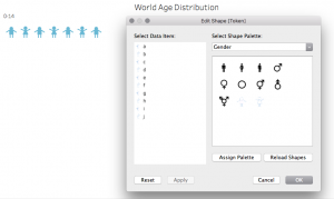
Also I discovered a tip, that when you want to make a parameter into shapes, you just simply drag it across the shapes feature in “marks” to the blank board below, choose the shapes from multiple categories, including the one you have just inserted(if it’s not there, try the reload button).
You can also look for existing png files online and insert them to Tableau instead of making them by yourselves. Using customized shapes will make your visualization more unique and specific to the data you want to present. Below it’s a simple example from me:
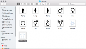
(The png files are located in “My Tableau Repository/Shapes/Gender”)

(This is where to find the customized shapes and use it in sheets)

Hope it helps!
And the Oscar goes to….
This year’s Oscar Ceremony, as always, has attracted the interest of a great audience, including the Hollywood, mass media and movie lovers. When I was back in China like five, six years ago, I would watch the real-time streaming Oscar Ceremony in the afternoon, and can name about what prize goes to whom or which. This year I was just waiting to read the media’s post. Except for the “funny mistake”(not funny at all) of announcing La La Land as best picture but actually the prize belongs to Moonlight, making some fast media quickly post the final wrong full Oscar result, this Oscar’s winning result fits with most of the prediction on fivethirtyeight, as you can see from here and here.
Firstly, let’s go to the prediction article. The author has collected the points of each nominee for different categories from multiple movie guilds. As we can see, all the predictions except the best picture one turns out to be right. This is a simple data visualization, just ranking the Oscar nominees by their total points from each source in a table. Although we did not know how the author get the data from those sources and what he or she did to get the result numbers. Anyway, these predictions are making Oscar less to be expected. Please also refer here to see the model used in these predictions, this is simply math.
The other article calculated the probability predicted by the betting organization. It has also borrowed the result from the first article. The visualization in this article is a set of line charts, that carefully record the implied probability based on Paddy Power betting odds. For the main categories, we will again find that La La Land supporters will lose the bet at best picture to Moonlight.
At last, I should say those visualizations are very concise and easy to understand, no fancy tables or animations. Also in my opinion, Oscar is about art, but art is very difficult to evaluate nowadays, in this sense, I think I trust data more, which is relatively more impartial. As long as we have data, we can visualize it, and make it as a living. 😀 Thanks, data, thanks, Oscar.
Internet of Things
I just found this awesome interactive data visualization from here.
As you can see, this can be seen as a PPT slide, or a dashboard, or a web page for displaying the concept of IoT(Internet of Things), how IoT is used on different sides of real life, and main companies involved in IoT’s development.
With computers being made into wearable devices, and big data analysis and internet connection becoming more and more convenient, now it’s time for us to build some magic. We won’t need to use a remote to change TV channel or go back home to heat the dinner, the IoT would complete these for us. It can even open the curtains and wake us up in the morning. To achieving these, we need to integrate the things we want to connect with different kinds of sensors, mini-computers, wires and so on.
Let’s go back to the visualization, we can see that it includes a timeline of IoT, a divergent line chart displaying various ways of IoT(with one click it can furtherly display the specific IoTs), the detailed IoT devices, explicit IoT data, the flow process of IoT, and the companies building IoT(one bad thing about this is that a lot of company names are not showing on the chart, but we can go to their website by clicking on the circle). Also the whole visualization has a uniform set of colors, making people comfortable to read it and take in the information it conveys. I think this is a good example of data visualization and hope to adapt to it in my future works.
Introduce great visualization TED Talks and Gapminder
This week I have focused my research on data visualization on renowned statistician Dr. Hans Rosling, a scientist with a great sense of responsibility by making the world better with datasets that will change people’s mindsets. May he rest in peace in heaven.
I started watching a TED talk by David McCandless, the founder of website “informationisbeautiful.net”, who mentioned the meaning for visualizing data—-compressing the overload information to reveal patterns or connections that matter. And Mr. McCandless regards Dr. Rosling as his master.
Then I found out Dr. Rosling’s talk, the one ranked as one of the top 500 TED talks, that he gave to the US State Department on the topic of developing countries’ health issues. Dr. Rosling used his animated visualizations to illustrate the changes of children’s death rate, people’s lifespan and HIV carrying rate of people living in different countries over time. Dr. Rosling was an enthusiastic scholar that cares about improving the overall health status of the world, and I greatly respect him for that. Also I have discovered this awesome website that Dr. Rosling had founded.
As people can fastly comprehend information conveyed in a picture, and as the size of data right now is so enormous, the way to use data visualization is inevitable. Just like programming is the way to communicate with computers, data visualization will become a common language and a tool, to interact efficiently with people’s mindset. For now, the resources above are enough for me to go over as a rookie visualizer, and I’ll need more knowledge in data mining, data processing and statistics. Hope that one way I can express dataset freely that will catch people’s eyes and make them ponder. And then I can proudly call myself “a data artist”.
Introducing My Dashboard
Hey guys, how is your weekend? For me, I have finished my very first dashboard.
This is a static single web page written in HTML, SCSS and ReactJS, it’s built with webpack and hosted on Heroku. The source code can be seen from here. Also, the images used in the web page are stored in AWS S3 buckets. You can clone my git repository to your local server, and start the code the see how it looks. The instruction is in the “README.md” file on the git repo.
The idea to use ReactJS instead of plain JavaScriptis that, we can build modules separately, and reuse different modules, which will facilitate web development in large scale. ReactJS also has many other advantages, like virtual DOM, great documentation, relatively stable and so on. Also by using SCSS, we gain benefits from OOCSS, the philosophy to develop responsive websites.
After launching the webpage, you can see that I use the percent circle mentioned last week. The elements below those percent circles are still images, next thing I will do is to change them into D3 DOM elements. This would take some efforts and I’ll offer the detailed instruction of the process. Please stay tuned for new improvements and feel free to reach out to me for suggestions, ideas and anything! Thank you! 😀
Pure CSS Percentage Circle
As I’m working on my first dashboard project recently, I pay great attention to building DOM elements with animations.
Here I have found a great website about simple percentage circle: http://circle.firchow.net/. You can also check out the source code on Github: https://github.com/afuersch/css-percentage-circleA few things you need to know before starting to build a percentage circle by yourself:
A few things that you need to know before starting to build a percentage circle by yourself: clearfix, transform, hover, before&after. “clearfix” is a class when you are using float layout, to automatically clear all child elements of one element. “transform” is the degree to rotate a CSS element. “hover” is when your mouse just moves onto one element, it may render some changes. “before” and “after” are CSS pseudo elements, which are not real elements on index.html, and you can induce some actions for them.
A complete animated percentage circle includes its outer circle, the bar, the percentage number, the filled color inside of the circle, before and after elements, and the clearfix keyword.
Right now I myself is pondering over the source code to understand each line of it. I know that I can just use it instead of reinventing the wheels, but I think it’s better to know the fundamentals and then build fancy visualizations myself.
How to Build a Typical Dashboard

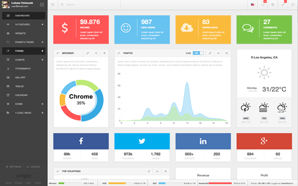
Here I have selected a typical dashboard screenshot from the Internet.
First of all, let’s look at the question, what is a dashboard?
For administrators(admin) at the back end of a website, a dashboard helps them to view data and manage the website.
For users of online services, dashboard makes them know better about their services with distinguishable icons, numbers and of course, charts. The charts are of different forms to present data.
In short, a dashboard is the home page of a control panel. A customized dashboard can be used to present anything the user wants. Followers at Social Networks, updates of news, weather, stock status, income, outcome, taxes, emails, and so on. With a useful dashboard, you don’t need a secretary to be a boss. You get the sense of control.
I have once interviewed with a company, who focus on building the control backend for companies, and they asked me how to design the layout of a dashboard. And here is my answer:
- Separate modules on the dashboard with consistent gaps,
- Use consistent and simple icons and charts to simplify the contents on the dashboard,
- Choose distinct color for different modules,
- Last and the most important, a dashboard doesn’t need to be fancy, but meaningful to users
Dashboard is really common nowadays, we can find it on Amazon Web Services, Google Cloud, WordPress, GoDaddy and many other websites, most of which are offering web hosting and managing services.
As I’m going to build one dashboard now, I’ll make it useful at first, and add more functions and decorations step by step. Hope I can build something like the image posted above. 😀
Insights from the political polling
There is a political forecasting website called fivethirtyeight.com that has been famous since it correctly predicted the winning result for President Obama in 2008, with various sources of data collected, calculated and visualized in an easy-understanding way. However, the forecasting result for the 2016 election was not near correct, as you can see here(https://projects.fivethirtyeight.com/2016-election-forecast/?ex_cid=rrpromo). Because I have been interested in the power of statistical polling, and I have friends working as data scientists, they were quite surprised about the deviation from the prediction to the reality. For this course, let’s leave the statistical part aside, and talk about the visualized data.
We have two main candidates, Hilary Clinton for Democrats, and Donald Trump for the Republic, the supporters for them are displayed in blue and red respectively, and from the depth of color, we can decide whether a state has more Democrats or Republic supporters, and if most supporters are for one party. Those colors can also be used to present the candidates’ popularity over time, the swing probability for each state, the importance for the candidates to win a particular state, and so on. This gives me some insights on how to build a meaningful data visualization. Given a dataset, I need to firstly find out the parameters and their relationships with each other, what the dataset is about and how to display it. I can do it with time, do it with geography, with histogram or bubbles, maybe add some animations or not. The website fivethirtyeight.com can be useful for beginners of data visualization, to get started by learning and imitating. In the end, it’s not just easy-understanding that matters, it’s the way to present authentic data that will make the visualization good.