 I actually found this visualization while searching for data for the team project, and it looked like a good candidate for a blog post. Here is where it can be found https://howmuch.net/articles/how-much-must-earn-to-buy-a-home-metro-area
This graph is published on the website is used to show major metropolitan areas across US and how much it takes to buy a house in the certain metropolitan area. This graph is very weak visualization in my opinion because of the following factors:
1. The presentation of the map itself has a nice 3d effect going on. We have discussed this in class and came to conclusion that 3D for any kind of graph is just unnecessary complication and only distract the reader from the message.
2. The scale is nice thing to provide on the legend but it doesn’t match the map. San Francisco for example peaks at 147k, yet the graph of San Francisco is higher than legends 150K. I mean it can be caused by 3D effect, but I did measure it with ruler and it is actually out of scale.
3. Uneven load on the sides compared to the middle of the map. San Diego and Los Angeles as well as Philadelphia and Washington are obstructing each other’s views and make it even harder to read.
4. Bar charts are made in form of the cones and it makes them much harder to read. The pointy ends of cones are not very distinguishable from the map itself. In addition cones tend to distort the proportions.
5. Color combination of the whole thing is just bad, and I am not only talking from aesthetic point of view. The contrast between map itself and bar graphs are not very distinctive, so end of the graphs actually blend in in to the map itself, very bad for visual representation of information. Also it looks like west coast bar graphs look darker then east coast bar graphs, yet according to the legend the color is not a property of bar graphs, colors should be the same across the map, yet they look different. Probably it has something to do with shadow effect of the 3d map.
6. Creators of the visualization probably realized all the visual downfalls to some degree so they actually labeled each bar graph with its value, so my question is “what is the point of visualization if you have to rely on labels to show the values of each data point?”, I don’t think this constitutes a good use of visualization.
7. The most confusing part however is visualization of house median price. It is logical to think that green is good and red is bad. But in this case the colors do not have this meaning; at least I hope they don’t. San Francisco is showed in red while Detroit is shown in green and it can be concluded that Detroit is better than San Francisco to buy a house. But Detroit is a ghost town with high unemployment and crime rate. And even considering the lower housing price it might be actually harder to buy a house there with Detroit’s salary.
8. The final issue is that the 2 parameters reported (the median home price and salaries needed to buy a house) are tied together, unless they do some fancy calculations (which they don’t) or take in consideration any differences in property taxation among different states (which they also don’t). In other words 100k a year salary will be required to buy a house in an area with median house price of 550k no matter where it is located on the map. So what is the point to include them both on the map, especially considering how hard it is to read color coded information (the color gradient very crude and map shadowing affect the colors as well ).
In conclusion it is one of the graphs that is better presented in plain text or graphed as series of bar charts next to each other. Now if users have problems with geography it is best to just include the map separately so users can look up places of interest individually.
Author: dabramov
767% Of Favorite Pizza Toppings
I was hungry, saw this graph and it caught my attention, but made me even hungrier :(. The graph supposed to show the distribution or perhaps popularity of pizza topping among UK people. One nice thing about this visualization it is grabbing attention very well; the picture looks very sharp and vivid. However that’s about only good thing about it. Upon closer inspection I started noticing things that are not right about it.
- It appears to be a bar graph made to look like pizza, the idea is cool but, using different pizza toppings as slices creates optical distortion so user will not be able to tell the different percentage accurately. It might seem as a good idea to show a picture of category rather then put a simple label. However they still needed to write labels in order to represent their data. Also it is possible that slices become small enough so it is hard to tell what kind of pizza toping it represents. Is it piece of bacon or ham?
- Categories do not add up to a 100% or to some defined total number of something. You never use pie chart if the pieces do not add up to a 100% or a total amount of something whole. In this graph they do not. What is even more confusing is that some categories have 2 sets of percentages. How do you interpret that? Is it percentage of a whole or just split to subcategories within category?
- Also on the bottom of the page there are even more categories that were not included in the diagram at all. What is the purpose to do visualization if not all data is included, especially trying to represent it as pie chart.
- Does the graph add any clarification to the information? No, it is actually making it confusing. The data presented probably needs to be visualized via series of bar graphs. Putting data in pie chart format just conditions the brain to think in a way that makes it hard to understand the data.
- The biggest revelation her is probably the graph was there just as picture not a bar graph at all. However such beatification is not acceptable! Faking the graph drastically changes people’s perception of presented information.
- Graph also presents false data correlations; For example, ham and pineapple are put together on one slice, however they are reported separately by different percentages. So in theory people who voted pineapple might not have selected ham, but the image implies that it is a bacon pineapple combo pizza to reader of the graph. Even better example is olives; they are present in 2 different kinds of pizza but reported only in one.
To summarize this review I think it is fair to say this graph creates more problems than it solves, just reporting categories using simple text line by line would create much less confusion for the reader . But would it have captured my attention? Is a whole different question to consider.
Aliens among us
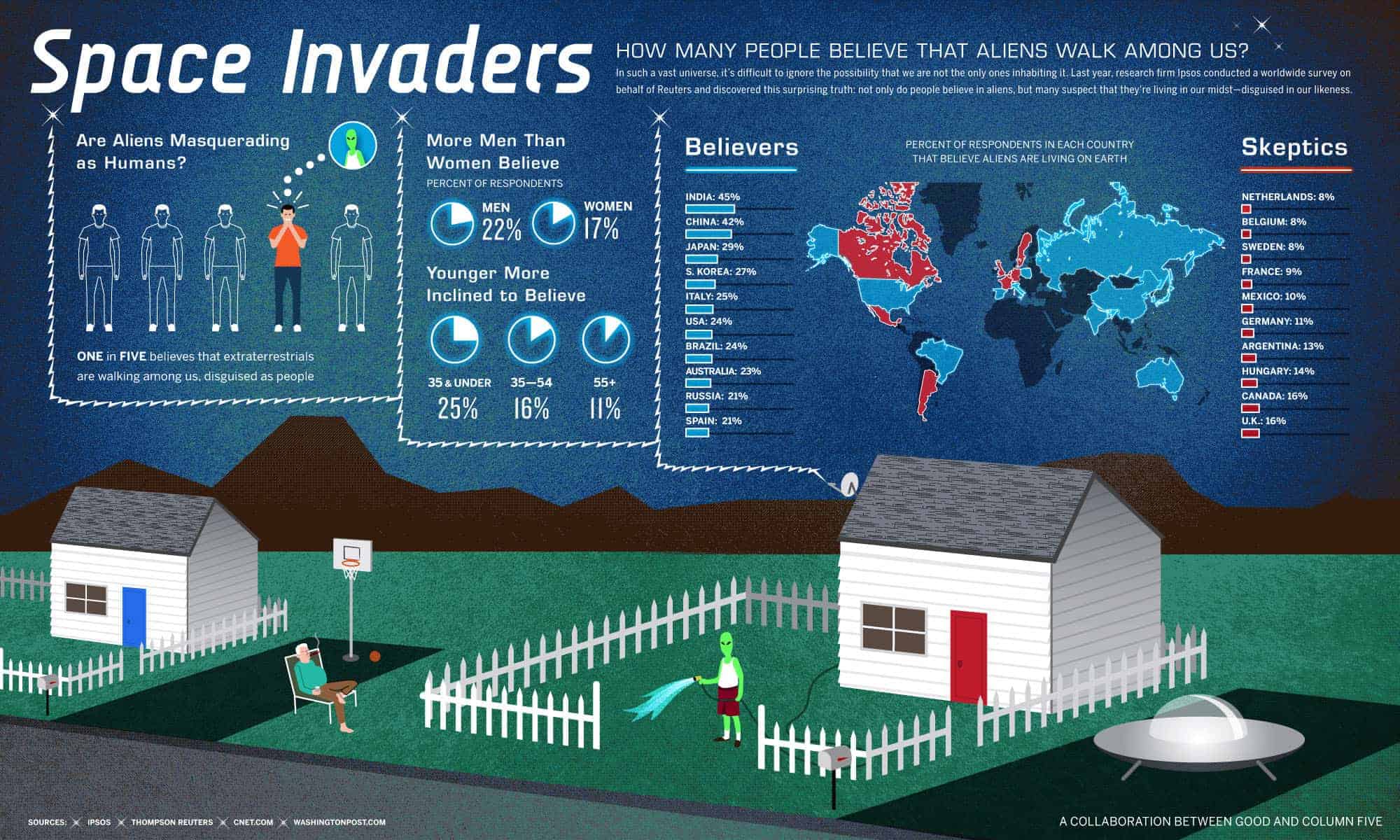
For this blog post I picked up this Info graphic because I found it to be somewhat interesting. It doesn’t really have the concrete claim (like aliens are among us or aliens are not among us), but rather tries to inform us on what are people’s opinions on the matter. Is this a good visualization? I think so, because topic itself is a bit hard to think seriously about it is good to have info graphic that has a sense of humor!
PROS:
- Visualization has to support the claim, since the claim is such that it just educates people on people’s opinions rather than claiming that aliens are indeed living among us I think it does support the claim very well.
- It looks visually appealing, the graphs and indicators are self-explanatory and don’t need any extra legend. Although some gaps could have been chosen better but I will mention it in cons section.
- Sources and claim are included in the graph itself so it needs no article to go along with it. In addition because graph has claim written on it is virtually impossible for someone to misuse the graph to prove their claim (unless their claim is same as the graphs).
- Believers and Skeptics showed on the map as well as a separate list in declining order. I think map visualization gives an interesting perspective on how neighboring countries have very different beliefs. For example Canada and Mexico are listed as non-believers while USA listed as believer.
CONS:
My main concerns are with data itself and how it was acquired, numbers are show no indication of how survey was taken and what the sample size was.
- One in the five people believes that there are aliens living among us. How exactly did they calculated it? Is it calculated across all of the surveyed countries or is it just based on US numbers. This is unclear and given the huge gap between believer counties and non-believer countries should be taken with the grain of salt.
- What was the exact question and response options? I have a hard time believing that 20% of people think there are aliens living among us. For example my grandmother saw something that looked like a spaceship long time ago but I know she never believed there were aliens on earth. Me personally; I do believe there is life somewhere in the universe, but I don’t think there are aliens living on earth. And defiantly not among us.
- The number of believers compared to age also seams iffy, it would be nice to know the sample size of each group. Also it seems a bit not logical how number of believers drops with age, if you believe in something that is hard to disprove why would you suddenly stop believing? Although I did find another article did show correlation saying that older man did believe less in alien’s existence compared to younger men.
- Pie charts on the info graph a little bit harder to read and compare, I think this graph should have been a bar graph. Bar graphs are much easier to compare to each other especially when differences in numbers are not very big.
- Split between believers and non-believers is not well defined 21% in Spain is not too far form 16% in UK.
http://www.newsweek.com/most-people-believe-intelligent-aliens-exist-377965
CDC FluView
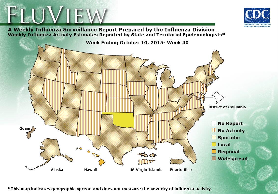
https://www.cdc.gov/flu/weekly/WeeklyFluActivityMap.htm
CDC chart shown here is to show the spread of flu at a given week over USA territory state by state. It has various levels of spread from no activity to widespread. Washington DC is the only one entity that has no data reported. I think in general this visualization does what it was made to do however there are few drawbacks.
- Presentation of the chart itself: if you have noticed the chart dates back to week 40 of 2015, why is this particular date? Well it is simple that is the chart that you get when you click on the link of the smaller current chart named “View Larger”, so instead of current spread levels you expect you will always get this chart (week 40 of 2015). And if you not careful you will take this chart as being current.
- Colors and patterns: they look a bit confusing some are patterns some are colors and they represent levels (a scale which is better represented by commonly accepted standards green to red or light to dark) , without reading the legend it is hard to understand and after reading the legend it is hard to remember which means what. With that being said even reading a legend and remembering doesn’t help much if you look at the chart from the distance (graph presented on projector), it is hard to tell sporadic from widespread in some situations. Also when looked up-close on the monitor patterns create some kind of visual artifacts that causes eye discomfort.
- Explanation of various levels of spread are not clarified on the page where graph appears and requires some link clicking and navigation to find.
- Usefulness of the visualization; the graph does what it says it should do but is it as useful as it can be? It repots spread levels by state, but it is not very realistic viruses don’t stop on state borders and in real life the spread is more of a gradient rather that level shift along the state border. Also this map is not very informative when levels are local, regional or sporadic. For example: California is pretty big and prolonged state so having local flu spread in San Diego and having no activity in Eureka is more than possible. So knowledge of local activity is not very useful for people within the state, and CDC probably does have this data.
So instead of doing state by state they can do a grid and use hotspots, but then it will be a different visualization.