Ways not to use Tableau

Till now we have seen many ways in which Tableau can be applied to Data but Users tend to utilize it in the wrong manner and expect it to perform operations which are not a part of its applications. Let us look at some of them and identify ways to avoid it.

  1. Using Tableau as an Online Excel: Many users try to convert Excel spreadsheets to Tableau worksheets and publish it on Tableau Server so that other users can interact with the data using filters. But all the features of Excel cannot be replicated easily into Tableau so the users tend to blame Tableau for not having the necessary functionalities. Tableau and Excel are not built to do the same work and therefore have different and compatible features. Solution: Static table-like reports should be created using Traditional BI Tools and the dynamic visualizations and dashboards should be generated using Tableau.
  2. Building business applications on top of Tableau: Tableau is not a document or project management tool or a collaboration system for applications. Solution: Tableau should be utilized for Data Analytics and Data Visualizations and Development Team should be used for creating custom applications.
  3. Using Tableau desktop as an ETL Tool: Users export data from Excel file, do the calculations that are easier in Tableau and expect to import that Tableau data back into an Excel file and analyze it further. This is not possible and it is seen as a shortcoming of Tableau. Solution: ETL should be executed using tools like Alteryx, Informatica, Microsoft SSIS and Pentaho and Tableau Users should stick to Data Analytics and Visualizations.
  4. Exporting Tableau dashboards to PDF or Image: Users export the dashboard as a PDF or an Image to include it in a static text document which makes it lose its interactivity. Solution: To retain the interactivity of the dashboards and share it, use Tableau Server or Tableau Online to avoid pitfalls in decision-making.
  5. Unlimited Tableau Reader Users: Analyst Users tend to share Tableau workbooks in a production environment on day to day basis with many users. This involves company-specific data and has the risk of leaking outside the company. Every day the data is refreshed so the analyst has to send the updated workbook again which makes it a cumbersome task with many risks. Solution: Tableau Server and Tableau Online should be used to publish and share interactive dashboards and to avoid the risk of leaking data.

Tableau is not a data creation and a table production tool and should not be used for modifying or modeling data. Tableau users should connect it to raw data and harness its capabilities to produce dynamic visualizations and dashboards using suitable Data Analytics.

Source: https://www.linkedin.com/pulse/five-reason-how-you-should-use-tableau-hrvoje-gabelica
 

Five years of Drought: Bi-Variate Map

Bi- Variate Map: This type of map or choropleth includes two variables on a map representation. It enables us to portray two separate phenomena simultaneously. The two variables should be related to each other as the bivariate map will show agreement or agreement between the variables. If you do not expect any association between them, then a bivariate map is not the right choice.

One of the most important features of choropleth is that it represents only normalized data: standard deviations, nested means, quantiles, and equal areas.

This infographic visualization piqued my interest in bivariate maps and how and where they should be used. Here it is a bivariate map as it renders size by frequency and color by severity simultaneously.

Due to the overlap of data over a particular data point, the different variates are not visible and the saturation and intensity of the color are lost.

To solve this problem,  hexagonal binning has been used which is an effective way to aggregate and visualize data. Binning here represents the number of points that fall within a hexagon on the gridded map.

The dots are proportionally sized by the amount of time over the past five years that experienced drought (the largest dots representing 80% – 100% of the time). It is difficult to show time as a dimension in a static map and is shown in this map by representing each location by how much it has experienced any drought over the past five years. (0-20%, 20-40%, 40-60%, 60-80%, 80-100%).

The second variate is the color which is a weighted value of the intensity of those droughts (deep purple indicates frequent “exceptional” most severe droughts). It is based on the weighted sum of the number of weeks that it experienced droughts(worse droughts count more).

Both the variates are joined on the map by location and that makes it easy to understand. It is one of the most effective ways to show the dynamics of drought and can be used to represent social, geographic and demographic data in a more potent visualization form.

Source: https://adventuresinmapping.files.wordpress.com/2016/07/fiveyearsofdrought1.jpg


Google Analytics & data visualization tips from it for Tableau

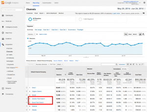
Google Analytics is a free web Analytics service that provides statistics and basic analytical tools for search engine optimization and marketing purposes. Its main features are Segmentation for Analysis of datasets like transformations and conversions, Data Visualization tools like dashboards and Scorecards, custom reports and communication through email-based sharing. It’s integration with other Google products like Adwords, Public Data Explorer, and Website Optimizer makes it very suitable for small and medium sized retail websites.

Google Analytics dashboard allows users to save profiles for multiple websites and see details for default categories or select custom metrics to display for each site. One of its advantages is that it is available through a plugin or widget for embedding into other sites. google-analytics

There are many practices that are followed in Google Analytics that should be followed while creating a dashboard and are particularly helpful in Tableau:

  • Use a maximum of 12 dashboard objects or widgets so that designers and analysts are able to focus on the relevant KPIs and pertain to the Story of the Dashboard. “Keep it Simple.” “Less is more.”
  • Improve User experience by leveraging Dashboard actions like highlighting sparklines to display underlying trends and show extra detail for respective data points.
  • Allow End users to change the Date aggregation of Line Graphs: Hourly, Day, Week, Month.
  • Keep Crosstabs width to a maximum of Ten Columns.
  • Use a vertical navigation in the left column to display the prioritized content to the top-left view of the dashboard.

Source: http://www.evolytics.com/blog/10-tableau-data-viz-tips-i-learned-from-google-analytics/

Big Data and Data Visualization

Why Visualization is the most significant “V” for Big Data?

Big Data Analytics is the analysis of huge data sets with large volume, variety, and velocity. But as the term says, the information extracted from it will be large in size which is not beneficial in decision making. Big data Analytics should be focussed on understanding the relationships between people and processes and then defining patterns that will lead to outcomes that are user specific and determined. Data Visualization helps in identifying the data that is important to produce graphs and charts that are relevant to get insights from Big Data.

Challenges with Big Data Visualization are Visual Noise, Information Loss, High rate of Image change or Data Change and Performance Requirements- Scalability.

Some probable solutions are:

  • Veracity: Reliability of the data sets is important as the analysis will not yield good results if the integrity of the data is questioned. Data Visualization helps in checking the quality of data following data governance. It also helps to deal with outliers- to remove them or to highlight them using another chart.
  • High-Performance Requirements: Increased memory and powerful parallel processing can be used for high dimensional data. By performing Interactive Visualization: selection, linking, filtering and rearranging or remapping, Big Data dashboards can be used to display meaningful results.

The most effective Big Data Visualization techniques with their Big Data class are:

  1.  Treemap and Circle Packing: Applicable to hierarchical data.
  2. Sunburst: Volume & Velocity.
  3. Parallel Coordinates: Volume, Velocity & Variety.
  4. Streamgraph & Circular Network Diagram: Volume & Variety.

Data Visualization is the most significant way Big data will be accessible to large and wider audience and will be essential to transforming analysis and reporting to effective decision making.

Source: http://pubs.sciepub.com

Netflix Infographics Data Visualizations

This infographic shows the importance of infographics and the idea behind using them. Infographics are used to portray a specific message to the viewers that are difficult to comprehend from complex data, for example, survey data. One of the key purposes of an infographic is to raise awareness about a cause, its severity and what can be done to support it.

The purpose of this infographic is to convey features and performance indicators of a product or its service’s operations, show its uniqueness and the competitors in its field.

Netflix

The advantages of an infographic are clearly observed by looking at this image.

  • It makes the information more appealing: By using the color coding of Netflix, it is easily relatable to it and makes it more appealing to the viewers.
  • It’s easier to understand: As the infographic is segmented and clearly labeled, it is easy to understand what it wants to convey.
  • They are more engaging and more persuasive: The viewer is more open to accepting the message infographic wants to portray. The use of pictures corresponding to the popular brands adds to the value of product or service.
  • They are accessible: They transform complex data into visuals that can be easily understood by a layman which makes them more accessible and why they are utilized in marketing and social media.
  • They are easy to recall: Using visuals pertaining to Netflix and its services, the information is absorbed effortlessly by the viewer which makes it easier to recall.

The disadvantage of this infographic is it does not mention the data sources with relevant links. The links allow the user to dig deeper into the information and makes it verifiable, as a reader can draw wrong conclusions without relevant data.

So, Infographics can be effectively used to deliver complex information in its entirety and appeal to the public by using proper visualizations.

Image source: https://www.behance.net/gallery/20892755/Netflix-Infographics-Data-Viz

Source: http://www.business2community.com/infographics/why-how-and-where-to-use-infographics-01407374#zFD1OV411xcHk6Bh.97

Difference between Tableau and D3.js

Tableau is a data visualization software that connects easily to the majority of databases be it corporate Data Warehouse, Microsoft Excel or web-based data and allows for instantaneous insights by transforming data into visually appealing, interactive visualizations called dashboards. It is a Business Intelligence tool with drag and drop interface which makes it fast and easy to use.

D3.js is a Javascript library for creating data visualizations in the browser and is built on top of common web standards like HTML, CSS, and SVG. D3.js helps you attach your data to DOM (Document Object Model) elements. Then you can use CSS3, HTML, and/or SVG showcase this data. Finally, you can make the data interactive through the use of D3.js data-driven transformations and transitions.

Differences between Tableau and D3.js:

  • Tableau: It is a proprietary tool and can be expensive if not using the basic Desktop Application.
  • D3.js: It is a free and open-source tool.
  • Tableau:Development time of dashboard is in minutes due to it drag and drop interface. Learning it becomes hassle-free.
  • D3.js: Development time can be from hours to days as hard coding is required and can be difficult to learn without prior knowledge of web development tools and languages.
  • Tableau: By applying user filter or row level security feature, restricted data access can be provided to different users.
  • D3.js: Concealing data from User can be accomplished but restricted access among different users in difficult to achieve.
  • Tableau: Variety of built-in charts and maps are available to utilize but out of box visualizations are not possible.
  • D3.js: Any imaginable visualization which is codeable is possible, but every chart has to be built from scratch.
  • Tableau: It is able to identify dimensions and measures and can handle gigabytes of data.
  • D3.js: It is struggle to handle large datasets of gigabytes in size.

Use Cases & Key factors:

  • Tableau: Internal Analytics Platform, Public Data Viz work, Need Answer fast, Speed to delivery, for internal use and great visualizations.
  • D3.js: Public Data Viz Work, Embedding into a product, real-time interactive web, control over display, for external use and great visualizations.

We can conclude that for quick and easy visualizations involving commonly used charts and maps, Tableau is suited and D3.js can be utilised when there are extraordinary charting requirements or high interactivity requisites.

Source: http://www.je-lks.org/ojs/index.php/Je-LKS_EN/article/view/1128/1030


World Values Survey

World Values Survey is a research project that focusses on changing values and beliefs and how social and political developments impact them over time. This survey involves people from over 60 countries and shows understanding of the importance of the select group of values with respect to each other: Family, Work, Friends, Leisure Time, Religion and Politics.

This plot graph will help the sociologists, economists, and political scientists to understand how the factors like GDP, diversity in population and culture influence the beliefs of people.

This visualization uses dot plot to show the relative importance of the values from the most important being on the circumference and tapering down in importance towards the center. The colors used are distinct which help to distinguish between the values represented in the plot. As the size of the dot decreases sequentially, it is easy to interpret the importance of values for the countries involved in the project.

The center dot plot shows how the world ranks the values comprehensively from most important to least important on average. We can certainly observe that about 75% of the countries rank family higher than other values while politics is universally the least important value. It also shows which countries are affected by the religion they follow.

The visualization makes it effortless and straightforward for a layman to perceive the graph and precisely shows the result of the survey. But as the graph represents data relatively, the size of the dots should not by directly connected to the percentages associated with the values and that is a disadvantage of this graph.

Source: https://knoema.com/infographics/hxpxvpg/world-values-family-work-friends-leisure-religion-and-politics

Different types of Map Visualizations.

Map Visualizations are one of the most interactive ways to represent raw geographical data and transform it into visual representation that is easy to understand and interpret. There are different types of maps that are used to represent different types of attributes and features:

  1. Choropleth Map: These maps show divided geographical regions that are colored, shaded or patterned in relation to a data variable. But this makes it difficult to read or compare values from the map.
  2. Cartogram: Cartogram maps are used to show data that combines statistical information with geographic location like population and terrain, etc. But sometimes they tend to exaggerate variables by using polygon geometry.
  3. Dot distribution map: Dot maps used dots to display a feature or phenomenon. They use visual scatter to show spatial pattern.
  4. Proportional symbol map: These are most commonly used for thematic mapping. A symbol is selected and its size or area is altered in relation to the value of data variable.
  5. Contour/ Isopleth map: Isarithmic map is a two-dimensional representation of a three-dimensional volume and isopleth maps is a type of isarithmic map that shows data that occurs over geographical areas. Contour lines or filled contours are used to show how features differ in quantity over surface.
  6.   Dasymetric Map: The purpose of this map is also thematic mapping but it utilizes standardized data and places areal symbols by taking into consideration actual changing densities within the boundaries of the map. They are generally created by geographical information systems and widely used for conservation and sustainable development.

Image source: http://guides.library.duke.edu/datavis/vis_types – category: 2D/Planar

Source: www.datavizcatalogue.com

Tennis: Analysis of 1st time Grand Slam winners.

As the Australian Open 2017 advances, the tournament draw is getting more unpredictable day by day. With the top players not matching the expectations and unseeded players taking full advantage of the opportunity, it will be interesting to see who gets the trophy in the end.

Australian Open collaborates with IBM to gather and analyze the match stats as well as evaluate how all the players are performing here in comparison with other Grand Slam tournaments.

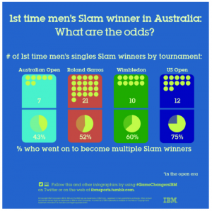
The two visualizations below show the no. of Grand Slam winners who are also First time winners and how many of them win more grand slam titles in the future.

DashboardMen

This visualization represents the Men’s Singles 1st time Grand slam winners.

Dsh2

This visualization represents the Women’s Singles 1st time Grand slam winners.

The colors which represent each tournament are their official colors due to which it is easier to associate them with their respective charts. The yellow dots which represent the tennis balls give the precise depiction of the no. of winners and in this case, the pie chart gives clear idea of the % of winners who go on to win more tournaments.

The graph shows that 1st time US Open winners are more likely to go on and win more Grand Slam titles in both the Men’s and Women’s categories. But going by the difference in  % , we can deduce that it is more challenging for Men’s 1st time winners to secure multiple grand slam titles than Women’s 1st time winners.

Source: http://www.si.com/tennis/2015/01/20/daily-data-viz-first-time-slam-winner-odds-australia-open