Young Padawan, Choose Your Path Wisely

ACT Score vs Gender vs Major

Introduction

This visualization was made by Dustin L. Arendt from the Pacific Northwest National Laboratory and Yanina Levitskaia from the University of Washington. The visualization won the award for Overall Excellence at an annual data visualization contest sponsored by the IEEE Visualization and Graphics Technical Committee (VGTC).

On the left side of the visualization, the author explained how the project was broken down, Overall ATC score vs. Gender vs. Major -> Top 2 tier score Analysis -> Outcome of students that were a good fit for computer science & engineering when they registered for ATC.

Impression

Upon first seeing this visualization, I was amazed by the complexity of the Sankey diagrams. However, I was having trouble interpreting the 3 diagrams. I continued to read the instructions on the left side and understood the datasets for the three diagrams and how to read the Sankey diagram.

What I Like About This

I like the fact that this visualization told a story. It stated the claim clearly at the title “Gender Discrepancies in Computer Science and Engineering”. And it examined data using ACT scores, an exam for high school students determining their eligibility for college.

What I Don’t Like About This

  • I cannot find the data for the year of the ACT score and where the data was taken from. The amount of data (77,584) seemed to be a lot less than the 2.1 millions of students in 2016 reported by US News.
  • Second, it is not clear to me what the author meant by “took the top 35 most common paths”. I concluded later that they meant by going to college and have a major.
  • Third, in the description of the last graph on the visualization, the author stated the graph was the detailed analysis of 752 students that were deemed good fit for engineering when taking the ACT test. However, with their choice of major, it resulted in poor moderate or great fit at the end. What I found unclear here is how did the author come to the conclusion of which student final major is a poor, moderate, or a good one. Was it based on the student’s academic performance in their poor fit major or some other factors.
  • Finally, the last graph on the visualization. The warrant the author tried to convey using this graph was that the rate of changing major for students who are good fits for computer science and engineering indicated in their ACT score and started as Engineering and Technology.

How I Would Improve

Overall, I really like the concept of this visualization and that it told a pretty convincing story. However, I would improve on explaining the data more clear, even just add the year and where the data was from. I would also explain how I reached a conclusion to classify various students into a poor, moderate, and good fit and the criteria used.

Reference

https://www.hcde.washington.edu/news/graduate-student-yanina-levitskaia-takes-first-place-in-data-visualization-contest

https://www.usnews.com/news/politics/articles/2016-08-24/bigger-numbers-of-high-school-grads-taking-act-college-test
When China Sneezes, the Others Get Sick

China Import Demand Potential Effect

Description

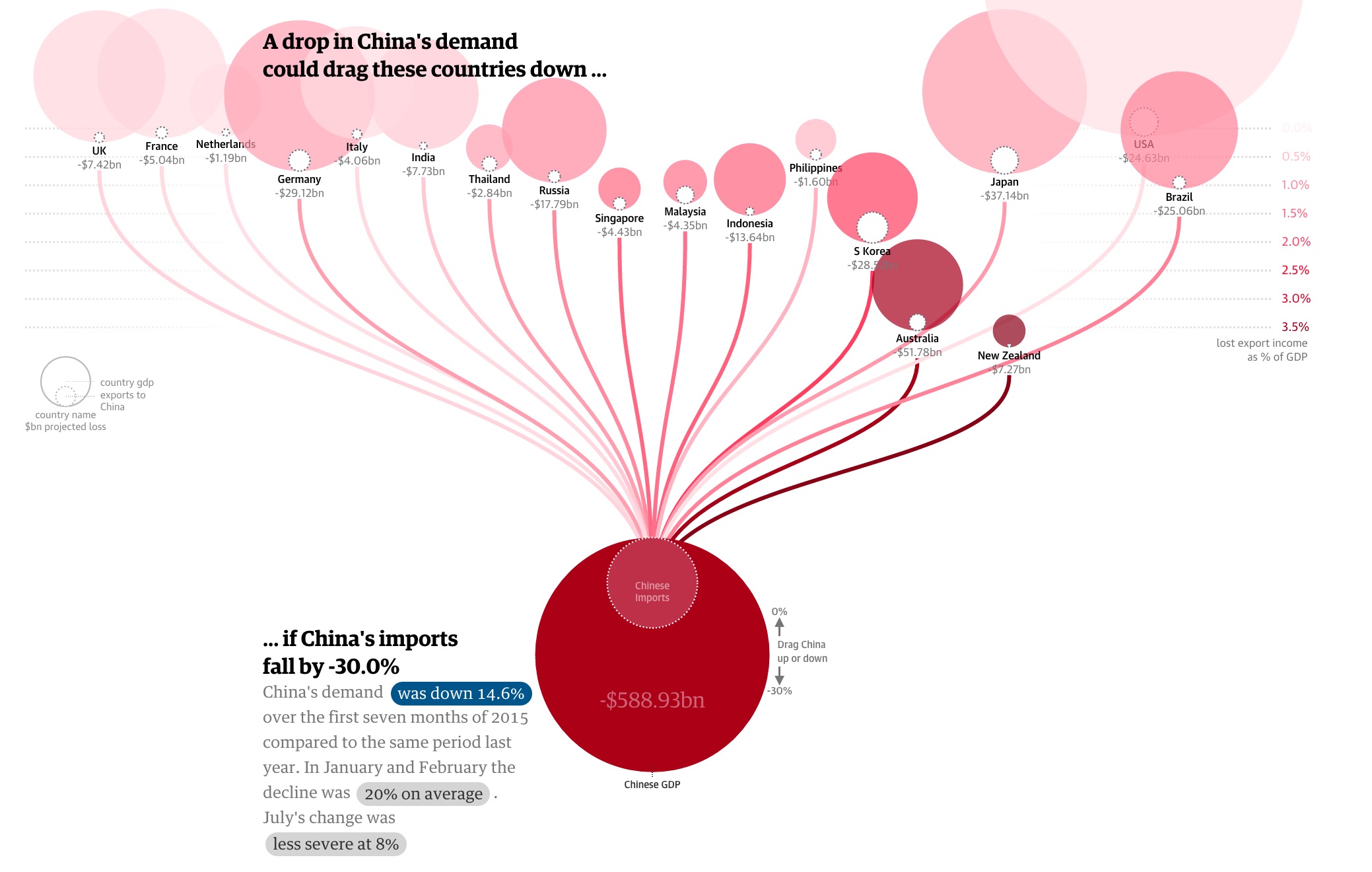
This is an interactive visualization of how 2015 China’s demand on import affects the economy of its trading partners. Indicated below, it is observed that the China’s growing momentum has started to slow down. To see how much China’s economy impacts the rest of the world, this visualization examined the relationship between China’s imports and other countries export.

The big dark red circle at the bottom represents China, and the inner circle represents China’s import demands. The China circle is connected to various trading partnering countries. By dragging the China circle up and down, we can manipulate the data to provision China’s import demand drop, from 0% to 30%, and we can observe the impact the change has on other countries shown by the export loss and its percentage of total GDP.

China GDP slowdown

What I like about this

  1. I like the interactivity aspect of this dashboard. Users can observe what impact China’s import demands has on its major trading partners.
  2. The warrant of this visualization is that China is experiencing a slowdown in growth and as a result, its import demand decreases. The graph shows exactly how big of an impact it is to other countries. This is an effective way to show how China not only is a big exporting country but also an influential importing country.

What I don’t like about this

Overall, I think this is a very good visualization. However, there is one thing I find puzzling. The size of circles representing the export loss for China’s trading partners does not change when China’s import demand changes.

To represent the changes the countries experienced in regards to China’s import demands, this graph changed the location of the whole circle (representing each country). The more percentage of GDP loss, the lower the position of the whole circle (notice in the picture how low is Australia and New Zeland compare to others). Also, the more percentage of GDP loss, the darker the circle turns into. However, it took me a while to notice the relationship of the positioning and the % to GDP loss.

A user can also hover over each country, and the graph will show you the amount of money the country loss due to import demand decrease from China. I felt the size of the import loss should also change. For example, when China decreases import demand by 30%, the export loss of the US is at $24.63bn (0.1% GDP) and Australia at $51.78bn (3.6% GDP), but the circle representing loss in the US still remains significantly larger than the one representing the loss of Australia when in actuality, Australia will lose more than half of what the US will lose.

What I Would Have Done

  1. Make the size of the export loss for each country change according to the amount of loss it will experiences when China’s import demand changes (as mentioned in the “What I don’t like about it” section).
  2. I will also put a color scale indicator along with the visualization to indicate the darker the color the circle turned to means the heavier the impact because the current scale on the right-hand side looks like it just faded out at 0.0%

References

https://www.theguardian.com/world/ng-interactive/2015/aug/26/china-economic-slowdown-world-imports

China’s Economy Slow Down is Bad for America

Drink More Water, Save Some Money

Introduction

Three California cities including San Francisco, Oakland, and Albany, were under debate last year, on whether to pass a penny-per-ounce tax on sugary drinks (a fact update, in November, 2016, the Proposition passed in all three cities). The tax would have impacted various sectors including consumers (higher income vs. lower income), beverage companies, and the government. Below visualization was done by The Pew Charitable Trusts studying the percentage movement on sugary drinks and water in Berkeley (where soda tax was imposed previously) versus SF/Oakland.

Soda % Change In Comparison to Last Year Berkeley Oakland/SF

Impression

One of the biggest principles that I have learned thus far in the class is there is always an argument of what you want to achieve with the data, and with different audiences, you have different objectives.

I believe this organization (The Pew Charitable Trusts) had a stance of pro-soda tax. Knowing the organization’s perspective on this issue, this visualization is fairly effective on conveying its believe. The chart clearly shown that in the five months after Berkeley passed the soda tax, sales of sugary drinks decreased when compared to the same time previous year. The only drink experiencing growth in sales is water.

Improvement

In my opinion, this graph conveys effectively in general. However, we can incorporate other aspects of the data set to target the needs of these two groups: the beverage companies and the government.

Beverage Companies:

In this article, it pointed out the increased on soda tax would impact more on lower income households because price tends to be the deciding factor on which product to buy. As a matter of fact, Berkeley saw 21% drop in sugary drink consumption in the month after the tax was implemented.

Another concept we learned from the class was it does not have to always be 0 or 1 (e.g. global warming or not, to pass the soda tax proposition or not). In this case, beverage companies could not only focus on opposing the proposition, but to think how to lose the least amount over this proposition.

From Berkeley’s stats, we know lower-income households consumption might decrease significantly after the soda tax. I would revise the graph and analyze data from each store and identify data locate in lower income neighborhood. We can then compare the historically sales in those stores and come up with strategies accordingly.

Government:

The purpose of the tax was to increase government income. However, with people shifting to buying water (no tax), the government might not get much out of this proposition. Therefore, for the government, the analysis could be a prediction of SF/Oakland’s tax using Berkeley’s historic performance as a baseline.

References

http://www.pewtrusts.org/en/research-and-analysis/blogs/stateline/2016/10/17/sparring-over-soda-tax-cities-set-referendums

https://ballotpedia.org/San_Francisco,_California,_Soda_and_Sugary_Beverages_Tax,_Proposition_V_(November_2016)

Blog Post 1 – cchen2 – Poking a Monster Graph

Pokememory
How memory is used in each Pokemon generation

Overview

My first blog post is about this visualization of Pokemon Generation 1-6 data usage. For each generation, this graph broke down various actions a user can do and the data it consumes when in different modes (e.g. Playing, Battling, Catching…)

Impression

The trend of data usage in Pokemon generations is fairly consistent. Except Gen 5, all other generations use more data than its previous generation. At first glance, this visualization reminded me of Tetris, the classic video game a lot and it took me a while to grasp the interpretation of the graph. There are couple reasons why I had difficulty understanding the graph:

  1. Some boxes with the same color could appear next to each other or stack on top some other colored boxes. For example, in every Generation, blue boxes like EVs (bottom row) are also at the very top (HP, Att, etc.)
  2. There are too many segments in the graph. From 18 segments in Gen 1 to 70 segments in Gen 6, this graph contains a lot of data for its readers to process.
Tetris

Possible Improvement

I would address the two points above.

  1. Arrange the order of the blocks so different color boxes are displayed together.
  2. I will group similar segments in one category (e.g. Group Nickname, OT Name, and OT ID into one category called Name, and group unused and unknown to one block). And have another graph to show the percentage breakdown of each process in the categories (e.g. Name group: Nickname  – 60%, OT Name – 30%, OT ID – 10%).

Sources:

https://www.reddit.com/r/pokemon/comments/4cndbn/how_memory_is_used_in_each_pokemon_generation/

http://www.tetris24.com/