Bikram Patnaik
Visualization Link: Fertility vs Life Expectancy
Maternal mortality is much higher in developing than in developed countries- Mahler, 1987
“The world is still ‘we’ and ‘them.’ And ‘we’ here refers to the Western world and ‘them’ is Third World. And what do you mean by Western world? Well, that’s long life and small family, and Third World is short life and large family.” – This is a podcast conversation that I heard last week playing in my friend’s car.
Well, the importance of quantifying the loss of life caused by maternal mortality in a population is widely recognized. In 2000, the UN Millennium Declaration identified the improvement of maternal health as one of eight fundamental goals for furthering human development.
Going by the old school definition, maternal mortality ratio (MM Ratio) is obtained by dividing the number of maternal deaths in a population by the number of live births occurring in the same time interval. It depicts the risk of maternal death relative to the frequency of childbearing.
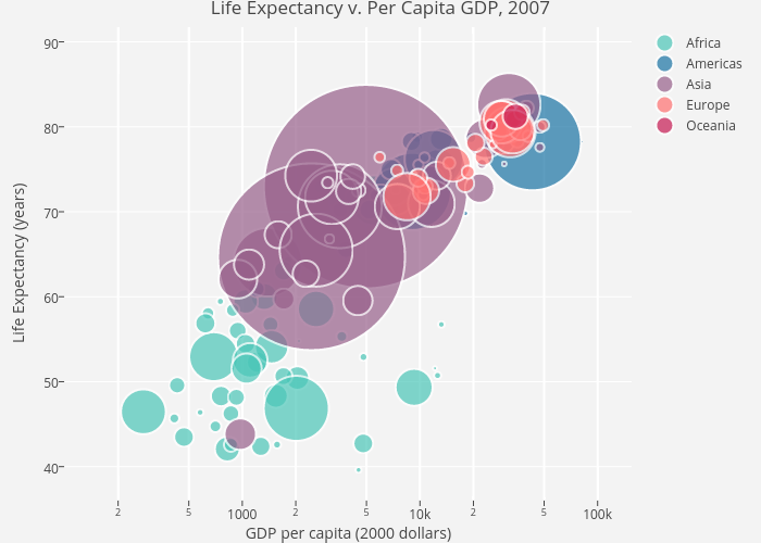
With the help of this visualization we will discuss if we can justify our main claim with proper evidence or is it just a regular misconception which should only interest health experts and statistician. The visualization reviews data from 150 countries and compares Life expectancy (maternal mortality rate) vs maternal fertility for the past 2 centuries. The vertical axis shows the average maternal life span in each country ranging from 10 – 80 years, where high up= longer life, to the bottom= shorter life. The horizontal axis shows the total fertility rate that ranges from 2- 9 children per woman. It’s interesting to see the usage of bubble chart for this, which is primarily used when you represent data that has three or more data series (In this case Life expectancy, total fertility and size of the population) and each containing a set of values.
UNDERSTANDING THE DATA:
Here each country in the world is a bubble,the size of the bubbles represent the population size and color represents regions of the world (see on top right side).Before rolling the years, we notice that in 1800 all the countries had a life expectancy less than 45 years and the children per woman ranged from 4-8 (on an average- 6 children) in a family. For further discussions let’s understand that high mortality rate means less life expectancy and vise-versa. Developed countries like France had a low fertility rate( 4.4- which means they had smaller families) and a life span of 34 yrs where as the developing county, Iran with a smaller population had a high fertility rate (7.1- meaning larger family) and the life span barely crossing 25 years. We see there is a significant difference between the developed and developing countries in terms of both mortality and fertility rate pertaining to factors like lack of adequate medical care, the greater prevalence of infectious diseases and higher incidence of pregnancy. This might seem to be a promising warrant that we want to verify our claim.
BUT!! let’s see what happens when years pass by. Till the 1940s there was no significant difference between the countries on the visualization. Only after 1950, there is a change that is noticeable. China starts moving with better health and improves steadily. All Latin American countries start to move towards smaller families. The blue ones are the Arabic countries,and they have longer life, but no larger families.In the ’80s, Bangladesh still remains similar to the African countries. But then the Bangladeshi imams start to promote family planning and pull the country higher up the life expectancy ladder. And in the ’90s, there was a terrible HIV epidemic that takes down the life expectancy of the African countries and all the rest of the countries move up where there are longer lives and smaller families, and we have a completely new world.
Let me make a comparison directly between the United States of America and Vietnam. In 1964, America had small families and long life; Vietnam had large families and short lives. The data during the war indicate that even with all the death, there was an improvement of life expectancy. By the end of the year, the family planning started in Vietnam; they went for smaller families. While United States had longer life, keeping family size. In the ’80s, Vietnam gives up Communist planning and goes for market economy, and it moves faster even than social life. And today in Vietnam, we have the same life expectancy and the same family size as in United States, 1974, by the end of the war. With this all the previous warrants fails and now this comparison acts as a strong rebuttal against our original claim.
DRAWBACKS:
Undoubtedly the visualization is amazing in itself, but there are few snags which can alter the statistics if taken into consideration. First, the data collected are only with respect to inter-countries. But what it doesn’t include is the scope to look at the differences among the maternal mortality within the regions of a given country which would give different insights. Second, there is no mention of various age group of women who face higher mortality rate; so that those age group can be targeted for special medical care during pregnancy. Third, there is no comparison with the actual vs target MM ratio data for any given country. There is a high probability that when these factors are combined together it might give us a different picture altogether.
FROM A CRITIQUE’S VIEWPOINT:
The number of different parameters presented on the interactive dashboard are overwhelming and seems far less from being user-friendly. For a new user it becomes hard and confusing, instead a simple drop down could be introduced to give the audience the flexibility to play around with their desired set of parameters.The simpler it is, the easier it becomes. Second, the visualization doesn’t allow us to see the change in MM Ratio across various countries as year passes. This is very crucial for any government health organisations to plan ahead of time. Third, though we see a bubble comparison between inter-countries but the total mortality figures/data over the years for a particular country is not seen ( neither it’s total comparison with the World data).
ALTERNATIVE APPROACH/MODIFICATION:
Though it’s visually appealing there are certain hiccups with this bubble charts visualization as well. It can be further enhanced and made simpler by adopting certain techniques.
- The bubble chart earlier didn’t give us a change in MMR for different countries. So, as a modification I would recommend to use 2-D clustered bar graph to show the deviation of MMR across the various countries over a period of time. This is a simpler alternative to visually represent a change in data, as you can see this in below visualization.

2. In this following modification, we make changes to the graph as pointed out in drawback section. Using a simple line chart we try to contrast two different projections for a given country. In the below visualization, we see the target MMR of Mexico and a comparison of it’s actual stats.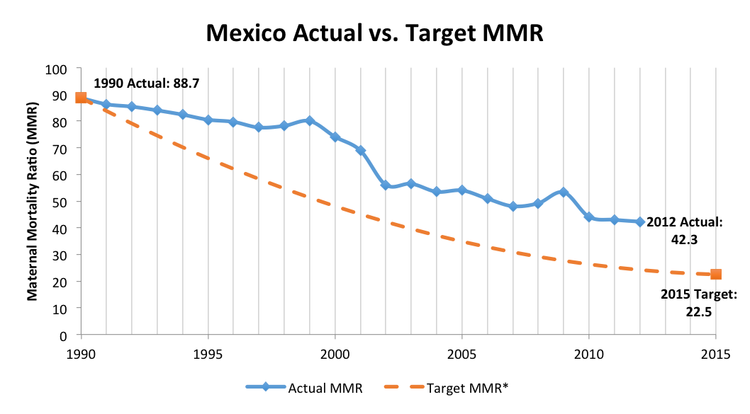
3. Further, we discussed that a bubble comparison between inter-countries is seen in the visualization but there is no individual mortality figures/data for a particular country over the years ( neither it’s total comparison with the World data).. The modified version looks like the below visualization.

4.The following visualization segregates the maternal mortality into different age groups and makes it easier to understand the impact over the spectrum.

CONCLUSION:
We could clearly see from the comparison between countries that in the modern era, all the developed as well as developing countries have the same mortality and fertility rate. Studies suggest that 45% of the potential number of maternal lives saved in developing countries is attributable to fertility decline and 55% of the potential number of maternal lives saved are because of safe motherhood initiatives.
If we don’t look in the data, I think we all underestimate the tremendous change in Asia, which was in social change before we saw the economical change.So rather than over simplifying the fact that only maternal mortality is higher in the ‘Them’ countries as compared to ‘We’ countries, we should try to embrace the changes happening around the world.
References : Princeton, NCBI , Encyclopedia Iranica, Quora, WHO, Mamaye, Wikipedia