Changing face of America

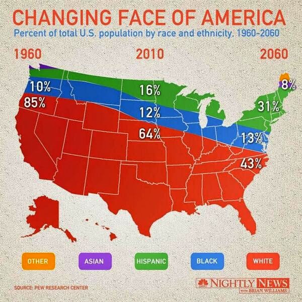
America is a land of immigrants. From centuries, People all over the world have migrated to this country to live American dream. Many have also become American citizens and contribute in the prosperity and development of the country. Recently I read an article “Changing Face of America” which shows the distribution of Americans belonging to different race and ethnicity as percent of total population over a period of time.

Distribution of race and ethnicity in the U.S. from 1960 to 2060

What I like about the graph

1] This is a perfect example of how a bad, deceptive and wrong visualization looks like.

Wrong – Because the data has nothing to do with the 50 states in US. The data is all about population distribution over 50 years,. Only the author can tell Why is the US map is used to show the percentage distribution of population

Deceptive – This is extremely confusing. It gives an impression that all the Asians Americans use to live in either Northern Maine or upstate Washington while South Dakota is an excellent place to be black. The best/worst part is There is not a single Hispanic within a thousand miles of the Mexican border

Bad – Another problem with this chart is that none of the percentage seem to add up to 100%. For the left and right extremes we can maybe assume that the numbers for the upper regions are simply too small to be displayed. But how do we explain the middle section? There are only three colors and the three numbers add up to 92%

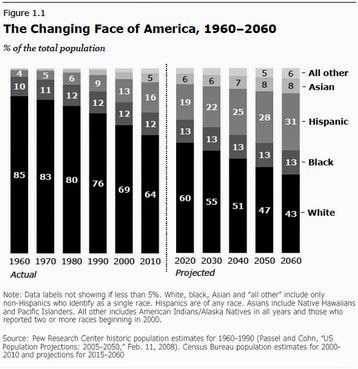
A correct and better version of this data representation is

What I like about this graph

1] US map is not used, which makes life easy for audience.

2] It is easy to read and understand the distribution of population as per race/ethnicity from 1960 till date and the prediction till 2060.

3] Vertical line separating the past (exploratory data) and the future (prediction)

4] Good color combination for different entities

5] Numbers are marked even for smaller areas of graph. Users are not kept guessing about the numbers

How will I change the graph

1] Create a bar graph showing percentage of population of different races/ethnicities over a period of time

2] Create bins for years, so that general trend can be viewed. This also helps to convey lot of information (1960 to 2060) in small space

Learnings from class

1] Understand the claim – It is very important to make the correct claim. The above visualization had no claim and so it was up to the audience to interpret the results.

2] Select a right context – It is imperative to select known and standard graphs for particular patterns. Example can be to use bar graph/line graph to show growth trends over time. Choosing a US map completely changed the context of the graph and showed deceptive information

3] Visual confirmation – Check if the graph conveys the right information. Scan through all parts of the graph (and change the filters) to check if it displays the right information

4] Careful use of infographics – Do not make simple thinks complicated. Though visualizations can be appealing, they can be harmful/deceptive. Be careful while playing with numbers. (example – percentage should add to 100)

5] Identify your audience – Visualizations are used to convey information in a clear/better/correct way. Deciding the audience of the visualization helps to decide what kind of infographics to use.

references – 

http://cartonerd.blogspot.com/2014/04/changing-face-of-america-bravo.html

http://digbysblog.blogspot.com/2014/04/

http://livingqlikview.com/the-9-worst-data-visualizations-ever-created/

Gun law in Florida

Florida is the south easternmost U.S. state, with the Atlantic on one side and the Gulf of Mexico on the other. Florida is a famous tourist destination. In 2016 alone, approximately 113 million tourists visited Florida. With Tourists and happening night life, unfortunately crime (involving gun) is high.

Florida’s self-defense law (The stand your ground) was passed in 2005  states –

“A person who is not engaged in an unlawful activity and who is attacked in any other place where he or she has a right to be has no duty to retreat and has the right to stand his or her ground and meet force with force, including deadly force if he or she reasonably believes it is necessary to do so to prevent death or great bodily harm to himself or herself or another or to prevent the commission of a forcible felony.”

After this law has been passed, there is an increase in gun deaths. However I saw a visualization which gives completely opposite visual representation of this fact. 

The following visualization depicts the gun deaths in Florida from 1990 to 2010 (Note the Gun law is passed in 2005 as marked in diagram)

What I liked about the diagram

1] Simple and eye catchy diagram – It does not try to integrate lot of unnecessary information. Also “Red” color attracts the viewers. It can also be associated with “blood” and hence human life loss

What I did not like about the diagram

1] Inverted Y axis/ Wrong first impression – Upon careful observation, I noticed that the Y axis is inverted. This means 0 starts at top and large numbers are at bottom. I did not understand the use of this inverted logic. This creates confusion and user can wrongly interpret that – gun deaths have significantly reduced after 2005 (After “Stand your ground”). This is because of human pre assumption of reading/interpreting line graphs is fixed

2] No units mentioned for Y axis – What are these numbers. Are they in hundreds or thousands. The core principles of visualization of “Scales” is not followed.

3] Time series fails to deliver the message – Here the years (along the X axis) have been grouped in 10 years bracket. However since this graph shows the time series, every year’s information is important. This only shows a general trend over years but fails to convey accurate figures.

A different version of above visualization using standard/normal Y-axis

The above visualization shows us how drastically the slope/trend can change if we invert/change the Y axis. Now the viewer can get clear picture than gun crimes have increased after the law is passed in 2005

How will I change this visualization –

1] Compare Florida with rest of USA – As seen in the below diagram, I would compare the gun crime in Florida with rest of USA. The units are well defined and user can clearly understand the increase in gun crime after 2005

2] Set the context to 2005 – A vertical line clearly indicate the time when Gun law was passed.

3] Use of color – I will use red color for Florida and blue color for rest of USA. This clearly shows the difference to the user

4] Standard Y axis – It is better to use the standard assumptions, and not try to make simple things complicated. This will be easy for users to quickly and clearly understand the trend

Learnings from the class –

1] Define the context – The visualization becomes more meaningful if context is clear and well defined

2] This example is a great reminder that we bring our own assumptions to our reading of any illustration of data. Something which goes up is increase in value and something which comes down is decrease.

3] Not to overcomplicate things – It is good to be artistic. But if we overcomplicate things, then user may interpret the visualization in a wrong way

4] Choose your Y-axis intelligently – This can make your visualization look completely different/deceptive.

5] Identify your audience – Not all of your audience will be mathematicians. Most of them will only look at the figure and try to identify the trend (without going into details)

References – http://www.businessinsider.com/gun-deaths-in-florida-increased-with-stand-your-ground-2014-2

http://www.orlandosentinel.com/travel/os-bz-visit-florida-tourism-2016-story.html

http://stat.pugetsound.edu/courses/class13/dataVisualization.pdf

Google search in China

Google has revolutionized the way we can search the content on internet. Offering a variety of services like Search, Maps, Apps etc. Google has made life easy for most of us. “Make Google your friend” is the favorite quote used by many. Though Google is well accepted name and a big brand company, its use and acceptance is restricted in China. There are many reasons (including political reasons) why Google has not succeeded in China. Recently I came across a blog where market leaders(in terms of revenue) in China for “Search” were shown. Author wanted to show how Google is NOT the leader in China. Here is the picture.

Google Search in China

What I like about this visualization

1] Clear numbers showing “Baidu” has 79% market share. Google is far behind (only 11.9 % share)

What I did not like about the visualization

1] No context – This shows the value in Q3 of 2014. However no information is published why 2014 is taken as a reference/context. Readers like me are kept in dark about Google’s performance over a period of time. Is it increasing or decreasing. Similarly what is Baidu’s performance over years ? Just one year’s data does not give us a whole picture. I feel this is incomplete information.

2] Is this Exploratory / Explanatory visualization – This diagram forgets one of the core principles of visualizations. User does not get any idea if this diagram just explores the data or it explains Google’s presence in china

3] Color selection – Red color indicates alert, alarms or bad things. Here “Baidu” which is market leader is assigned red color (which is surprising). After lot of thinking, I came to conclusion (which may be wrong)  – Since China’s flag has red color, and the owner of this visualization wanted to show strong presence of Baidu in China. Hence he kept same color as flag.

4] What does the ring shows –  Maybe larger rings shows higher importance. But in that case larger rings should be placed at bottom with smaller one’s on top

5] Inefficient use of space  – Reader knows that the blog is about China. So why to again show its flag? I think this is waste of space

I found one more bad visualization of the same data, which is shown below

Circle – Still not the perfect visualization

The above visualization has following problems

1] Shows the figures only for 1 year. No comparison over years.

2] Becomes difficult to compare values. Lot of space wastage (circle is empty in the middle)

How will I create this visualization

1] Data speaks a 1000 words – I will strongly prefer a comparative graph showing Google/Baidu performance over years. So my context will be stretched over a number of years. This will clearly show the increase/decrease in market share of different companies. See the below bar graph. User can clearly understand the performance of Baidu and Google over years. This clearly shows that Google is losing the market from 2012 onwards (16.2% in 2012 to 12% in 2014)

2] Less Space , more information – Use the available space wisely !

3] Color combinations – Use of standard color combination (clear distinction between Baidu and Google). I would still not prefer “yellow” for Google, but its much better than the above graph


References for blog- http://visual.ly/baidu-statistics-and-trends

References for blog – https://www.chinainternetwatch.com/7375/china-search-engine-market-q1-2014/

References for core principles of visualization -https://www.tableau.com/blog/stephen-few-data-visualization

Don’t make your executives do the math !

With abundance in data, it can be a tedious task to look through your numbers to interpret data and take important decisions. Visualization is an effective way of describing the patterns in data. When visualizations are created for top level executives, Sales/Marketing heads, they will not play around it, and will accept (or reject) whatever visualization is created for them.

One of the most common scenario’s for visualization is sales related information. The below “line graph” shows Sales and Target figures for a given year (monthly)

Year wise Sales performance

What I like about the graph

1] Time wise trends in Sales achieved and the expected Target (comparison)

2] Different colors to distinguish between Sales and Target

3] A good scale which covers the data properly

What I don’t like about the graph

1] No details about numbers. Though above line graph gives a general idea about the months in which target was reached/missed, it fails to give the numbers (Executives will be interested in “how much” rather than a general idea)

How can we add value to above visualization

1] Include details. Show numbers. Add bar graphs

Crisp and clear numbers.

The above visualization makes use of “Bar graph” and “line graph” into single picture and gives us information about

1] How much was sales as compared to targets (Percentage up or down) – For CEO

2] Actual sale figures (line graph) – For Sales head

3] Red and Green color combination tells us good/bad news

Conclusion – It is important to identify the target audience and include details accordingly. Do not make your executives do the math ! The more questions they ask from looking at visualization, the more scope of improvement. 

References  – https://www.klipfolio.com/blog/dashboard-design-mistake-forcing-users-to-do-the-math