Green Dashboard Effect

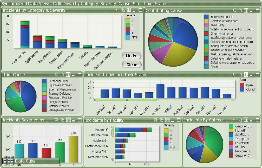
We all have read about the “greenhouse effect” in our science class. That’s something damaging our planet.. right ? The dashboard below has a similar effect on our eyes. Jokes apart, lets critique what’s wrong in the below dashboard and how can we improve it.

What’s wrong:

Too much usage of colors: Too much colors are used in this dashboard, which is highly distracting and hides the information from the metrics.

Green and Red- not a good combination: This combination of colors works well when we want to convey the message of accept/reject. In this context the color combination doesn’t fits. Besides that, this color combination is not appropriate for the audience who are color blind.

Too much data in a tight space – This dashboard doesn’t have enough room to breathe. Due to this data overload, it is difficult to identify the most important data or trends and deviates the attention of user.

Bad Design Structure: A good dashboard is build using a hierarchical and structured template, but this dashboard lacks clear visualizations and appears to be blocks of green.

Wrong choice of chart:  This dashboard basically provides the health status of the system. However, it doesn’t encompasses all aspect of a health monitoring system like how the health changes over time. The choice of charts are too simplistic and therefore doesn’t provide inherent insights.

Fonts are difficult to read – The font size is too small and the labels are not clear enough to read. The metrics are small as well, and if this dashboard is displayed on a screen it will be really difficult to read.

What can be done to improve this ?

Reduce amount of color. Meticulous use of color makes the dashboard more appealing. Instead of big blocks of green/red, we can use up/down icons which would clearly convey the same message of being on/off target. This also gives us more space in the dashboard and is better for color blindness.

Create blank space: We can create some white space between widgets. This helps user to easily read and understand the information conveyed.

Prioritize the information: More is not always better. It is important to identify the right KPI for the business. Limited, but important information should be displayed that will make the dashboard more efficient and less crowded.

Using relevant charts: Any monitoring dashboard should not only have the current status of the health, but also helps users to get the trend or comparative status too. So identifying relevant data and presenting them in a trend line or a bar chart can produce more important insights for the end users.

Consistent and larger font size: This improves the readability and makes the labels and metrics clearly visible when displayed on a TV or a big screen.

Conclusion

While creating a dashboard, the primary focus should be on displaying the right data and getting those metrics to the right people. The above dashboard tries too hard by using flashy color, adding complexity, confusing visualizations, and failing in the main purpose of effectively communicating the crux of the information to its end user. Following dashboard principle of simplicity we can not only make an efficient dashboard, but also help end users to make efficient decisions.

More is not always better

Let’s begin our discussion with an example. If you go to a coffee house and see them serving 15 different varieties of coffees, there is a big chance that you will be confused what to choose. Instead, when you go to a place having 2 variations in their coffee, you are likely to find your caffeine easily. Research shows when there is too much choices, consumers are less likely to interpret them, and if they do they are not sure if their selection is the “right” one.

The service incident dashboard is one such component that is usually over engineered and have too much information. There is no doubt that it is one of the key tools used by the IT group to make business decision, create release plan and estimate budget for the next business cycle. However, many such dashboard suffers from the “problem of plenty”. Let’s evaluate one such dashboard as shown below.

This dashboard breaks many rules of best practice dashboard design namely:

  • Unclear design: Most of these dashboards are either presented to the manager, or displayed on the TV screen for the team, but its really difficult to read all the information properly. Too much details clutters the dashboard and the information are not easily comprehensible.
  • Inappropriate use of chart: To get the information from the stacked bar chart, we have to dissect the segments and spend time understanding everything. Use of pie chart to present too many section is not a good practice as it makes the chart exceptionally difficult to understand and determine the percentage of each item.
  • Bad use of legend: This dashboard is heavily depended on the legends (for both pie charts and bar/column charts) to communicate the information, which adds an additional cognitive barrier. User have to look back and forth to read the charts. Also the legends are very long, which adds to the mess.
  • Inconsistent use of color:  The selection of colors for the charts is very distracting and not visually pleasing. But more importantly each color represents different information in each widget, with the exception of the top-left widget and bottom-left widget. The “blue”, for instance, represents different things on five different charts. This creates a huge barrier for the brain when trying to process the data quickly.
  • Poor data layout: The layout is not consistent. The third row has three charts as compared to the first two which have two charts. The axis is also poorly labelled.

What should be done to fix this dashboard:

  • It is important not to present too much data in one single dashboard, which brings us to the concept of identifying the right KPI for the business. Limited, but important information should be displayed that will make the dashboard less crowded.
  • Creating blank space between the charts will make the data easier to read.
  • If the team is unable to set any KPI, then adding goals and targets to the visualizations, would also make it more actionable.
  • Reducing the number of colors and keeping it consistent in all the charts will help to remove the cognitive barrier of color for viewers.
  • Replacing the pie charts with either a bar or column charts
  • Using filters will also help users to see only the data they need. Currently the dashboard don’t have any filters associated.
  • The font size should be bigger and the labels could be more crispier with smaller texts. This makes the dashboard more readable when presented to audience.

Conclusion: The dashboard we discussed tries too hard to provide a lot of information. As discussed in the beginning, when a consumer is provided with all metrics, none of them seem important. So even before designing the dashboard, it is imperative to understand what are the most important parameters that should go to the dashboard, in order to make it more effective.

Source: https://www.matillion.com/insights/why-great-dashboard-software-doesnt-always-equal-great-dashboards/

Smart City.. but not so Smart Dashboard

“Smart city” is no more a buzzword. With the advancement in technologies and devices communicating with each other, thereby generating huge volumes of data, we can render insights to help build a smart city. I came across such a smart city dashboard with feeds showing the current health of London.

http://citydashboard.org/ 

London City Dashboard

The dashboard shows obvious stuff, like weather information, pollution level and tube status. There is also a feed from twitter showing whats trending in London. There are chunks of other data like the air pollution level and the FTSE index. Now all these data looks good on a 10,000 ft level, but to better understand why this dashboard was conceptualize, we need to ask two important questions:

  • What goals are we trying to achieve by measuring all kinds of data?
  • What data will be most useful to citizens? And how to cater relevant data to right audiences?

The obvious answer to first question would be to have a common platform which provide its user access to important data. To be successful in its purpose, the portal needs real time feed of data. And I have observed several lags in providing real data feeds. As all these machines produce more data, how do we ensure that it can be readily understood and reused by all audiences.

Now let’s look at the other question. The essence of any dashboard lies in identifying its audiences. If the dashboard is used by the regular commuter, the subway data might be useful. They already know when and which train to catch, so even the running status should work fine; but for a tourist this data is useless. They would seek detail information about the subway service. I am also not sure how the FTSE index will be a good information. Below are some more limitations in the dashboard:

  • Too much information are presented in a small space and has ended up looking extremely cluttered and distracting.
  • Not all information are relevant to every group of audiences.
  • The color theme is quite distracting and serves no real purpose and this draw focus away from the data itself. Aesthetically the dashboard is not pleasing.
  • There are so many variations in the visualization style. There are boxes, line chart, temperature widget all in the same place.
  • There is no clear focus on any aspect. Audiences are actually seeing a lot of different numbers without getting much insights.

What can be done to make this better:

  • Identify what data is relevant and deliver it back to the relevant audience. One way of doing it is by giving the users to customize the dashboard as per their preferences.
  • Present some historical trends that could potentially help users when the dashboard is unable to get any live feed.
  • Improving the look and feel of the dashboard by using pleasing color, use of uniform visualizations and removal of unnecessary widget.
  • There should be a note to state briefly what each component do. This improves the overall usability of the application.

References: https://www.opendatasoft.com/2016/10/05/smart-city-dashboards/


The Devil of the Data Visualization World

A pie chart is one of the inefficient ways of communicating data to the audience. Generally speaking, pie charts can be used to show how one part is related to the whole, however they are often misleading, and inaccurate. Let us evaluate such a chart.

The above chart conveys an idea about the total percentage of active and inactive bitcoin addresses. About 65% of all bitcoins in existence are associated with an addresses that had some activity within the past year and have been categorized into separate group as per their last usage. This data is quite interesting and relevant to the hot electronic payment system domain, however the visualization violates several aspect of good design and unable to make an effective communication. Below are the details of my evaluation and I will conclude by providing an ideal chart for this data.

Point 1: There are multiple(10) categories in the pie, and I found it difficult to identify the proportions correctly and compare across these categories. Now one might argue that these portions have been labelled by the values of each slice, but we are forced to look across different sections to make any comparison. The text levels are also small and overly complex.

Point 2: Making the chart in 3D is like adding insult to injury. Humans are bad at judging relative sizes and adding a 3rd dimension makes it almost impossible. I found the section near to me(my screen) “Last six months to one year”(15%) to be the biggest. However the “Last 1-3 months” section has a bigger value(24%).

                               3D vs 2D pie chart

Point 3: Color and Aesthetics are not good. The choice of color is very amateurish, and gives no real relation to each other. Also pie chart’s circular structure use up too much space while not allowing their labels to line up. The time scales of each slice are completely different which confuses the audience more.

How would I change it:

A plain and simple representation of data is the most effective way of communication. We tend to over-engineer a chart which changes the essence of the information that needs to be communicated.

A table can be used instead to communicate the information. Even a bar graph is a useful tool for this data set. When we want to compare two things, in this case the use of bitcoin address, we typically should put those two categories as close together as possible and align them along a common baseline to make this comparison easy. A bar graph can help us do this comparison easily because our eyes compare the end points and it’s very easy to assess relative size.

The look and the feel of the dashboard can be modified by changing the font and simplifying the text label. The text label should not be very long. Regarding the color scheme, ideally a darker color creates more impact. Both the 24% and the 2% section in the pie chart have darker shades, which doesn’t adheres to the selection of the best color scheme. So instead of multiple colors, a single color of varying hue should be used.

References:

http://www.dashboardinsight.com/articles/digital-dashboards/building-dashboards/the-case-against-3d-charts-in-dashboards.aspx