For my last blog, I have picked a visualization selected by Bill Gates to be printed in Wired Magazine that he guest edited. He might have his own reasons for choosing this visualization but I see many downsides with this graph.
To start, the audience can infer that the green section representing injuries is significantly smaller than the other two, but it is difficult to judge the relative sizes of the other two sections. Similarly, inside the yellow/pink/green box, it is easy to spot the larger rectangles and get a sense of their relative sizes but again we cannot accurately compare the diseases.
Also, it is easy to read names of diseases in large rectangles but it is straining to the eyes to read inside the small boxes. In addition, few rectangles do not even have a reference label. Even though they appear to be minor causes of untimely death, a designer should not leave out information just for aesthetics of the graph.
Next, I do not understand the need of three different colors. All three colors are segmented similarly in the legend so what is the real need for using too many colors? The same could have been achieved by using just one “stepped” color scheme and separating the three major segments with borders.
Lastly, the 3-D effect doesn’t provide us with any information and on the contrary makes the treemap harder to decode. Another problem induced by this effect involves the darkened colors that appear on the sides of the treemap to represent shadows, which are meaningless and misleading
Solution:
My recommended solution would be displaying the information that appears on the treemap in a simple bar graph. This would convey the story accurately, clearly and would be equally engaging.
References:
Article: https://www.wired.com/2013/11/infoporn-causes-of-death/
Note: Refer article for the visualization
 To some, this visualization might be very engaging but I see many pitfalls in this graph.
 The above chart basically matches price of gold to yield of bonds. To somebody who reads The Economist, the above correlation holds substantial value but the visual noise created by distracting image (coin), extremely enlarged chart and microscopic font deviates the attention of the reader.
 In this chart too, it is difficult to concentrate on the plotted columns while ignoring the cranes and workers that litter the chart. These irrelevant decorations just compel the reader to work harder than they otherwise should to discover the meaning hidden in the data.
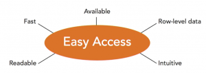 At this point, it is good to consider things like color choices, fonts, layout and also about access, right. Try to answer following questions: Will people be able to click on it, and immediately access it? Will it be fast? Will it run well?
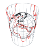
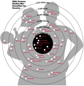
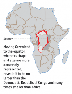 It was only after research and travelling, I got to learn about real shapes and sizes of various continents but there might be many students who leave school with such wrong perception caused due to poor visualization.