We all struggle to present the data in the most impressive visualization in Tableau. Most of the times, the ‘Show Me’ menu comes to our rescue. One of the most common mistakes in designing graphs is choosing the wrong graph type from this menu. Below are its possible issues:
- Upon selecting the parameters when you click on ‘Show Me’, it stops you from thinking out of the box and limits your creativity.
- Few very useful chart types are never displayed. Chances are that once you select the measures and dimensions; the tab gives you a bunch of options and neither fits the claim.
- Sometimes, it portrays chart types that should never be used. For instance, for creating the visualization of the market share, it shows the options of pie chart, which might display a complete misleading claim that the you want to tell.
This can be substantiated by looking at the following visualization:
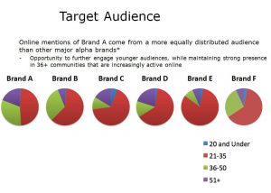
Issues with this visualization:
- It has perceptual problems as no labeling of the shares is done
- Very difficult to make comparisons for the same age across multiple brands
- Results are conveyed but cluttered with long text
- It uses multiple pie charts
How this graph is improved:
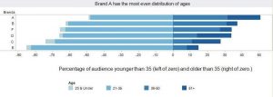
- It facilitates age comparisons much better than the multiple pie charts and enables the audience to see the age distribution of each brand
- The color scheme is subtle yet powerful. The color intensity increases with increasing age, so one need not refer to the legend at every brand
- The legend and labeling is clearly shown with age groups
- The intended message to be sent across to the audience is displayed clearly
One needs to think of the best way to put across the claim of the visualization without limiting to the existing charts.
Reference:https://www.forbes.com/sites/naomirobbins/2011/11/29/thinking-outside-the-chart-menu/#1b4d7b59171a