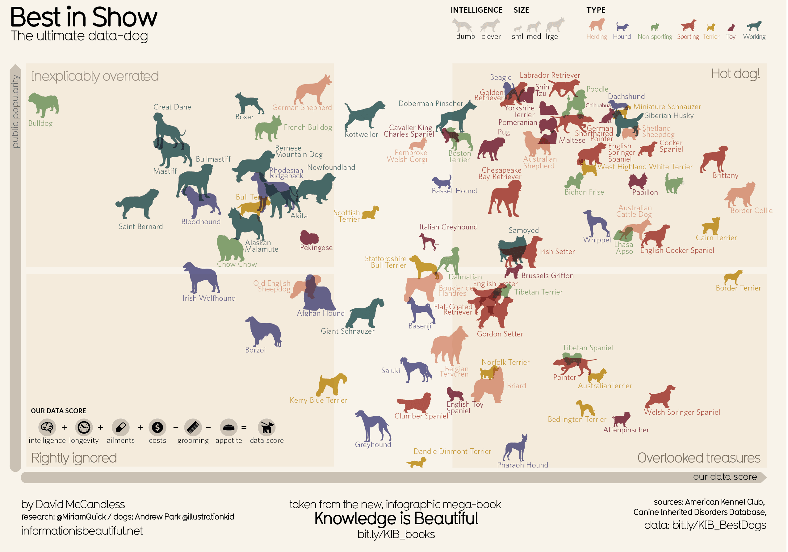
This infographic depicts information about the different types of dogs available and aims to categorize the different dogs and predict the best dogs. The visualization is projected in an x-y axis and divides the dogs into 4 different regions: Rightly ignored, inexplicably overrated, Hot Dog, Overlooked treasure.
Things I liked:
- The graph is aesthetically pleasing as images of the actual dogs used which helps us relate. Also, the use of transparency is excellent.
- The classification of dogs based on size by portraying actual size difference and the use of color to identify the dog type helps us easily identify each dog.
- All these provides us with excellent options if we want to buy one, which in this case is the category ‘Hot Dog’.
Room for improvement:
- Ailment should be deducted instead of being added in the score calculator.
- No indicator is provided of the amount of exercise or attention required for each dog.
- This infographic could be made an interactive one with the details like name and all elements of data score being shown when hovered over each dog symbol. Here viewers cannot view the value of the parameters on which data score is calculated.
Lastly, I would mention that each dog is suited for a specific surrounding and perform unique functions so comparing them on the same platform would be unfair.
Reference: http://infobeautiful4.s3.amazonaws.com/2014/11/RETINA_Best-in_show.png
Interesting post. I found the visualization too overloaded with graphics and it hinders the readability. As you mentioned, representing fewer breeds of dogs would have been a better approach for this type of info-graphic.