While doing my assignment, I was doing some research on how to design a tableau dashboard and what are the key principles for creating an informative dashboard. I found a video explain the Dashboard Best Practices and thought of writing my blog on same.
Building Dashboards involves creativity, science and art and there are 5 key design principles for designing a Tableau dashboard.
- Have relevant metrics: You need to have relevant metrics for your dashboard which align to the overall strategic goal. A good practice is to involve stakeholders at an early stage to identify the required metrics. Also, it is good to remember, if it doesn’t get measured, it doesn’t get improved; hence make sure that the selected metrics are the ones which can be improved or on which corrective action can be taken.
- Make it visually pleasing, do not overboard
The idea of the dashboard is to make it easy for the users to compare and remember data. Take advantage of this but do not go overboard with the charts and try to limit between three to five charts in one frame. Too much information can be confusing and detrimental to the viewer. - Make it interactive:
Take advantage of the Tableau’s features to create a high level summary of the data but always allow users to explore through the data and get engaged. Give them opportunity to dig to the level of detail to meet their needs. - Make it easy to use and access:
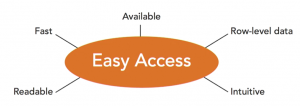 At this point, it is good to consider things like color choices, fonts, layout and also about access, right. Try to answer following questions: Will people be able to click on it, and immediately access it? Will it be fast? Will it run well?
Focus should be to make a positive experience for the audience and that they can access and use it easily - Be open to improvement:
Be open to improvements and try to collect feedbacks. Creating dashboards should be a continuous process. Metrics and goals might change and a good dashboard should be up to date with those challenges and changes so that it stays relevant.
Keeping in mind the above principles can help us in designing a better dashboard.
Reference: https://www.lynda.com/Tableau-tutorials/Creating-visuals/417094/442256-4.html?autoplay=true
Well compiled and very informative.