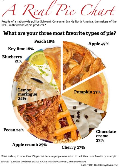
The Pie Chart shown in the image would have been more meaningful if it had depicted the results of a simple survey – “What is your most favorite type of pie?” But it is trying to represent the top three favorites. The participants were in fact asked to rank their three favorites. Hence it is quite impossible to understand from this chart which pie was ranked No. 1 favorite by maximum number of participants. For example, though Apple pie tops the chart with 47%, it is quite possible that several participants voted Apple pie as their 3rd favorite, not their top favorite. Hence, in spite of attractive graphics, this chart is quite misleading, fails to communicate the survey results effectively and hence a failed visualization.
To avoid this kind of failure, understanding the data we are trying to visualize is extremely important. In this example, if pie charts were the way to go, a single pie chart would not suffice to depict the survey results. Also, while designing a visualization, giving too much importance to the graphics is good only if it does not take away the focus from the fundamental objective of the visualization – effective representation of data.
Image source:
http://euclid.psych.yorku.ca/datavis/gallery/images/pies/pie-chart-02.jpg
Reference:
http://euclid.psych.yorku.ca/datavis/gallery/evil-pies.php
You have rightly pointed the weakness in this visualization. Probably assigning weightage to the first, second and third favorite pie of each person taking the survey and then showing the cumulative percentages could have been a way to represent the favorite pie of the sample surveyors.