Lying with statistics has been a thing for a long time, but charts tend to spread far and wide theses days. Some don’t tell the truth. So it’s all the more important now to quickly decide if a graph is telling the truth. This is a guide to help you spot the visualization lies.
Truncated Axis
 Bar charts use length as visual cue, so when make the length shorter using the same data by truncating the value axis, the chart dramatizes differences. Someone wants to show a bigger change than data actually tells.
Dual Axes
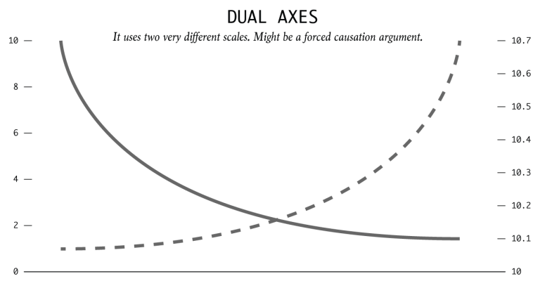
By using dual axes, the magnitude can shrink or expand for each metric. This is typically done to imply two events which actually independent with each other are correlation and causation.
It Does Not Add Up
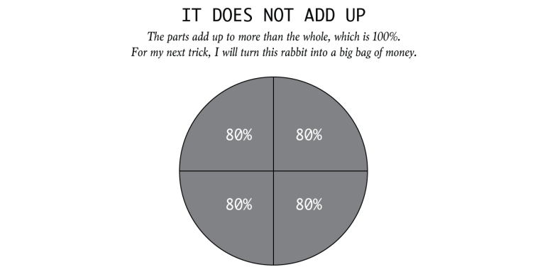
Some charts specifically show parts of a whole. When the parts add up to more than the whole, this could be a problem.
Seeing Only In Absolutes

Everything is relative. You can’t say a town is more dangerous than another because the first town had two robberies and the other only had one. What is the first town has 1,000 times the population that of the first? It is often more useful to think in terms of percentages and rates of relative factor rather than absolutes and totals.
Limited Scope

It’s easy to scope dates and time frames to fit a specific narrative. So consider history and proper baselines to compare against.
Due to words limited, to be continued next week…
http://flowingdata.com/2017/02/09/how-to-spot-visualization-lies/