Static visualizations can offer only precomposed “views” of data, so multiple static views are often needed to present a variety of perspectives on the same information. Dynamic, interactive visualizations can empower people to explore the data for themselves.
- The Novice User. Even novices must be able to examine data and find patterns, distributions, correlations, and/or anomalies. They must be able to build and use tools that enable faster decisions based on real-time information. As the National Research Council of the National Academies of Sciences states, even “naïve users” should be able to “carry out massive data analysis without a full understanding of systems and statistical uses.”
- Driving Processes. The solution must allow the user to establish KPIs that provide the rules that drive processes. These must be displayed visually—for example, by color—in real time based on defined thresholds. Likes its architecture, Interactive Visualization is a means to an end – to stimulate informed action.
- Data Must Tell A Story. An intuitive, visual workplace that it easy to master is based on easily digestible interactive patterns. Data must tell a story that instantly relates the performance of a business and its assets. Almost every Interactive Visualization narrative takes place across multiple layers. Users must thus be able to select data elements and filters, and then highlight and modify options to change data perspectives – from high-tech overviews down to the most granular detail.
- Data Correlation. The user should immediately know not only of hot spots that require attention, but also effortlessly find trends based on the dynamic relationship between multiple data streams and the data derived from them by means of predictive analytics.
- Prescriptions: “What should happen next?”World-class Interactive Visualization and underlying analytics capabilities surpass that standard by offering prescriptive analytics(“What should happen next?”) to drive real-time asset behavior modification.
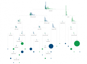
Picture below is one the best interactive visualization of 2015 according to experts. The visualization is about machine learning. To find a complete description about this please look at: http://flowingdata.com/2015/12/22/10-best-data-visualization-projects-of-2015/
References:
http://www.forbes.com/sites/benkerschberg/2014/04/30/five-key-properties-of-interactive-data-visualization/#a5efa2344eb0
http://chimera.labs.oreilly.com/books/1230000000345/ch01.html#_why_interactive
Frontiers in Massive Data Analysis(National Academy of Sciences 2013)