Today’s healthcare reporting tools have incredible powers to tell stories about patient health—whether individual patients or entire populations. But simply showing the visualizations won’t be enough. The present reality is that not many physicians use these tools to such an extent. There are several factors that can affect their ease of use, starting with acquiring the actual data.
Collecting and directing the flow of information: It would be nice if physicians, researchers and other clinicians could just shepherd the needed data into a simple dashboard and quickly go about their business of curing the world of what ails it.
Turning different data formats into one for all: Once the data has been acquired it must be made usable. And here’s where the time-tested computing principle of “garbage in, garbage out” applies. Data must be scrubbed, normalized and aggregated into a standard format all can view and manipulate.
Presentation: Data visualizations must be easy for business users to access.
- Make the reports/visualizations relevant based on the user’s role, identity and concerns. Each set of users—clinical, financial, executive, IT, marketing, etc.—requires different metrics.
- Begin with the end in mind. This may seem an obvious piece of advice, but be sure to communicate with business users what they need to see or want to accomplish in advance of structuring the report. And as a general rule, aim for no more than three to five key performance indicators.
- Make visualizations easily accessible by users. Circling back to our observations about today’s mobile healthcare landscape, this is especially important for physicians and nurses who are constantly on the move.
- Make sure you are HIPAA-compliant. It will be far easier to obtain data from outside data sources if you can demonstrate that it will be well-protected within your organization—in storage, in transit and in the way it is presented.
- Create reports that can lead to action. The more information that can be acted on, the better.
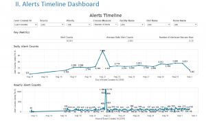
An impressive example of visualization in healthcare would be Santa Clara capstone project in the Kaiser Permanente in which students have been developing a Clinical Alert Notification system (CANS) manages alerts from all physiological devices and nurse calls. This application holds large amount of data, which can be used not only for making business decisions but also for reducing alert fatigue. A screenshot attached to this blog shows how an interactive visualization in Kaiser project is designed how it can help stakeholders.

References:
https://www.healthcatalyst.com/healthcare-visualization-benefitshttps://www.healthcatalyst.com/healthcare-visualization-benefits