Today, we live in a world where unaware HIV is a huge risk, to those individuals and to others. So, it is of high importance that the US Government and people become aware of this and take necessary actions. This graph explains the percentage of the population(age>13) who are unaware of their HIV status in each state of USA.
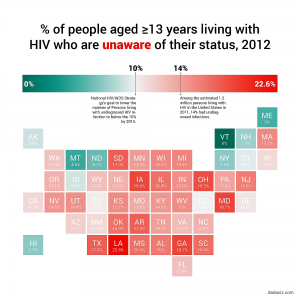
Depicting this information in a color map graph is an excellent chart selection to visually explain how each state is affected by unaware HIV population. This graph can also be represented using a line graph, scatter plot or bar chart indicating the percent of the unaware population on the y-axis and different states on the x-axis. But, illustrating the information on a map of USA, allows readers to easily locate their own state or any particular state and view the percentage.
Also, the use of two different colors and varying intensities gives the viewers a holistic view of the situation of the country. It is easily determined that the south and mid-west regions are the most affected. Therefore, the health authorities of USA and the various states should come up with ways of dealing with this persistent issue.
Reference: http://dadaviz.com/i/4328/