Long before we had sophisticated tools to create visualizations, we used to rely on charts to convey our messages. These charts had to be manually drawn with precision and patience. One such chart which is famous for its precision and content is Charles Minard’s map of Napoleon’s invasion of Russia in the early 1800’s. A cursory look at the map below shows data labels strewn across as if it’s a painter’s canvas.
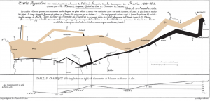
However, a deeper look at this chart points out why this is considered as one of the pioneering works in the field of statistical graphics. To lay the details in simple terms, the chart combines five data plots:
- Size of Napoleon’s army: The size of the army while marching into Russia is denoted by the width of the brown/beige bar, whereas the size while retreating is depicted by the thinner black band.
- Direction of invasion: The direction is depicted in standard notation by using left-to-right as invasion and the reverse to denote retreat.
- Geographical plot of invasion: The chart shows a map of Russia in terms of the places visited during invasion and retreat.
- Temperature: Plot of the temperature recorded during the retreat.
- Time plot during invasion: Shows the duration of retreat as a time series.
What impressed me the most in this chart?
- The chart is able to incorporate and explain different dimensions in simplistic terms.
- Even with the complexity of having a wide variety of dimensions, there is no loss or over-loading in details.
- The addition of temperature is a clever one, since it allows the reader to make cause-and-effect analysis.
Reference:
- Original source – https://en.wikipedia.org/wiki/Charles_Joseph_Minard
- Additional source to extract the English version of the chart – https://datavizblog.com/2013/05/26/dataviz-history-charles-minards-flow-map-of-napoleons-russian-campaign-of-1812-part-5/
I liked the way in which the designer has conveyed a lot of information with such simplicity. Also, he has managed his visualization without using too many colors.
I liked the way in which the designer has conveyed a lot of information in such a simple manner. In addition, he has managed to do so without use of unnecessary colors.