Project Ukko is an interactive data visualization jointly created by EUPORIAS, Barcelona Supercomputing Center and data vis designer Moritz Stefaner.
The project aims to create a seasonal wind prediction model that can be used in energy industry and scientific researches by analyzing and processing over 100,000 data points drawn from Euporias, a European environmental organization.
The most prominent part in this project which I would like to discuss with you is its expressiveness and effectiveness using of mark and channels.
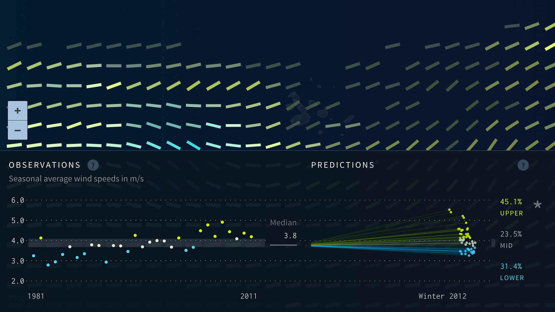
The project use thousands of rectangles, each of them is a mark to represent the dataset in a specific location in the world. There are 4 channels which encode data into the mark:
- The color opacity represents how well the prediction model performed.
- The size represents the predicted wind speed.
- The color and tilt together represent predicted wind speed trend.
By using these 4 type of visual channels, the project presents an aesthetic, simple yet high data-density visualization to us. However, we couldn’t know the wind direction from it, it would be better if it could encode this data in future.
Reference:
https://www.wired.com/2016/02/project-ukko-is-a-clever-way-to-visualize-the-complexities-of-wind/
https://blogs.scientificamerican.com/sa-visual/the-data-my-friend-is-blowing-in-the-wind/