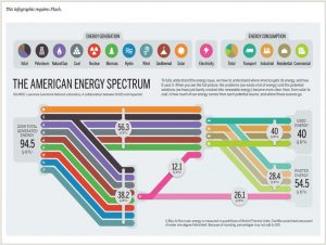
The visualization is about amount of energy generation, consumption and energy wasted in US in 2009. Each energy generation and energy consumption source is represented pictorially using different colors and symbols.
The visuals on the left-hand side shows all different sources of energy generation with help of different colors. The total energy generation for US is 94.5 QBTU. This energy generation is segregated to – energy used and energy wasted which is 40 QBTU and 54.5 QBTU.
Takeaways from this visualization:
- Coloring segregation: There are around 14 source of energy generation and consumption. Each source has been assigned a different color to distinguish visually.
- Simple to understand: All the complicated details have been shown in a simple manner. For example, Total electricity is generated from 8 different sources of energy. This has been clearly captured in pink line in the visualization.
- Highlights the problematic area: The most important point to keep in mind whether your visualization clearly depicts the underlying problem or motivation to make the visualization. This visualization clearly shows that out of total energy generated, 54.5 QBTU is wasted which is more than 50% and this needs to be addressed to utilize energy efficiently.
References: http://www.informationisbeautifulawards.com/showcase/444-the-american-energy-spectrum