
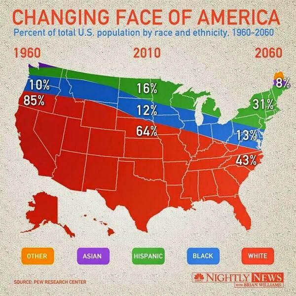
The above visualization shows the racial and ethnic divide of the US from 1960 to present and predicts till 2060. Though the visualization is pleasing to the eyes and looks innovative at first, I believe that the information is wrongly represented and the visualization can be improved
- The visualization is confusing as it appears that the states consist of the races depicted, i.e., california appears to be 100% white.
- The scale of the map is not consistent throughout. 85% and 64% appear to share the same area. White race has a negative slope as there is a decrease in percentage of population, similarly Black race have a negative slope even though there is an increase in percentage of population.
- The year 2010 seems to have almost no Asian population which is misleading. Similarly there is no “other” representation in 1960. This leaves the audience to speculate whether there are no other races in 1960 or it is left out of the map as Asians in 2010.
I think the above visualization tried to be innovative but it failed in representing the information accurately due to a map of the US in the background, a simple line/bar graph would have sufficed.