Would you like to know the rank of your birthday? Here you can check with this interesting heat map plotted with days and months. It represents the number of babies born in the United States between 1973-1999. (Non-US citizens please ignore your rank!)
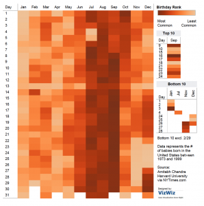
Here heat map is the best suitable visualization and it is made using Tableau. Following are some interesting insights.
- If you hover over your birthday, you will see rank and exactly where it stands.
- Along with the rank top 10 and bottom 10 ranks are displayed separately.
- The orange colored palette helps reader to easily distinguish between dates.
- September month has many of the top days where as January is least common.
- Around major holidays, fewer babies are born.
Heat maps are well-suited for visualizing large amounts of multi-dimensional data and can be used to identify clusters of rows with similar values, as these are displayed as areas of similar color.
Source: http://www.vizwiz.com/2012/05/how-common-is-your-birthday-find-out.html
Image-source: http://public.tableau.com/views/MostCommonBirthdays/MostCommonBirthdays?:embed=y&:loadOrderID=0&:display_count=yes&:showVizHome=no