http://www.slate.com/blogs/the_slatest/2015/10/06/syrian_conflict_relationships_explained.html
Syria
 Every day we hear something new yet terrible news related to Syria. Complexity of the situation has been on the increase as more countries are joining hands with one party or the other thus aiding in worsening the conditions in the country. People have had to flee their motherland just to survive and find shelter where ever they can. Sadly, only few people have a complete picture about the involvement of all countries in this crisis.
Most countries and global organizations have come to the call of helping Syrian refugees by welcoming them with open arms while some are still skeptic about it. No one knows how long it could take to solve this crisis but as of now it has only been scaling upwards which means more war is yet to come in a land that was once a peaceful place to live.
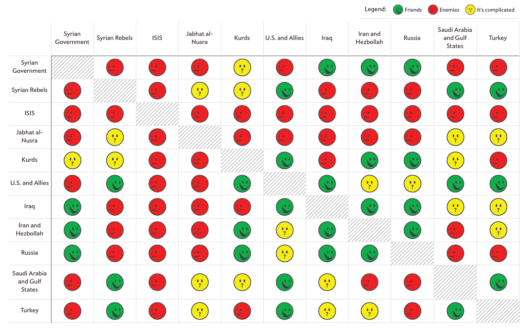
Digging deeper-
Under such circumstances a dashboard like this can be of great help to educate people about the different ties each country has among them. Even though the images we see in our mind upon hearing the word Syria involves bloodshed yet this dashboard conveys the message with emoticons that are used by us frequently, just succoring us to digest this knowledge in the most understandable language of today.
One can clearly see how each country is linked with all other countries in terms of friendly, enemy or complicated. Moreover, on clicking on a relation between any two parties gives you a justification of why their relation has that tag. Within this small visualization, it conveys the message equivalent to what most writers must fill up pages to do the same.
Drawbacks-
Undoubtedly the dashboard is an enlightening one yet there are few shortcomings in it. Firstly, a single color cannot define the same level of hatred or love that all countries have for each other. Just because one party might not like the other party does not make them hate each other within the same context as parties who do hate each other. Seeing a red emoticon would make the viewer believe that two countries must be arch rivals due to the red emoticon even though their ties might not be that bad. Secondly, the yellow emoticon does not provide much information as it leaves the viewer in the same state he was in before viewing it. Just how complicated the situation is cannot be shown with the use of a single emoticon.
Modification-
1. The visualization shows the picture of all countries involved today however, it would have been better if they could portray it in a yearly manner just to give the viewer an idea of who joined the crisis and at what time. This would also help in understanding how the problem from a civil war became global with time.
2. More variety of emoticons could be used to show different levels of hatred or friendliness that two parties have with each other. Countries that do not hate each other but support different parties or stand on different grounds could be shown with an emoticon that has lighter shade of red and same goes for green emoticon as well. With different shades of colors, use of the yellow emoticon would lessen thus, conveying a more powerful message with lesser confusion.
3. Syrian crisis not just involves these countries but also the people of its own country and all who have died in this war. It would have certainly given way more depth in knowledge had the author somehow managed to depict the people who lost their lives along with refugees who seek asylum elsewhere.
Conclusion-
We can clearly see relations of all countries involved in the Syrian crisis and how it has been on the rise ever since it came into being. Nearly half the population of Syria has had to flee to survive. Families are broken apart with no knowledge of their loved ones. It is high time the world comes to the aid of Syrians as today it is them but tomorrow it could be you.
References:
http://www.bbc.com/news/world-middle-east-23849587
https://www.worldvision.org/refugees-news-stories/syria-refugee-crisis-war-facts