Let’s begin our discussion with an example. If you go to a coffee house and see them serving 15 different varieties of coffees, there is a big chance that you will be confused what to choose. Instead, when you go to a place having 2 variations in their coffee, you are likely to find your caffeine easily. Research shows when there is too much choices, consumers are less likely to interpret them, and if they do they are not sure if their selection is the “right” one.
The service incident dashboard is one such component that is usually over engineered and have too much information. There is no doubt that it is one of the key tools used by the IT group to make business decision, create release plan and estimate budget for the next business cycle. However, many such dashboard suffers from the “problem of plenty”. Let’s evaluate one such dashboard as shown below.
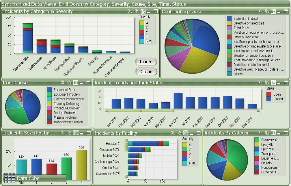
This dashboard breaks many rules of best practice dashboard design namely:
- Unclear design: Most of these dashboards are either presented to the manager, or displayed on the TV screen for the team, but its really difficult to read all the information properly. Too much details clutters the dashboard and the information are not easily comprehensible.
- Inappropriate use of chart: To get the information from the stacked bar chart, we have to dissect the segments and spend time understanding everything. Use of pie chart to present too many section is not a good practice as it makes the chart exceptionally difficult to understand and determine the percentage of each item.
- Bad use of legend: This dashboard is heavily depended on the legends (for both pie charts and bar/column charts) to communicate the information, which adds an additional cognitive barrier. User have to look back and forth to read the charts. Also the legends are very long, which adds to the mess.
- Inconsistent use of color: The selection of colors for the charts is very distracting and not visually pleasing. But more importantly each color represents different information in each widget, with the exception of the top-left widget and bottom-left widget. The “blue”, for instance, represents different things on five different charts. This creates a huge barrier for the brain when trying to process the data quickly.
- Poor data layout: The layout is not consistent. The third row has three charts as compared to the first two which have two charts. The axis is also poorly labelled.
What should be done to fix this dashboard:
- It is important not to present too much data in one single dashboard, which brings us to the concept of identifying the right KPI for the business. Limited, but important information should be displayed that will make the dashboard less crowded.
- Creating blank space between the charts will make the data easier to read.
- If the team is unable to set any KPI, then adding goals and targets to the visualizations, would also make it more actionable.
- Reducing the number of colors and keeping it consistent in all the charts will help to remove the cognitive barrier of color for viewers.
- Replacing the pie charts with either a bar or column charts
- Using filters will also help users to see only the data they need. Currently the dashboard don’t have any filters associated.
- The font size should be bigger and the labels could be more crispier with smaller texts. This makes the dashboard more readable when presented to audience.
Conclusion: The dashboard we discussed tries too hard to provide a lot of information. As discussed in the beginning, when a consumer is provided with all metrics, none of them seem important. So even before designing the dashboard, it is imperative to understand what are the most important parameters that should go to the dashboard, in order to make it more effective.
Source: https://www.matillion.com/insights/why-great-dashboard-software-doesnt-always-equal-great-dashboards/