Usually any visualization or an infographic is created with intent to give the audience a one-shot view of the subject matter, then the content associated with it elaborates the first level view. However, some charts fail to communicate the information effectively. The chart considered for this blog is an example of such infographic.
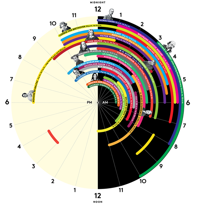
The above chart depicts ‘sleep schedules’ of geniuses. In terms of my comments, I would start with things I like about this graph, then things I didn’t like as much and ways to improve it.
Some of the things I like about this visualization are:
- The color distinction of black and white for the AM and PM times is very apt, that way audience can quickly notice the change in time.
- The round shape resembles shape of the ‘clock’, this shape helps quickly visually associate the numbers with hours.
- This visualization is insightful, gives out new set of information and combines it in one visualization
Things I disliked about this visualization are:
- I would say this visualization is not aesthetically pleasing. Though the color selection of hours is good, the schedules shown have many colors and in some cases, the same color is used to depict schedules of two different people which creates some confusion. For example, one may think that there might be some link between those names.
- This visualization can’t be termed as Functional, it contains a lot of information but it’s not conveyed effectively. Additionally, this visualization does not intuitively show any comparison between sleep habits of these people and doesn’t help readers infer anything.
- For few people, faces are attached the information while few people just have names written which creates some visual inconsistency.
Better Way of Representation:
I believe, a better way of representation could be the one where differentiation or variation in the sleep times is immediately visible. A timeline chart/ Gantt chart may be a right choice here. (currently, as there is a lot of information reading the various rings is very difficult). Alternatively, in a timeline or a Gantt chart, Every column would be associated with an hour in a day and every line item would correspond to an entry of sleep schedule of a person in hours. Every line item would also show Name of the person on the side. This way a clear association between the name and hours will be established and this chart would intuitively bring out comparison in sleep habits of different people .
Reference: http://junkcharts.typepad.com/.a/6a00d8341e992c53ef01a3fd25a481970b-pi