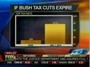
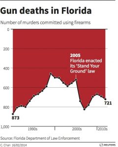
Abstract: Evolutionary pressure has made us visual beings. Because we respond so strongly to visual cues, charts and graphs have the power to move us in a way that other ways of presenting data can’t match. Therefore data visualization as one of the most important tools we have to analyze data can be misleading as well. In this blog post we’ll take a look at 3 of the most common ways in which visualizations can be misleading.
Charts can mislead us into believing things that aren’t true. Sometimes this is accidental, but other times we are being deliberately manipulated. Sometimes it’s easy to spot what’s wrong, but other times the sleight of hand is very subtle.
Dodgy Diagrams: The most notorious of the data visualization deceiver’s tricks is to use chart axes that don’t start at zero. We’re very good at comparing the lengths of objects, so choosing a non-zero axis can greatly magnify small or meaningless differences. Taken to an extreme, this technique can make differences in data seem much larger than they are.

Cumulative Graphs: Many people opt to create cumulative graphs of things like number of users, revenue, downloads, or other important metrics.
Ignoring Conventions: One of the most insidious tactics people use in constructing misleading data visualizations is to violate standard practices. We’re used to the fact that pie charts represent parts of a whole or that timelines progress from left to right. So when those rules get violated, we have a difficult time seeing what’s actually going on. We’re wired to misinterpret the data, due to our reliance on these conventions.

Conclusion: Here are some simple rules we should use to keep our work virtuous.
- Always start your plots from zero, unless doing so would be misleading.
- Use a linear axis scale – avoid different sized categories and log plots unless there are good reasons to do otherwise.
- Never, ever forget that correlation is not causation. No matter how tempting it is, don’t do it. Bear in mind that your audience will almost certainly see correlation as equaling causation, so be careful.
- Maps are beautiful, but they can be powerfully misleading. Never use them alone and always consider the unintended message you might be transmitting.
References:
http://data-informed.com/whats-wrong-picture-art-honest-visualizations/
http://www.cs.tufts.edu/comp/250VIS/papers/chi2015-deception.pdf
http://avoinelama.fi/hingo/kirjoituksia/misleadingvisualizations.html
http://www.citylab.com/design/2015/06/when-maps-lie/396761/