Data representation has evolved significantly in the past couple of years. There has been a monumental increase in the use of different visualization methods to depict data in efficient and more lucid ways. This has revolutionized the field of data representation beyond measure. But there is a flipside to this – an increasing number of visualizations that knowingly or unknowingly mislead the audience. To exploit this ever-improving field more, it is imperative that the viewers have a fair idea about the ways data representations mislead them so as to avoid the potential landmines.
Truncated Axis
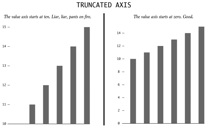
There is a high likelihood of the viewer being misled by the bar graph above if he/she was looking just at the bars and not at the axis. The one on the left has been truncated so that the values start from 10 instead of 0. Implication? Values larger than it actually is.
Dual Axes

Typically used to represent correlation and causation, the take-away information from the representation above may not be an accurate depiction of the data since the scales to which the lines are drawn are different on either sides.
More than a 100% ?
This is usually seen in pie charts and wedge diagrams. The sum of all the wedges might show a value which is more than 100%. A perfunctory glance might not be enough to make out the error and as such, like in bar charts, the data represented might actually be more than it actually is.
Absolutes and Relatives

Another major flaw in representing data can be seen in the representation above. The darkened areas purportedly show the number of crimes(and by extrapolation, the danger levels) of various cities of the USA. A casual glance at it misleads the viewer into thinking that the darkest areas are the least safe because of an increased number of mishaps but in reality, the map has not been adjusted to account for the population in the cities.
Taking things out of context

The bar chart on the left, in isolation, says a vastly different(and obviously deceptive) story to the actual context. A casual glance shows an increasing trend, but in reality, the data shows a minimal increment in comparison to the time period before and after it.
Using illusions to deceive

The area of the third box is actually three times the area of the smallest box. But a data representation involving these boxes seem to give a vastly different picture as the area of the biggest box seems to much more than the actual three times.
Source : http://flowingdata.com/2017/02/09/how-to-spot-visualization-lies/