A major factor to keep in mind when creating a dashboard is where it will be viewed. Will it be on a TV screen in an office or conference room?
Some design elements that affect readability are:
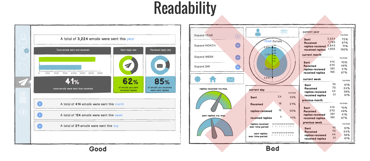
Excessive precision – Depending on the end user, precise figures can be distracting or overwhelming. Rounded metrics and simplified details may be more appropriate for the dashboard.
Consistency – With dashboards, consistency is key for easy navigation. Keeping functions, filters and other options in the same areas for each dashboard will allow users to find features quickly and easily. Applying the same font, color palette and style will give your dashboards a more cohesive look.
White space – Without any white space between objects or widgets, your dashboard will look cluttered. This makes it hard to distinguish what information is the most important, as well as difficult to understand the information.
Visualizations – When visualizing metrics, don’t use multiple visualizations just because you can. Choose the best chart or graph to portray the information clearly.
- Number + Secondary Stat – To display a single measure
- Bar Charts – Showing data over a related series of data points
- Line Charts – Showing the relationship of data in the same series of data points
- Sparklines – To display a trend for single data point
- Bullet Graphs – To display multiple data points in a small space
- Pie Charts – NEVER USE PIE CHARTS
Definitely something to keep in mind when we create a dashboard for more than one device. Too many graphs on a mobile dashboard would hamper the readability. Interesting read!