Data visualization in sports is straightforward. For example, the most intuitive way is to show the ball movement in basketball court is to visualize the data on a basketball court like below.
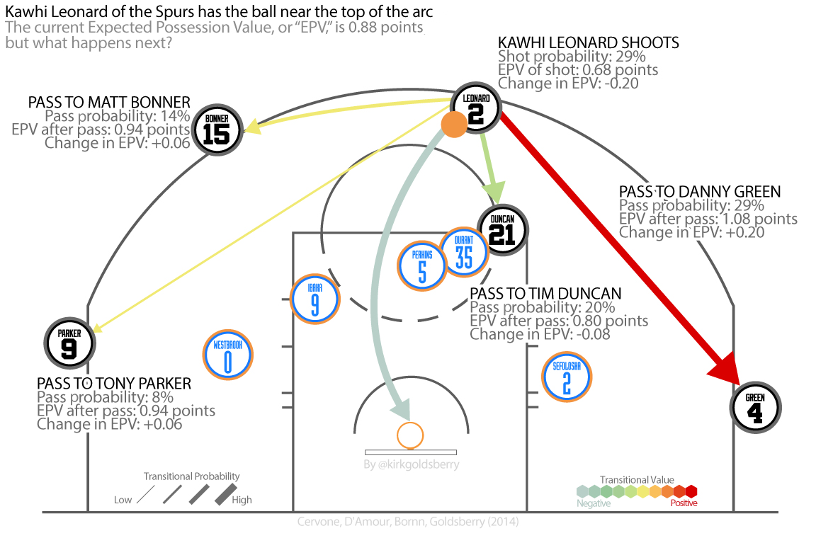
Like the graph shown, the best decision that Kawhi Leonard choose would be passing the ball to Danny Green at this point. It will give the team EPV(expected possession value) 1.08 points. the data visualization using the color from light to dark to show the transitional Value. The visualization is very easy to interpret. Coaches may change their decision bases on this.
For the data prepare and cleaning, the STATS SportsVU cameras are installed in arenas. The camera set tracks every ball movement and the results. So the data is very reliable.
The visualization will not only show the ball movement decision, but the player movement. There are 82 games for one NBA team to play in one season. Then the file size, complexity and success rate are going to increase. So in the future, basketball will not be the only sports using this technology. The way athlete playing the game is going the change.
One more thing I found interesting in basketball data analytics is that not everyone is buying it. For example, Charles Barkley, a former NBA player now a basketball commentator at TNT, constantly raging against the correlation between basketball data analytics and team performance. It is always fun to watch old school analytics arguing with new one.
Reference:
Welcome to Smart Basketball
https://www.theatlantic.com/entertainment/archive/2015/06/nba-data-analytics/396776/
Taking Data Analytics to the Hoop
http://www.ibmbigdatahub.com/blog/taking-data-analytics-hoop
NBA drafts Big Data
https://rc.fas.harvard.edu/news-home/feature-stories/nba-drafts-big-data/