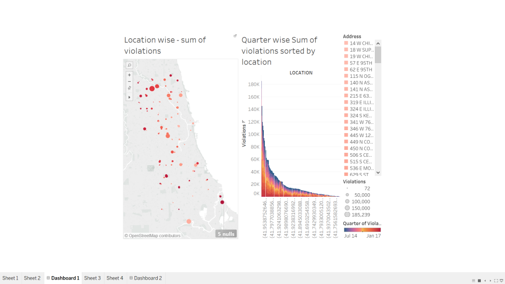
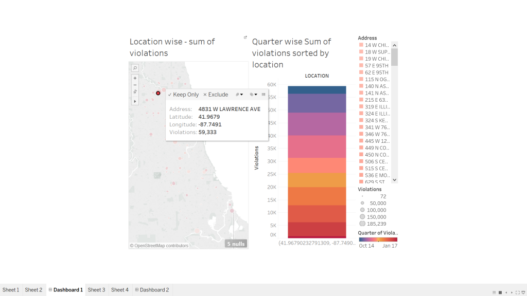
Last week we learnt about interactive data visualizations and its prominent highlights-how effortlessly and conveniently it merges and presents data based on different topics with the help of one common factor that binds them together. Interactive data visualizations are special types of info graphics that let the use play around, explore and essentially “interact” with the data and with what the visualization presents. However, like most other data visualizations, they have their own purpose and strengths when it comes to certain topics. In most cases, I have observed interactive data visualizations to be used in places where there is a lot of information associated with a certain data field (consider example of “state”) and cannot be adequately represented with one pie chart or line graph. This data is further sub-divided into related fields that tell us some more information about the “state field” like income or sex ratio, which would be further divided into income based on region or gender or occupation or sex ratio based on age group etc. While I was working on the project on interactive data visualizations, I realized that the entire essence of a good interactive diagram is the choice of field that would bind the two visualizations together. A field that is selected to be used as a filter, should relate the two charts in such a way that clicking on it would expand and bring forth more information about the concept. At the same time, we must be careful that the “filter / highlight action” on the dashboard is not repetitive of what the first chart does, instead the “action” functionality should bring to light additional information about the same field that could be completely represented using the first diagram.
P.S. I have referred by own assignment for this week- Interactive data visualizations to put forth my opinions for this blog.