Where do college graduates work?

A Special Focus on Science, Technology, Engineering and Math

https://www.census.gov/dataviz/visualizations/stem/stem-html/

The average college degree takes four years to complete. By that time the job market or the student’s career choice could have changed providing a mismatch between the intended field of study and jobs available or targeted job.

Goal/Purpose/Question

The question that the visualization is asking that after a college student graduates, what field do they work in?

How far away/related is it from the field they studied? What is the volume of students that followed those paths?

This data is for 2014, but it can be implied that it also serves the purpose of displaying the shift in market labor demand from when the student entered school to when they entered the job market.

One could also potentially assume that it shows the state of where the job market is going– (if you make the assumption that those who selected majors going into college picked the correct majors at the time). However more investigation would be required to understand exactly why this would be the case.

What I liked about it

  • Graphic is clean and simple. User can clearly tell quickly where the disconnects are either starting from occupations or from topics of study
  • The data is cut in many different ways, making it easy to see how different types of groups differ
  • The type of visualization used is good to show path, differentiation, and flow while also isolating STEM careers

What I didn’t like about it

  • While this visualization choice is good for overall flow, it is very challenging to get an idea for actual percentages.
  • Filters send you to additional pages instead of filtering current view
  • It doesn’t allow you to filter on values other than STEM (although included in the viz). This makes it hard to read the overall view
  • A bar char or additional colors may be more appropriate to distinguish unused space from actual values here
  • I would also have the question of if the creator of the viz accounted for any of the college grads that either went back into school
  • The visualization is not time relative to individual situation – IE to dig further into why there could be any potential gaps between major topic and ending career.

Conclusion

There are no specific goals of this viz aside from exploration at where STEM students end up in their careers however there are some ways that it could be cleaned up to better define and make it customized for the user and not break up the user experience.

Redesign/ additions

To redesign this I would use the additional tabs or page breaks for any alternate views IE if there were alternate visualizations however for filters only I would keep those in the same page to keep the user from having to switch pages.

I would also add another color to differentiate non stem majors/workers flow a bit more. They have been included, so making them easier for the user to distinguish and understand is important.

I would add a view as a bar chart or table with actual numbers and percentages so the user could understand the actual numbers that are associated with these transitions. It’s hard exactly to grasp if one wished to go deeper just looking at the flow.

References

https://www.census.gov/dataviz/visualizations/stem/stem-html/
 

Syria

http://www.slate.com/blogs/the_slatest/2015/10/06/syrian_conflict_relationships_explained.html

Syria

Every day we hear something new yet terrible news related to Syria. Complexity of the situation has been on the increase as more countries are joining hands with one party or the other thus aiding in worsening the conditions in the country. People have had to flee their motherland just to survive and find shelter where ever they can. Sadly, only few people have a complete picture about the involvement of all countries in this crisis.

Most countries and global organizations have come to the call of helping Syrian refugees by welcoming them with open arms while some are still skeptic about it. No one knows how long it could take to solve this crisis but as of now it has only been scaling upwards which means more war is yet to come in a land that was once a peaceful place to live.

Digging deeper-

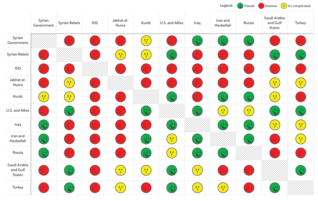
Under such circumstances a dashboard like this can be of great help to educate people about the different ties each country has among them. Even though the images we see in our mind upon hearing the word Syria involves bloodshed yet this dashboard conveys the message with emoticons that are used by us frequently, just succoring us to digest this knowledge in the most understandable language of today.

One can clearly see how each country is linked with all other countries in terms of friendly, enemy or complicated. Moreover, on clicking on a relation between any two parties gives you a justification of why their relation has that tag. Within this small visualization, it conveys the message equivalent to what most writers must fill up pages to do the same.

Drawbacks-

Undoubtedly the dashboard is an enlightening one yet there are few shortcomings in it. Firstly, a single color cannot define the same level of hatred or love that all countries have for each other. Just because one party might not like the other party does not make them hate each other within the same context as parties who do hate each other. Seeing a red emoticon would make the viewer believe that two countries must be arch rivals due to the red emoticon even though their ties might not be that bad. Secondly, the yellow emoticon does not provide much information as it leaves the viewer in the same state he was in before viewing it. Just how complicated the situation is cannot be shown with the use of a single emoticon.

Modification-

1.       The visualization shows the picture of all countries involved today however, it would have been better if they could portray it in a yearly manner just to give the viewer an idea of who joined the crisis and at what time. This would also help in understanding how the problem from a civil war became global with time.

2.       More variety of emoticons could be used to show different levels of hatred or friendliness that two parties have with each other. Countries that do not hate each other but support different parties or stand on different grounds could be shown with an emoticon that has lighter shade of red and same goes for green emoticon as well. With different shades of colors, use of the yellow emoticon would lessen thus, conveying a more powerful message with lesser confusion.

3.       Syrian crisis not just involves these countries but also the people of its own country and all who have died in this war. It would have certainly given way more depth in knowledge had the author somehow managed to depict the people who lost their lives along with refugees who seek asylum elsewhere.

Conclusion-

 We can clearly see relations of all countries involved in the Syrian crisis and how it has been on the rise ever since it came into being. Nearly half the population of Syria has had to flee to survive. Families are broken apart with no knowledge of their loved ones. It is high time the world comes to the aid of Syrians as today it is them but tomorrow it could be you.  

References:

http://www.bbc.com/news/world-middle-east-23849587

https://www.worldvision.org/refugees-news-stories/syria-refugee-crisis-war-facts

US Recession Rebound Faster Than Other Advanced Economies.

There was a time when I wanted to use pie charts for everything. They looked great and they showed data with great clarity. But now if you google “pie charts are the best” , the first article that pops up is titled – “Pie Charts Are the Worst” and the search result went to the extent of calling them ‘Evil’! This is when I realized that I used pie charts only for percentages with not more than 3-4 pieces in one chart, and this was 10 years ago.

Below visualization is part of an article which talks about the employment growth of G-7 countries after the great recession. The two pie charts were originally part of a report released by the Council of Economic Advisers under the Obama Administration, to support that fact that the United states created more employment than all the other of G-7 combined since 2010. In other words, the rebound of the US economy was much faster than other advanced economies.

At first I really liked this visualization. The things which are working well are:

  • The visualization is quite crisp. It clearly states that the chart on the left shows share of total employment for each of G-7 countries, and the right one shows the net employment growth. One can confidently claim that the charts talk about the 7 countries and comparatively the US is doing much better than others, which is the essence of the article.
  • There is a clear mention of what time range is considered for the data used, validating the fact that the time after the recession of the late 2000’s is in consideration.
  • The sequence of countries are same in both charts with names labelled. This makes it visually easier for the user to compare each country for its total and new employment growth
  • A note is pro-actively added about rounding explaining that components may not sum to totals.
  • Source citation is also one of the best practices which is not followed much but in this case it is clearly stated.
  • There is no data overflow.

But going back to what I started with, pie chart is a great visualization technique when there is a need to show how a whole picture of is segmented  (into few parts). The data sets for which pie charts are really helpful are the ones:

  • which can be condensed to exact percentages.
  • which do not break into more than 3-4 pieces.

Keeping this in mind, the things which could be improved in the above charts are:

Titles and Labels:

  • One needs to read the whole article to realize that the claim of the visualization validates the title.  The visualization lacks a more suggestive title.
  • The time range is same for both the charts but still mentioned thrice (redundant). The space could have been used for the title.
  • The sub-title has “percent” mentioned to show that the numbers are in-fact percentages, “%” sign next to the number would have served the same purpose and would have made easily readable along with saving the space.
  • When pie charts have more than 3-4 pieces it becomes really difficult to tally the slices with the legend to identify which slice represents what. Therefore labeling is done for every piece (Country name and percentage in this case).The is of course across the entire chart (given it is circular) making it look messier.

Data Layout:

  • Although countries have the same sequence in both charts, ordering them in ascending percentages would have been a better choice.
  • The choice of slice colors could have been more pleasant, right now it looks too stark.

If I had to make this visualization, it would look like this .

Learning from the class:

  • A visualization needs a clear context and claim to make it more independent. This helps user get the crux of the subject without actually reading the article created around it.
  • Judicious choice of graph/chart is critical in terms of user friendliness and aesthetics. In this case a bar graph serves a better purpose than a pie chart:
    • Comparisons become much easier.
    • Data is not cluttered all across the visualization.
    • Lesser labeling is needed.

Reference:

Business Insider Article: http://www.businessinsider.com/us-economy-added-jobs-faster-than-all-g7-economies-combined-2017-1

Report: https://obamawhitehouse.archives.gov/blog/2017/01/06/eight-years-labor-market-progress-and-employment-situation-december

Opinions about Pie chart and alternatives: https://www.quora.com/How-and-why-are-pie-charts-considered-evil-by-data-visualization-experts

Education quality — Tuition vs Graduation Rate

Description:

This graph uses tuition vs graduation rate as a measurement to determine the education quality. In this graph, X-axis is the 6-year graduation rate and Y-axis is the tuition. Also, public institutions are represented as blue, private non-profit institutions are in green and private for profit institutions are in brown. The size of the bubble indicates the full-time-equivalent.

What I like:

The author did a good job on telling the audiences why he creates this graph. His research starts from a story that a student who has 3.9 GPA drops out of school because he thinks the tuition he paid won’t be paid back in the future. Therefore, his graph focused on tuition vs graduation rate. [1]

He also separated all the education institutions into three main kinds, which makes the analysis more accurate. Besides that, size of the bubble is very functional. This meets the requirement of aesthetics. It’s very easy for the audience to read the message directly from the graph. For example, the audience can easily figure out that the brown bubble on the left is the largest one. Also, most of the tuition of public school is below $10000, as well as, for the private non-profit institutions, the graduation rate has the positive relationship with tuition.

What I dislike:

The graph doesn’t meet the requirement of validation. The data of the graph is not accurate. According to the data from NCES, public institutions have the lowest graduation rate, which is below 30%. [2]

Also, the data showed in this graph is very subjective. There exist many other external factors, which will result in the difference in the final result. For example, some student many have double major. This will also increase the tuition and duration of graduation years. Moreover, the data focus on the 6-year graduation rate. However, some majors, such as medical science or , may require more than 6 years, and there majors may have a lower graduation rate with higher tuition.

Therefore, the author has a good approach to the question. However, the accuracy of the graph still needs to be concerned.

Reference:

[1] http://alfredessa.com/2014/01/measuring-education-quality-a-first-look-at-graduation-and-retention-rates/

[2] https://nces.ed.gov/programs/coe/indicator_ctr.asp

New Zealand – top toursim destination

I was googling about best places to visit in New Zealand and trying to gather tourism information about New Zealand. And I stumbled upon the official website of New Zealand tourism. And Market & Stats tab caught my eyes, the moment I looked at that tab, it showed the list of the countries and I got more curious what stats would it been showing related to New Zealand vs other multiple countries. I opened the stats for the Singapore. The moment this page loads, the first thing is the visualization of International Visitors – Total vs Holiday Visualization of International Visitors for Singapore . And I started wondering what this graph is all about.

What this visualization about:

Even after reading the whole article, I was still clueless. After doing a little research, I understood that this graph is showing the No. of Singapore Visitors that arriving in New Zealand over the time period of Mar 2016 – Feb 2017. One line graph shows No. of Singapore visitors coming to New Zealand for Total i.e all purpose of visits i.e business, tourism etc. Other line graph shows No. of Singapore visitors coming to New Zealand only for Tourism. In short, the graph is trying to convey the purpose of visits of Singaporean to New Zealand.

Did I like anything about this graph?
When I say I started wondering that what this graph is about – it’s clear that there is nothing I could like about this graph. But I was clear it trying to convey No. of Visitors from Singapore to New Zealand.

How this visualization could be better:
1. The title of the graph: The title of the graph is International Visitor Arrivals – Total vs Holiday. This graph is about the purpose of visits of Singaporean to New Zealand. Instead of International Visitor Arrivals, the title could be Singaporean Visitor Arrivals – Purpose of visit. Total vs Holiday makes no sense at all. The Total includes all types of visits of the visitors, but it wasn’t clear anywhere what “Total” means. For me, “Holiday” also took the time to understand that Holiday meant Vacation or Tourism. Now, depending on your targeted audience, the words used for the title matters. For a visitor like me, using “Vacation” instead of Holiday would make sense and “Tourism” if the graph was targeted for NZ Tourism Manager.

2. More line graphs on all major purpose of visit: The graph shows line graph for Total. It could have included all the bifurcations or types of the visits and shown line graph for them. For example, Purpose of visit (Total) could be divided into Business, Education, Medical. It could have shown trend and no.of visitors for each of type of visit.

3. Making it more insightful: This graph could be made more insightful by adding reasons or events that contributed to the trend in an increase or decrease in No. of Visitors. It could have recorded various events/reasons that would have helped to understand why there is an increase in No. of Visitors in the month of December.

Another graph that caught my attention was International Visitor Arrival – holiday by countries . This graph shows No. of Visitors by Holiday by countries. Comparison of No. of Visitors by countries is good KPI to understand from which country New Zealand had more no of visitors in terms of tourism. But this graph doesn’t really compare the data and trends of no. of visitors by tourism by countries. This could have been better as shown here: Overseas Residents’ Visits to Japan by Country and Region

Conclusion:

The author was trying to convey Singaporeans Visitors visiting New Zealand – Total vs Holiday. But the visualization didn’t do justice to the message or claim. A visualization should be simple to convey the story or message to any type of audience. One should in keep in mind to give importance to minute details such the words or title of the graph, even a title of the graph should match the message/claim of the graph. Adding more details by showing no. of the visitor by the different purpose of visit or just by telling what “Total” includes would add more sense to the graph.

References:

Tourism2025, Japan Tourism Stats, China Market snapshot

USA Consumer Expenditure Over the Years

Here are visualizations developed by creditloan which depicts how the average US household spent their annual paycheck over the years. Below is one such graph for 2010 expenditures.

Description : The charts summarize the breakdown of consumer expenditures with respect to different categories like housing, food, healthcare etc. The underlying data is collected from the survey of the consumers conducted by US Department of Labor.

Audience : The chart is intended for general public to assess their spending. Additionally, the visualization provides a sneak peak to the government into the average household spendings to focus on the median income range households when planning policies, federal budgets and debt ceilings.

Critique :

  • The chart is overburdened with data. There are way too many images that are accommodated without absolute necessity. In addition to images, there are too many numbers, colors making it difficult to get to the information-of-interest.
  • Though the article introductions conveys that we are going to looking at how the spendings have been over the last couple of years, it is quite difficult to gain insight of data/category comparisons over the years.
  • The expenditure presentation over the years is not consistent at all. Representations for 2013, 2014 and 2015 are through infographics but 2010 and 2009 are represented in doughnut charts and 2012 data is represented through an embedded video.
  • Taking a closer look at the doughnut charts,  there are scaling issues with no ordering. The infographic lists all of the numbers in the Consumer Expenditure Survey in no particular order without providing any interpretation or relative comparison. Among the charts presented, the tabular format of 2011 representation seems to be the best as it is easier to read and get to the information-of-interest with not much looking around.

Betterment : 

  • The data from the survey can be better represented using stacked bar charts by year. The expenditure breakdown by category can be appropriately represented so as to track the changes in expenditure for a particular category over the years.
  • Each category would be represented by a different color. Though not-so-minor variations cannot be captured as the category in bar chart may not be aligned to the same line. To address this concern, the percentage values can be  put into each portion. This feature also conveys  what category contributed most of the expenditure for a particular year in a straightforward manner.
  • The stacked bar chart is an uncomplicated way of reading the changing trends over the years rather than having a consistent format of separate charts for different years.


References :

https://www.creditloan.com/blog/how-the-average-us-consumer-spends-their-paycheck/

http://www.hamiltonproject.org/papers/where_does_all_the_money_go_shifts_in_household_spending_over_the_past_30_y


Visual Problem Solving


https://www.globaldatavault.com/blog/information-destruction-history/

Analysis

Let us analyze the above visualization against the objective and the subjective dimensions of visual problem solving.

OBJECTIVE DIMENSION:

What is purpose of the visualization?

This visualization is created by a company that offers digital Backup and Disaster Recovery Services. The purpose of this visualization is to show the significant information losses suffered by the human civilization throughout History. The intended purpose of this visual is to convey to the audience the need of protecting information loss from disasters such as wars, floods, fire etc.

Who is the audience?

The audience for this visualization would be the service providers’ target customer base which could be any large corporation that stores or possess a huge amount of data/information.

How will the visualization help the audience?

The intended purpose of the visualization is to emphasize that disasters are a big threat to data and the importance of having some backup and data recovery plan. However, the service provider aims to use this  visualization to get the attention of its potential customers and make them interested in its offerings. However the visualization fails to achieve this purpose. This visualization can be good only as a simple representation of certain facts and as a way of increasing general knowledge but it is not relevant in the current digital age context.If you don’t offer the right context to the users they can’t do anything with data visualization.The way information is stored in the current digital world is entirely different from that of the early days when libraries were the only source of storing and accessing information. With Internet, cloud technology and everything virtual, war and fire are not the biggest threat to information. Today’s data is vulnerable to being stolen, destroyed or compromised by disgruntled employees, competitors, terrorists, criminals and malicious hackers and the above visualization does not show any of these aspects.

SUBJECTIVE DIMENSION

Is it Truthful? No, there is always a certain amount of subjectivity that goes into any visualization as one chooses what data to show and how to show it. By focusing on one part of the data, one might inadvertently obscure another. The above visualization presents destruction of libraries (main source of information/data storage) and correspondingly loss of data across major cities from 600 BC till 2013. There are some questions that can be asked about what’s been shown and what’s not  :Was information truly lost in those fires? What about copies of the books destroyed which were kept elsewhere? Are these the only major incidents of data destruction’s due to disasters? What about the loss of information due to other disasters such as earthquakes, floods etc.?

Is it Functional? No, the visual looks a bit cluttered and busy. One major flaw that comes in the way of the visual being functional is that when one reads the title, “Information destruction through History”, one expects a visual that shows time progression whereas the visual displaying the world map just adds to the confusion. The lines connecting the location on the map to the corresponding information also create a clumsy look.

Is it Beautiful?  Yes and No, on first glance, the visualization looks interesting and may capture the attention of the “corporate audience” but it can also backfire as it may not look serious enough . The symbol used to show the destruction by fire is clearly understood. However, the symbol used for “bombing” looks more like a torch which again can represent fire. ‘Aesthetics’ depend on the specific audience to whom the visual is targeted and their preferences should always be kept in mind while choosing look and feel of the visualization.

Is it Insightful? No. The important criterion for visualization is whether through its use we can see something that would have been harder to see otherwise or that could not have been seen at all. A simple representation in form of numbers could have provided the same insight that a lot of historical data was lost during wars and due to wars.

Is it enlightening? No.  The visualization does not help in answering any specific question and neither does it unearths any new information that could not have been found, had the data not been presented in the way its depicted in the above visualization.

Conclusion

Good data visualization should enable decision makers to grasp difficult concepts or identify new patterns. There are many ways to visualize data, new tools and chart types appear constantly, and each strives to create more attractive and informative charts than before. However, focusing on the principle that a visualization should clarify and summarize the main message rather than confusing and overloading the reader with superfluous information is the key to make an effective visualization.


References:

http://www.datapine.com/blog/misleading-data-visualization-examples/#

https://flowingdata.com/2011/09/23/5-misconceptions-about-visualization/

https://www.elsevier.com/connect/a-5-step-guide-to-data-visualization

Are 3D Info-graphics cool or can baffle anyone?

Nowadays people are working on n-dimensions for a better understanding of data and to get accurate insights. However, an infographic with more than 2-dimensional representation will misguide a user and even creates difficulty to understand.

Let’s walk through a classic example of this scenario, image 1.0 is a column chart but in 3-dimensional representation. It tries to depict sales of widgets monthly, there are 16 widgets that are being sold for 11 months of a year. At first glance, the chart looks really cool with column coming to life and appealing.

Image 1.0 – 3D Infographics

Problems: Aesthetic scenes, Distortion, Accessibility.

Let’s take a step back and understand few things before we go ahead, who are the targetted audience and what do they need? I guess that’s for Sales managers who would be the targetted audience for this kind of report. The information they look for is sales for each product, in this case, a widget for a time period (Weekly, monthly or yearly). This list can extend to the region, geo this list goes on.. and is totally dependent on the kind of business a company own.  In this case, all the information is being depicted correctly in this chart but by using a wrong viz.

From a viz developer point of view, aesthetic sense plays a major role in increasing usage. This claim can go wrong if we use a 3D chart which is beautiful and appealing to one’s eyes. As this chart doesn’t help to understand data for the months from April to November as they all overlap on each other. Secondly, there are too many legend colors which create lots of confusion to the reader. In addition to this, we can see that color changes when there is an overlap of bars.

Coming to the metrics that are depicted, they do not reflect any figure of sales i.e. in millions or thousands, as a sales manager one would be really interested in those figures.

Accessibility plays a major role in navigating or drilling through the reports, which is missing in this report. Image 2.0 is a sample sales report which shows how line graph can better interpret sales figures than column chart. Secondly, when you hover on the line we can see the actual sales numbers which give an exact idea of how the team is performing and are the targets met.

Image 2.0 – Reference Chart for Sales reporting

Segmentation of products into multiple categories is very important to compare. In image 1.0 we can see that there are more than 15 widgets, they are high in number to compare.

Finally, a person working on viz should first understand who are the audience, what data are they looking for and at what granularity. Interpreting in 3D viz looks and sounds cool but it doesn’t serve the purpose.

World’s Biggest Data Breaches

Rarely does a week go by without a government agency or large company announcing a data breach. For example, while writing this blog I learned a large-scale cyber attack hits nearly 100 countries and thousand of computers ransom throughout a day(Click here to know more). The risks, cost and threats are increasing. A data breach means that data was accessed by individuals who should not have been able to access it. It also means that account protection of the data failed. The data can represent personal information, such as health records, email conversations, online transactions and banking records, or corporate data, which is most often customer information or hosted applications.

While exploring different kinds of data breaches happened over the past years, I came across “World’s Biggest Data Breaches” created by Information Is Beautiful site. In this post, I discuss what I liked, what I didn’t like and based on the raw data, how I would create the graphs to get better insights.

Things I like

  • Aesthetics: Interactive and dynamic visualization creates a rich experience that makes it easier for the user to navigate and analyze based on their interest.
  • Validation: When clicked on a bubble, the visualization also provides additional details of each breach for context and sources from which the user can validate the numbers and related information.
  • Multiple filters: Users are able to see data breaches based on Method of Leak, Number of Records Stolen and Data Sensitivity and Organization.
  • Colors: Use of different colors to distinguish leaks based on year or method of leak

Things I didn’t like

  • Misleading bubbles on the graph: As shown in Image 1, tiny bubbles appear when you change the filter and it is hard to say whether those are bubbles for security breaches or not since it does not show a tooltip or a label. If those bubbles show security breaches, tooltip is required to identify the company name and related information

    Misleading small bubbles among bubbles with valid breach
    Image 1: Misleading small bubbles among bubbles with the valid breach and same size of bubbles for different size of the breach.
  • Inaccurate depiction of information: If you observe the bubbles in Image 1, Slack and Uber has same bubble size though they have a huge difference in the number of records stolen. 500,000 records got stolen from Slack while only 50,000 records were stolen from Uber (refer Image 4). This behavior in a graph is clearly wrong and conveys inaccurate information to the user.
  • Poor choice of information representation: The data is shown from 2004 to 2017 and there are multiple flaws in it. Bubble lies over multiple years which makes it confusing to decide when the breach happened. Because of the style of the graph where years are shown vertically, it is impossible to do year over year analysis.
  • Weak KPIs: This visualization can be used for exploratory analysis but does not contain a claim or insights. The data could be used to see stronger KPIs. For example, which type of attacks over years has occured more, year over year analysis of total attacks and which year had a maximum number of attacks.

How would I improve

Luckily I found dataset for this visualization and decided to create few graphs to show how we can improve.

  • I fixed misleading bubble size by using correct aggregation fact and adding size axis to the graph. Utilizing X axis for size and Y axis for year helped differentiate data by size and time. Below is a sample graph fixing what was wrong in Image 1.

    Image 2: Fixing the size of bubbles
  • To resolve the incomplete use of historical data, I used the same bubble format but added the size of data axis as well. The result was much clear and less confusing visualization with similar filters that serves the purpose of exploratory analysis.

    Image 3: Exploratory Analysis of World’s biggest data breach
  • I implemented one of the strong KPI that would show the number of data breach over the years by the method of leak. We can gain many insights from this graph – 1. If the number of data breach is increasing over year or decreasing, 2. What type of leak has happened most over the years, 3. What type of leak is increasing which means we need to create more safeguards for such breach 4. What type of leak is decreasing which means we created good enough safeguards for such breach. Using the “Method of Leak” filter, we can also see the trend of specific types of breach.

    Image 4: Deriving better insights by identifying strong KPIs

Conclusion

In data visualization, it is very important to choose the right graph and KPIs to gain useful insights. Especially for the activities like data breaches which are very crucial to any company in terms of user security and public relation. While making visualization we should make sure that information provided in the graph is correctly rendered and valid type of graph is chosen based on the available information in the dataset.

Reference:

  1. World’s biggest data breaches: http://www.informationisbeautiful.net/visualizations/worlds-biggest-data-breaches-hacks/
  2. Raw Dataset: https://docs.google.com/spreadsheets/d/1Je-YUdnhjQJO_13r8iTeRxpU2pBKuV6RVRHoYCgiMfg/edit#gid=3

More is not always better

Let’s begin our discussion with an example. If you go to a coffee house and see them serving 15 different varieties of coffees, there is a big chance that you will be confused what to choose. Instead, when you go to a place having 2 variations in their coffee, you are likely to find your caffeine easily. Research shows when there is too much choices, consumers are less likely to interpret them, and if they do they are not sure if their selection is the “right” one.

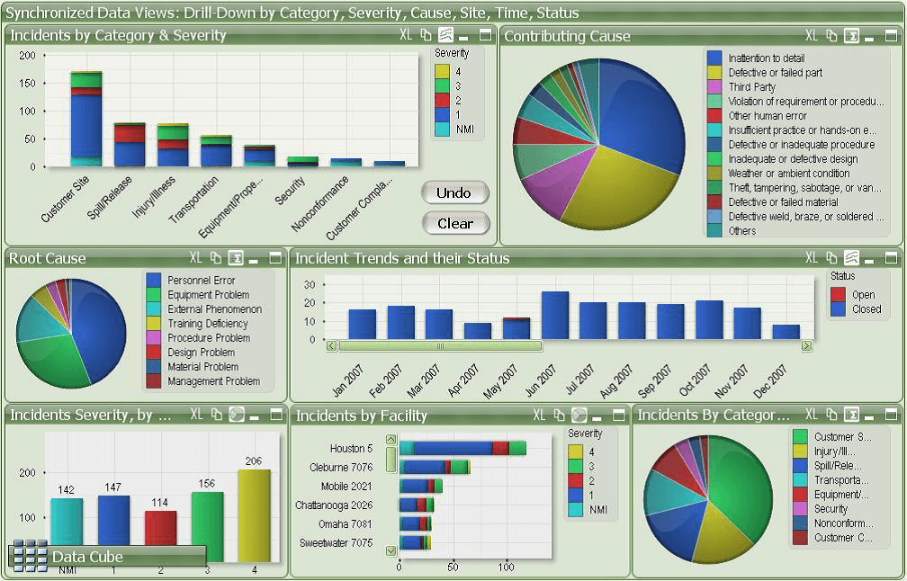
The service incident dashboard is one such component that is usually over engineered and have too much information. There is no doubt that it is one of the key tools used by the IT group to make business decision, create release plan and estimate budget for the next business cycle. However, many such dashboard suffers from the “problem of plenty”. Let’s evaluate one such dashboard as shown below.

This dashboard breaks many rules of best practice dashboard design namely:

  • Unclear design: Most of these dashboards are either presented to the manager, or displayed on the TV screen for the team, but its really difficult to read all the information properly. Too much details clutters the dashboard and the information are not easily comprehensible.
  • Inappropriate use of chart: To get the information from the stacked bar chart, we have to dissect the segments and spend time understanding everything. Use of pie chart to present too many section is not a good practice as it makes the chart exceptionally difficult to understand and determine the percentage of each item.
  • Bad use of legend: This dashboard is heavily depended on the legends (for both pie charts and bar/column charts) to communicate the information, which adds an additional cognitive barrier. User have to look back and forth to read the charts. Also the legends are very long, which adds to the mess.
  • Inconsistent use of color:  The selection of colors for the charts is very distracting and not visually pleasing. But more importantly each color represents different information in each widget, with the exception of the top-left widget and bottom-left widget. The “blue”, for instance, represents different things on five different charts. This creates a huge barrier for the brain when trying to process the data quickly.
  • Poor data layout: The layout is not consistent. The third row has three charts as compared to the first two which have two charts. The axis is also poorly labelled.

What should be done to fix this dashboard:

  • It is important not to present too much data in one single dashboard, which brings us to the concept of identifying the right KPI for the business. Limited, but important information should be displayed that will make the dashboard less crowded.
  • Creating blank space between the charts will make the data easier to read.
  • If the team is unable to set any KPI, then adding goals and targets to the visualizations, would also make it more actionable.
  • Reducing the number of colors and keeping it consistent in all the charts will help to remove the cognitive barrier of color for viewers.
  • Replacing the pie charts with either a bar or column charts
  • Using filters will also help users to see only the data they need. Currently the dashboard don’t have any filters associated.
  • The font size should be bigger and the labels could be more crispier with smaller texts. This makes the dashboard more readable when presented to audience.

Conclusion: The dashboard we discussed tries too hard to provide a lot of information. As discussed in the beginning, when a consumer is provided with all metrics, none of them seem important. So even before designing the dashboard, it is imperative to understand what are the most important parameters that should go to the dashboard, in order to make it more effective.

Source: https://www.matillion.com/insights/why-great-dashboard-software-doesnt-always-equal-great-dashboards/