Young Padawan, Choose Your Path Wisely

ACT Score vs Gender vs Major

Introduction

This visualization was made by Dustin L. Arendt from the Pacific Northwest National Laboratory and Yanina Levitskaia from the University of Washington. The visualization won the award for Overall Excellence at an annual data visualization contest sponsored by the IEEE Visualization and Graphics Technical Committee (VGTC).

On the left side of the visualization, the author explained how the project was broken down, Overall ATC score vs. Gender vs. Major -> Top 2 tier score Analysis -> Outcome of students that were a good fit for computer science & engineering when they registered for ATC.

Impression

Upon first seeing this visualization, I was amazed by the complexity of the Sankey diagrams. However, I was having trouble interpreting the 3 diagrams. I continued to read the instructions on the left side and understood the datasets for the three diagrams and how to read the Sankey diagram.

What I Like About This

I like the fact that this visualization told a story. It stated the claim clearly at the title “Gender Discrepancies in Computer Science and Engineering”. And it examined data using ACT scores, an exam for high school students determining their eligibility for college.

What I Don’t Like About This

  • I cannot find the data for the year of the ACT score and where the data was taken from. The amount of data (77,584) seemed to be a lot less than the 2.1 millions of students in 2016 reported by US News.
  • Second, it is not clear to me what the author meant by “took the top 35 most common paths”. I concluded later that they meant by going to college and have a major.
  • Third, in the description of the last graph on the visualization, the author stated the graph was the detailed analysis of 752 students that were deemed good fit for engineering when taking the ACT test. However, with their choice of major, it resulted in poor moderate or great fit at the end. What I found unclear here is how did the author come to the conclusion of which student final major is a poor, moderate, or a good one. Was it based on the student’s academic performance in their poor fit major or some other factors.
  • Finally, the last graph on the visualization. The warrant the author tried to convey using this graph was that the rate of changing major for students who are good fits for computer science and engineering indicated in their ACT score and started as Engineering and Technology.

How I Would Improve

Overall, I really like the concept of this visualization and that it told a pretty convincing story. However, I would improve on explaining the data more clear, even just add the year and where the data was from. I would also explain how I reached a conclusion to classify various students into a poor, moderate, and good fit and the criteria used.

Reference

https://www.hcde.washington.edu/news/graduate-student-yanina-levitskaia-takes-first-place-in-data-visualization-contest

https://www.usnews.com/news/politics/articles/2016-08-24/bigger-numbers-of-high-school-grads-taking-act-college-test

Retail Trends

Retail trends always keep on changing. With digital transformation taking charge in all the industries, retail is no exception. Retail trends during the holiday season especially, are interesting to study.

Following are some visualizations around these trends in retail during the holiday season. The Claim of all of them is that the sales rise high during the holiday season in retail. The Audience is different players in the retail sector.

Following is first of the set, which shows number breakup based on key holidays. This gives a good picture of how much is spent during different holidays.

https://drive.google.com/open?id=0Bzau8FgD0T1AUmRTLTQ1cFdEZXM

Things missing in this visualization:

Incomplete data: The year of the data is not mentioned in the source which leaves the data incomplete.

Unreadability: As many figures are mentioned in the pie chart along with multiple colors, it’s difficult to read the data.

Following is another way to look at the data where it shows the overall retail sales over the years and also shows the specific percentage of e-Commerce in the overall sales. This gives a good picture of the total sales trend in retail with a focus on eCommerce.

https://drive.google.com/open?id=0Bzau8FgD0T1AQnBRUmJta2FZTWM

Context: One thing missing in the above data is, it doesn’t mention if its US specific data or any other countries are involved as well, that would help put these values in context.

Following is another such visualization in the same category. This  demonstrates the sales during holiday time along with the YOY % increase over time. However this focuses on the Online sales. The warrant in this case is Forrester which makes it more genuine.

https://drive.google.com/open?id=0Bzau8FgD0T1AM0RnNWxqZEs0OXM

Things that could be done better:

I feel if all the above data points are put together if would give a good picture of the retail sales trend.

  • First chart should be the ‘overall retail sale’ showing YOY % increase.
  • Then, a deep dive into the ‘e-commerce’ specific sale per holiday to show YOY change against the overall sale by holiday.
  • And finally the chart which shows absolute number of sale for retail by holiday season over years, as a bar chart.

References:

Silicon Alley Insider Chart of the day

https://images.search.yahoo.com/images/view;_ylt=AwrTcYR9jR5ZTV8APKwunIlQ;_ylu=X3oDMTIyZmFoZWxnBHNlYwNzcgRzbGsDaW1nBG9pZAMyNGQ5M2IzYjRkZGFhOGEzNzhhM2FhNmIyMWRlYjYwNgRncG9zAzYEaXQDYmluZw–?.origin=&back=https%3A%2F%2Fimages.search.yahoo.com%2Fyhs%2Fsearch%3Fp%3Dholiday%2Bsales%2Bgraphs%26n%3D60%26ei%3DUTF-8%26fr%3Dyhs-mozilla-002%26fr2%3Dsb-top-images.search.yahoo.com%26hsimp%3Dyhs-002%26hspart%3Dmozilla%26tab%3Dorganic%26ri%3D6&w=610&h=404&imgurl=s-media-cache-ak0.pinimg.com%2F736x%2F80%2Fbb%2F65%2F80bb6502df47c107be613ce4f9605017.jpg&rurl=https%3A%2F%2Fwww.pinterest.com%2Fliberteks%2F2017-smb-success-trends%2F&size=18.0KB&name=Retail+%3Cb%3EHoliday%3C%2Fb%3E+%3Cb%3ESales%3C%2Fb%3E%2C+Explained+in+5+%3Cb%3EGraphs%3C%2Fb%3E&p=holiday+sales+graphs&oid=24d93b3b4ddaa8a378a3aa6b21deb606&fr2=sb-top-images.search.yahoo.com&fr=yhs-mozilla-002&tt=Retail+%3Cb%3EHoliday%3C%2Fb%3E+%3Cb%3ESales%3C%2Fb%3E%2C+Explained+in+5+%3Cb%3EGraphs%3C%2Fb%3E&b=0&ni=144&no=6&ts=&tab=organic&sigr=11saqpief&sigb=15j33p5de&sigi=12f22raio&sigt=120clcnqq&sign=120clcnqq&.crumb=nVfANCsALA/&fr=yhs-mozilla-002&fr2=sb-top-images.search.yahoo.com&hsimp=yhs-002&hspart=mozilla

CBRE 2016 Holiday Sales Chart


An Insider look in lives of famous creative people

To get out of the blues of this hectic week ( credit goes to two big submissions), I have decided to talk about something interesting. As this is the last blog, it gave me the difficult time to search for a satisfactory topic to bid farewell to this blog ritual. After hovering over two topics for a while, I decided to explore more on the daily routine of 16 famous creative people. This infographic is quite famous and got published both by FastCompany and BusinessInsider.

https://www.fastcompany.com/3028428/infographic-see-the-daily-routines-of-the-worlds-most-famous-creative-people

The infographic from “Info We Trust” is created by RJ Andrews, it talks about the daily routine of famous 16 people, round the clock divided into 6 major categories. However, these six categories are further specified precisely for each personality

Why the chart is winning:

The audience of a newsletter is always general public and Andrew’s did a superb job in attracting its Audience, Especially almost everyone can find out one or two personalities easily whom they admire their entire life.

The thoughtfulness of author wins full marks for the Aesthetics of this infographics. A pie resembling the clock and serving a good frame for the pictures is unbeatable.A brief description at the upper right of pie makes it more insightful.

The image is satisfying objective dimensions of a visualization. All the information at one place as author, title, Resources, inspired by and a tagline makes it right on point explaining all the 5W’s and how to questions.

This Viz falls in a category of visual exploration and enlightens readers actions by inspiring them with their ideal personalities. In the article, the author made a statement, “If you’re an artist, it’s a helpful guideline, especially if you feel guilty taking that midday nap. Thomas Mann and Charles Darwin certainly didn’t.”

The data for the given viz is derived from Daily Rituals: How Artists Work by Mason Currey about 161 geniuses. As I don’t have much understanding of this data, assessment of subjective dimensions of graphs is little difficult. Here is what I can conclude so far

Subjective dimensions:

Truthfulness: Data is derived from a research. I can’t say whether I can determine the truthfulness of chart but yes the visual is not making it deceptive that is for sure.

Functional: No doubt about it, The infographics is already been adored by the audience and published by two big platforms in 2014 and 2015

Beautiful: This is the most beautiful chart, I have come across till date. Although watching all of the pieces in slides is more clear but it is beautiful indeed.

Insightful: Information is insightful if you want to know about all of them without reading biographies.

Enlightening: Only if your daily routine can be changed through inspirations from super creative people. Also, if you looking out for some excuses to go to the pub and drive analogy with your favorite personality.

 
Some loopholes that can’t let this infographic win 100% score:

Missing context of data: I cannot talk about the warrant and rebuttal of this claim as there are no documentation and data sources cited. In lack of which I am not able to confirm the right choice of visualization.

Inconsistent Overview: Divided categories are again described for each piece of information which is not even readable in full form. Here it fails to provide an overview to the audience. Moreover, it makes it confusing. Apart from sleeping no activity is similar among two people than representing each in all of these pieces at the same place doesn’t make sense to me.

No compare and contrast ease: As the discrete information is serving a purpose of a frame and clock but failing in comparing and contrasting activities of two people. For people like me, visualization is the best tool to directly comment on the differences.

As we say eyes beats the memory, this infographic will serve more as a gallery than a visualization. If I will go and check out the whole info in 21 slides I would rather not dare to find out any insights or comparison. This would be too much time to spent on this infographic.This Visualization is the perfect example of Aesthetic before the objective or validation of claim.

If I were to redesign this visualization:

-> Certainly, I like the pictures but if it is converting a viz into a gallery, I would certainly not choose that.

-> A simple representation and a tooltip feature to not flood my viz with over information will be my choice.

-> These are a lot of pies, which might illusion the redundancy for my audience, Hence choosing a bar graph could make me happier. Save the space to soothe your eyes!

I have found a better visualization for the above infographic. Data and research resources are similar:

https://podio.com/site/creative-routines
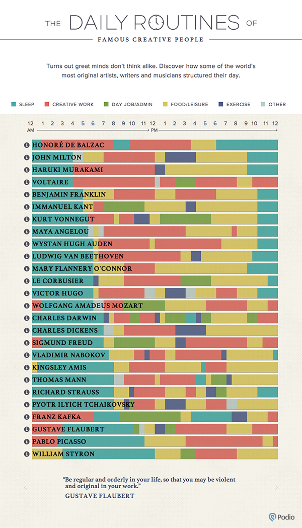
A simple beautiful improved and interactive viz, which also flashes the famous quotes by these big personalities, along with a disclaimer.

Clean representation of all six categories and no over flooding in an overview of this information. A tool tip shows the insider information without distorting the main purpose of consistency in visualization.

A clock on X- axis: Some numbers are good and we don’t want resemblance mostly in the clock. The reason I prefer a numbered dial over a blank dial with fancy figures.

Better color-coding: Removing white color seems a very intelligent stroke just that I didn’t like the red for primary work either( green was better). but might be for him sleep is the most constructive activity for creative brains 😉

Compare and Contrast: Now it is serving a purpose of visualization, let me quickly find out who two are similar or extreme opposites.

Efficient use of space: The focus is not diverted and you can see everything without putting the strain on your eyes. Bravo to the Author for a perfect visual problem-solving !! 🙂


References:

https://podio.com/site/creative-routines

http://www.businessinsider.com/daily-rituals-of-16-famous-creatives-2015-1/#ch-day-was-mapped-out-onto-a-24-hour-cycle-1

https://blog.miproconsulting.com/category/nerdery/

https://www.fastcompany.com/3028428/infographic-see-the-daily-routines-of-the-worlds-most-famous-creative-people

Is Violence In America Going Up or Down?

The US has more guns per capita than anywhere else in the world. These days, we have been hearing news, and stories of shooting sprees in the United States. This makes me wonder – is violent crime really getting worse in America? With those thoughts, I happened to read an article which showed the 50 year trends in the violent crime in the United States.  The article had the following chart which showcased the total number of violent crimes in the US from 1960 to 2009 and the overall trends throughout.

What did I like about this graph?

  1. The author wants the viewers to compare the number of incidents over the years. I can conclude that numbers are unstable and one can’t accurately make any predict for the upcoming years with this historical data.
  2. The graph encompasses a long-time span of 50 years which gives one a pretty decent idea of the crime history in the country.

How will I make it better?

Use of the right type of graph:

The bar graph used is surely giving a good picture of the changes in the crime numbers over the years. However, the use of a line graph would have served the same purpose and would also look neat. A line graph is commonly used to display change over time as a series of data points. Use of bars to cover such a big time frame seems unnecessary.  Owing to this, the simple straight forward information is passed on in a somewhat cluttered manner.

I would make use of line graph instead to provide similar insights. Using a line graph, the same message can be conveyed by just a single line and does not look overwhelming.

Highlighting important years:

By studying the graph in a bit detail, it can be noticed that there are some periods – 1975, 1981, 1992 post which a continuous trend (increasing or decreasing) seems to change. For me, those points are noteworthy as I would like to drill down further and would be more interested to know what exactly must have happened that year which caused the trend to break. Hence if the graph had those years highlighted the readers would not have to struggle to mark those years.

Hence, I would mark such findings so it would catch one’s attention immediately and provide better insights. This reduces the task of the readers who are interested in finding specific patterns and wanting to explore more details.

Audience:

Giving a thought on which group of users would find this information the most useful, it would be perhaps the police department of the United states, the federal and state government and the law makers. So as described above, if the graph highlights the interesting patterns then perhaps that can be used by the government to take decisions related to the staffing of police. The police department may use it to study the crime history in a period say 1992 and introspect on their moves then and improvise their strategies from those take-aways. The law makers might use to check if there had been a specific rule or law being imposed which caused the trend to break.

Claim:

The bar graph does indeed impart a lot of information and the complete statistics. However, it does not have a claim as such. The first visualization in such a long article should better be very impressive as that’s the point where a reader decides whether to continue reading the article further or to just switch to something else!

For e.g. I notice that one of the take-aways from the graph is that the year 1992 was peak of the violent crimes. This could have been added in the form of a brief description or a statement on the top. By doing that, even the very first look at the graph provides a key insight. Also, it would invite more audience.

Improved Y axis:

Currently the Y axis has just 4 values being shown. It does give a fair idea of the number of crime incidents occurred each year. However, since the x axis is spread across around 50 years and that no two years have the same number of incidents happening, there is a room to spread the Y axis across more values.

I would start the Y axis with 0 and then increase it at shorter intervals until I reach 2000000. This gives the readers a better estimate of the actual count of the violent crimes for a specific year.

Aesthetics:

Using bright relevant colors and a bigger font would help reach out to a larger audience. The colors being used also play a role in engaging the viewers. To me, the grey color looks too dull and old.

I would use the red color. Red is a very emotionally intense color as it symbolizes fire and blood. Thus, using red to represent crime figures becomes apt. It helps in connecting well with the audience and inducing the right amount of seriousness in the minds of the readers.

Redesign: Below is my attempt to redesign the visualization to present my ideas based on the data collected from the source in the article. I have taken the dataset from website – The Disaster center which had the complete the data for crime from 1960 to 2009. I have also worked on the aesthetics to make the graphs neat and clean.

References:

Main article: https://lowtechcombat.com/blog/2010/12/50-year-trends-in-violent-crime-in-us

Crime Dataset: http://www.disastercenter.com/crime/

http://www.pewresearch.org/fact-tank/2017/02/21/5-facts-about-crime-in-the-u-s/

Pets Industry Analysis Bad and Good Examples

When I was doing my individual project, I did a lot of research on the pet’s industry. Surprisingly, I found out that pets are serious business.

As pets are playing a more important role in peoples’ lives, there has been a huge growth in the industry. It could be the reason that more people are devoting themselves on their careers than having children, or it could be the reason that a lot of people are waiting until later in life to have children even decided that they don’t want to have children at all. Pets are taking the place of children and their owners are generally referred to as “pet parents”.

Bob Vetere, American Pet Products Manufacturers Association COO and Managing Director said:

“The strong growth in the pet-care industry demonstrates what an important role pets are playing in the lives of Americans. They have become a part of the family. Spending across all sectors, from pet food and veterinarian care to toys and treats, reflects what lengths we are willing to go to for our pets. ”

I found some classic good & bad visualizations on the pets’ industry analysis.

The Bad:

I absolutely have no idea why they are using pie chart here.

1.Fail to choose the right chart. The idea of data is not representing the parts to whole relationship. It doesn’t even have the percentage ratio on the chart. And the representing parts don’t sum to a meaningful whole.

2. The labels are in different font. I assume that the smaller the portions are; the smaller font the labels will be. But it will make it even more difficult for people to read the small portions.

3. The high contrast color is burning your eye. The good part of these color is that it is very eye-catching, but it is too pop that it could be a bit distraction.

4.Unnecessary 3D effect. The 3D effect is gilding the lily, and could mislead readers sometimes.

The good:

This chart chose a much better presentation of the second “bad” pie chart.

  1. The bar chart is better to represent the comparison in between different portions.
  2. It not only has the labels for each tab, it also has a unique silhouette on each tab to represent a different animal. The presentation is not only effective, easy to understand, but also very elegant.
  3. Unlike the previous pie chart, the color selection of this chart is also with high contrast, but beautiful at the same time. It is eye-catching, but it won’t over power the information that the chart wants to present.

Better:

If I’m going to make some changes to the first pie chart, I would do it in this way.

https://drive.google.com/open?id=0BwmDkc-M_2qyT1paSW1PVXhnOUk

The good visualizations can be improved in the following ways as well:

  1. The number on the axis could be in the same font for easy reading.
  2. The “millions” on each tab could be deleted
  3. There could be a follow-up chart explaining that though there are more dog owned households, there are more freshwater fish, cats, horses, etc., per household. That means there is a hug market in pet purchase for these kind of pets.

Conclusion:

The pet market is strong and growing. Consumers are more willing to spend on pet pampering than ever before and this trend is set to continue. A good visualization will help audience to better get the KPI(claim) of the pet industry and make good judgement call(action).

Reference:

  1. Pet Franchise Industry Overview

http://www.franchisedirect.com/petfranchises/petfranchiseindustryoverview/18/286

  1. Pet businesses will prosper: Industry trends for 2014 and beyond

http://www.multibriefs.com/briefs/exclusive/pet_businesses_will_prosper.html#.WSUSD7zyub8

3.     Follow industry trends: Grow the most successful pet business

http://exclusive.multibriefs.com/content/follow-industry-trends-grow-the-most-successful-pet-business/pet-care

Simple is not always better!

https://www.census.gov/dataviz/visualizations/035/

Analysis

The Description

This graph explores variations in high school education attainment within selected race and Hispanic origin groups by gender and nativity between regions within US.

Purpose of the visualization

Compare and Contrast: Attainment of a high school diploma (or equivalent level of education) is generally very high in the U.S., so this graph focuses on the percentage of the population 25 and older who do not have a high school education.

What’s good?

  • Clear and concise heading and legends, and no unnecessary embellishments.

What’s Not-so-good?

Aesthetics:

  • There is no consistent color palette that has been used.
  • The visualization is static and shows a lot of information but does not highlight any insight or actionable information. Basic Annotations and highlights can help hit the message home.
  • A lot of white space

Information:

  • There are a bunch of additional points that aren’t readily view-able in the data but become visible once the data is presented in a more detail oriented format. For example, there are notable differences between foreign-born and native population among many groups, in the West, and 57 percent of Hispanic foreign-born males had less than a high school education compared with 19 percent of Hispanic native-born males. Nineteen percent of Asian foreign-born females had less than a high school diploma compared with 5 percent of Asian native-born females. However this is not easily understood from the visual. In short, this visualization could use a fair amount of details so that the intended purpose of the data can be achieved.
  • A lot of information is spread out which doesn’t allow for easy comparing and contrasting between different classifications.

A better Version:


http://i32.photobucket.com/albums/d27/nsrivastava/Blog4_zpsqo6uvgfr.png

Cleaning up the data to create new category that identify gender and nativity helps combining the charts into a single graph which helps in presenting a consolidated view of the data.

Using Filters a lot more insights can be gained which are not possible from the original visual. A few such insights are:

  1. Foreign Born females and Males from the west region has the highest percentage of people without High School Education.
  2. Among Native Born, North East lags behind with the highest percentage of population without High School Education.
  3. Overall, there is difference in avg percentage of people without high school education between Native and Foreign Born

What can be improved further?

Spatial Context

Depending on the information that is to be conveyed, it makes sense to display a map for visualization depicting geographical information. Visual cues are always easy to read and understand. Since the data is for US regions, showing this information on a US map divided into 4 regions helps the audience connect and identify with the information.

Icons, shapes, and symbols

A picture tells a thousand words. The use of icons, shapes, and/or symbols can improve visualization’s readability and also helps in capturing the attention of the audience. There’s a thin line between graphics that enhance a data visualization and junk, but when done tastefully, graphics have the ability to provide much more information than words alone.

Symbols, icons not only make the visualization more engaging, but they also provide the advantage of reducing, and often eliminating, language barriers.  In the above visualization, using the universal symbol for male and female can help even those with language issues to identify and compare the percentages for male and female.

Conclusion

It should be carefully considered as to what is the best type of visualization for the piece of information or data set that needs to be presented. While ease of understanding should always be a consideration, ensuring that the visual conveys all the relevant information and provides the gist of what the underlying data is trying to showcase is also extremely important.

References:

https://extension.org/2017/04/11/7-elements-of-good-data-visualization/


The World’s Most Valuable Brands in 2017

Justin Mungal

Lately, I find that data visualizations are more eye-catching than attention-grabbing.  Complex color schemes on maps draw in the eye, but there is nothing to maintain attention for the purposes of learning something new, as the informative details of the data cannot be distilled from the image alone.  My favorite example of visualization eye-candy is the red and blue mapping of American states according to their political leaning. 

The image is attention grabbing, but the real learning takes place at the county level, and still, the true understanding of county level data needs to be coupled with county population levels for an accurate understanding of voter geography.  In essence, the graphic distorts the reality of voters’ geographical dispersion and therefore impedes my trust of the source and any other data they may present.

My slightly jaded attitude towards eye-catching images was unhinged by a recent attention-grabbing visualization of the world’s most popular brands by country.

The visualization depicts a smattering of the most valuable brands across the globe by country.  The color scheme represents brand strength on a scale of 0 – 100 and the size of the country corresponds with the valuation of the most valuable company for that country.

What I love about the visualization is that at first glance, my attention was grabbed and I immediately started learning.  We are so used to hearing about major U.S. brands, that few Americans, including myself, could claim meaningful knowledge of major non-U.S. brands.  This image provides a pallet for the eye of major global brands in relation to what the viewer is likely familiar with – American brands.  Thusly, the viewer is immediately immersed in a visual exploration of international brand valuation.  Note here, that I am presuming the viewer to be American since the chart was produced by an American news media station (MarketWatch).  By comparing international brands to familiar U.S. brands one realizes just how dominant the American market is – our companies dwarf those of other countries by fractions of dollar value.  The sizing of the countries instantaneously captures this major discrepancy in valuations, although given the size of the image as a whole, it is a bit difficult to fully appreciate the sizing imbalances.

What I most dislike about the graphic is its size.  For example, the size of the image not only makes the differences in country size difficult to distinguish, but even makes reading the company names labeled on smaller countries rather unintelligible.  Furthermore, the size of the image means that the authors were forced to create a cutoff for which countries would show up at all.  I presume that a country needed to have a company worth over $3 billion since the lowest valued company listed is $3.7 billion.  Accordingly, no African and few Latin American countries made the cut to be depicted in the visualization.  Personally, learning about non-US companies was what grabbed my attention, and so missing out on large chunks of the world was rather disappointing.  In this regard, the author seems to have forgotten the audience, Americans, and what would be most insightful to them, namely a thorough exposé of unknown global brands in juxtaposition to well-known U.S. brands.

A redeeming factor for the shortcomings of this visualization is its pairing with a listing of the world’s top ten most valuable companies. Interestingly, only two non-U.S. companies make it on to (the lower end of) this list.  Here, the giants of globalization are named and their dominance by valuation is most well pronounced.  Given that the learning point for me was regarding non-U.S. companies, I would have liked to see either an extended list (say top 20) and/or a list of highest valued non-U.S. companies.  Again, the authors should have been more sensitive to the fact that their audience is Americans who are well versed in local business but less so and more interested in foreign business affairs (as far as learning something new goes).  To that end, it would have been easy for the authors to have allowed the user to scroll down a longer list of companies or to even select a listing of companies by country to provide a deeper dive and visual confirmation of the suggestions of the mapping (that many global brands are small in comparison to top US brands and that many of those non-US top brands are largely unknown to the general American public) for an audience captivated by their first stunning mapping of global company valuations.


References:

http://www.marketwatch.com/story/the-most-valuable-brands-in-the-world-in-one-chart-2017-02-08

http://illinoisentertainer.com/wp-content/uploads/2012/10/Red-States-vs.-Blue-States.png


DataViz Tools : Can’t live with , Can’t live without!

Data visualisation has been around for a long time now all the way since the 17th century. It has been important to communicate information in the most effective manner to the audience, due to which constant innovation in the field is visible. Overtime, people have discovered new ways and new effective tools to visualise data. Tableau , Infogram, Plotly, Datawrapper are just few of the examples of the tool that make your life easy when it comes to data visualisation. And then I came across this infogram post that took me back to my 10th grade essay question “Technology, A blessing or A curse?”.

https://infogr.am/d073c128-c212-4521-b1d2-1fea642456e5

Usually I start my blog with what interests me about the chart or the positive points about it. However this time I sat there staring at the chart analysing it, trying to figure out what its trying to say. After a time lapse I came to concluded that the only positive point that this chart has is that we know the title of its story. It answers the basic description question: what? Followers on social media.

When DataViz tools makes the creators life easy, the viz should make the audiences life easier. But this chart doesn’t seem to do that. Below are the reasons why:

Fails to answer the description questions:

While the chart tells us it is talking about the followers on social media, it refrains from giving us other information such as which time period was this data collected.

Fails to have a claim

The chart compares the followers on social media for the companies: Apple, Google, Coca-Cola, Microsoft and Toyota. While Apple, Google and Microsoft are tech companies, Coca-Cola comes under the food and beverage company and Toyota is in automobile sector. Why compare the followers of companies that are not related to each other.

Repetitive attributes

On the Y axis we see that Youtube, Instagram, LikendIn, Twitter, Facebook being repeated over and over again. Where too much information cramped into a visualisation is a problem here the creator has put the same set of attributes five times.

Selection of Colour

All the companies have been assigned the same colour hence there is no way of differentiating based on colour. Although the x-axis has the company names listed and the colour is not needed there is again unwanted information at the bottom added to the visualisation.

Does not specify the unit of measure of the data

When you click on the circles it gives you a number, but no where it is specified what that number means ..Is it a percentage ? Is it in thousands , millions or billions.

Hence this chart has failed the three basic criteria of Data visualisation : Data, Claim , Aesthetics. Data Viz tools are no magic spell, they are here to help not do your work. Sometimes all people do is make use of tools to come up with a fancy chart but little do they think about the objective and subjective dimensions. Tools are a blessing indeed only if you know how to use them the right way. This chart however is a curse!

Redesign : https://public.tableau.com/profile/pooja5766#!/vizhome/FollowersonSocialMediaoftoptechcomapnies/Sheet2


Race to Magic Mountain.

Dashboard – Who’s on the Magic Mountain?

This dashboard published on The Economist gives an overview of the attendance demographics for the World Economic Forum ’13-’14 held at Davos, Switzerland.

First some background on the World Economic Forum :

  • Swiss nonprofit foundation based in Geneva
  • Annual meeting held in the end of January every year
  • Annual meeting brings together leaders in business and politics, journalists and economists for four days to discuss pressing world issues.
  • Motto – “Committed to improving the state of the world”.

The Dashboard :

The intent of this dashboard is to convey some key numbers about the attendance at the forum like – male vs female delegates, % of representation of different countries and number of delegates in distinct sectors.

Subjective Dimensions:

– Truthful? Partially. 

It is partially truthful. It does represent direct numbers and figures truthfully. I say it is

partially truthful because of lack of key contextual information on one of the charts that the article uses to make a claim at the end. I’ll elaborate more on this later.

– Functional? Adequately.

It conveys information on who is on the titular ‘Magi Mountain’ i.e., at the World Economic Forum.

– Beautiful? Adequately.

This chart and the article were published on The Economist whose readership includes highly educated people many of whom are influential executives and policy-makers. The colors chosen are safe and do not overwhelm the audience.

– Insightful? No.

There is not much insight to regained from this dashboard. Many of the values presented are direct figures and not much analysis has been done on them.

– Enlightening? Not really.

Unless the enlightenment sought to be gained by the audience was that their future financial success depended on become a member of the Forum.

Lets delve deeper into two aspects of the dashboard :

Color Palette – Overall & Highlights :

I like the overall color palette the dashboard has employed in the different charts. The colors neither overwhelm each other nor the reader. That being said the key takeaways from each chart could have been highlighted more effectively if some other color palette was chosen. The author has used a predominantly blue palette with different shades ranging from indigo to cornflower blue which is difficult to interpret in terms of the differences between them when viewing the charts.

Claims: The article states some ‘key takeaways’ like –

“Of the 2,622 hobnobbers invited to this year’s World Economic Forum in Davos, Switzerland, just 15% are women.”

“The total worth of the 15 richest is around $285 billion.”

“The stock-market value of firms represented is $12 trillion, about one-fifth of the world’s total. And after all the inflated expenses and egos, what has been the fate of the companies that sent delegates at least three times in the past five years? Those 104 firms underperformed both the S&P 500 and MSCI World Index. Time to get back to work.”

I mentioned ‘key takeaway’ in quotes because the third statement is the key focus of the article. And the only way the viewer could possibly gain some information on the claim or to back the claim, from the chart, is to look at spaghetti chart at the lower left corner. The chart does not provide any further information to back such a bold claim that those companies needed to work harder, or as said in the article ‘get back to work’.

Doing some research about the general profile of the companies that attend the forum, I was able to find that most of them are long standing and stable organizations.

This is further evidenced by the fact that the World Economic Forum is invite only and requires a very expensive membership — As of 2011, an annual membership costs $52,000 for an individual member, $263,000 for “Industry Partner” and $527,000 for “Strategic Partner”. An admission fee costs $19,000 per person.[17] In 2014, WEF raised annual fees by 20 percent, making the cost for “Strategic Partner” from SFr500,000 ($523,000) to SFr600,000 ($628,000) – https://en.wikipedia.org/wiki/World_Economic_Forum#Membership

Measuring these organizations’ performance year over year does not make sense because they go back far too long to be able to outperform themselves and instead they present a stable upward trend in performance that is too little to present as much of a performance improvement.

Redesign Examples (for different years, namely 2015 and 2016) : I was able to find a better set of visualizations that visualized the attendance demographic of the World Economic Forum here & here. In both the visualizations, there are no dubious charts and the differences, be it in age/gender/number of delegates by role, are presented clearly to the user.

References :

https://en.wikipedia.org/wiki/World_Economic_Forum#Membership

http://www.economist.com/news/international/21595032-whos-magic-mountain

http://www.bbc.com/news/business-35285852

https://www.msci.com/documents/10199/fa5cdafc-d8a3-4c2f-94dc-268723a685fd

http://www.ibtimes.co.uk/davos-2016-how-much-does-it-cost-attend-46th-world-economic-forum-1538520

https://www.theguardian.com/business/2015/jan/21/-sp-davos-guide-world-economic-forum

http://www.economist.com/blogs/graphicdetail/2016/01/daily-chart-15

‘Save the pies for dessert’

We all stress about money, so why don’t we talk about it? Three out of four Americans regularly stress out about money. That means that at any given time, the majority of us might be spinning in our heads with worry, shame, and anxiety about the very same thing—but none of us is talking about it.

In technology companies, the salaries are sky-high.  Companies like Google, Facebook, Apple, Uber have set a trend in offering their people, on average, six -figure paychecks.

Let us focus in detail on the pay composition of the key roles in the tech giant Google.

View post on imgur.com

What do I like about the pie-chart?

  1. Labelling: The labels are explicitly mentioned and this takes very little effort from the reader to match the slices of the pie to the text.
  2. Colour coding: The Visual property seems to be very appealing and effective, a “color-blinded” reader can also interpret the information from the pie and colours alone do not have a meaning of their own on the pie chart.

What do I not like about the pie-chart?

  1. Complexity: Pie-charts are poor at communicating data, they take up more space and are often difficult to read.  Research suggests that it gets very difficult to the reader to compare the size of the angles when there is no scale present,  interpreting the accurate data is complex in the above figure, with too many arrows pointing in different directions, this seems to be a herculean task.
  2.  Not-a-proportion of the whole: Pie charts are usually used when different slices of the pie combine to form a whole. In the above chart, the slices represent salaries of disparate positions at Google and the sum of the parts essentially do not add any value.
  3. Overlapping slices: The overlapping slices confuse the reader, it takes some effort from the reader’s end to understand the slices of the pie and the underlying pies data is not easily decipherable. For example, the salaries of the staff user experience designer, Engineering Director cannot be understood without effort. The underlying slices data is fuzzy.
  4. Too much Information overload: Research suggests to never have any more than 7 categories in the pie-chart as it becomes harder for the eye to distinguish relativity of size between each section. In the above pie-chart, the author has used around 10 slices and this make the chart cluttered and hard to distinguish, because of multiple categories, it becomes hard for the reader to identify the proportions correctly, compare different categories and gain any insight from the picture.
  5. Less effective: One of the objectives of a visualisation is to present information in a way that can be quickly read and easily understood. If you glance at the above chart too quickly, the chart does not deliver the information in the most effective manner.
  6. Missing Timeline: The chart does not appear to have a timeline. Absolute time adds a lot of meaningful information to visualised data and the reader is deprived of this information.

How did I Re-design this?

1.  A range of values:  The salaries are a range of values and hence box plot would be an ideal visualisation, the box plot gives us the Highest salary in the group, the lowest and the median. So, the reader can have a comprehensive view of what each position in the company has to offer.

2. Comparison of data: By using a box plot the comparison of salaries among the positions is easier than that of pie-charts which had angular views for the salaries.

3. More effective: The reader can get the gist of the visualisation with ease and can quickly identify the salaries corresponding to the positions which makes this an effective visualisation.

View post on imgur.com


https://public.tableau.com/profile/publish/google_salaries/Sheet1#!/publish-confirm

References:

https://www.quora.com/How-and-why-are-pie-charts-considered-evil-by-data-visualization-experts

http://www.insightsquared.com/2014/02/why-pie-charts-are-the-worst/