
Introduction:
This visualization- books that make you dumb was featured on boston.com in 2008- http://archive.boston.com/bostonglobe/ideas/brainiac/2008/01/books_that_make.html
The author obtains the average SAT scores from different universities and also pulls the top 10 books that the students at these universities recommend. For example, if your SAT scores are low, you are likely to get admitted to a mid-tier university where the fellow students around you are also following content that is not very intellectually compelling.
Using this, he tries to identify which books are read by students in the low SAT score bucket and otherwise. By doing this, the author takes an unconventional and interesting stab at tagging the books based on intellectual calibre rather than the converse approach where we tag intellectual calibre based on books(weird but interesting, yes!)
What is the authors claim?
To be able to understand the visualization better, it is imperative to understand the question the author is trying to answer.
So, I went on to define the objective dimension:
What does this visualization do ?
The visualization aims at using the average SAT score as a proxy measure to gauge the intellectual prowess and classify books based on how many intellectuals are reading it.
Who is it targeted at ?
The visualization was featured on boston.com and gawker and was possibly targeted at the readers of these journals.
How does he do it?
He uses the average SAT scores from colleges and the top 10 books they recommend.
Analyzing the visualization from a subjective standpoint
So, for any visualization to be successful and serving well, we expect it to be –truthful, functional, beautiful, insightful & enlightening.
Truthful- So, there are a couple of things here –
Data + Assumptions–> Visualization
Data – The visualizer pulls this data about average SAT scores and top 10 books recommended from all colleges on Facebook. So, he is typically looking at these books from an 17-18 year olds perspective.
The choice of books would have been very different if there were no age group restrictions. For example. Don Quixote is considered the greatest book of all time (based on – http://thegreatestbooks.org/) in the classic genre but, this book is practically not anywhere in the list. So, this list is heavily skewed in favor of the the preferences of 17- 18 year olds and is unlikely to convey any inputs to people from other age groups.
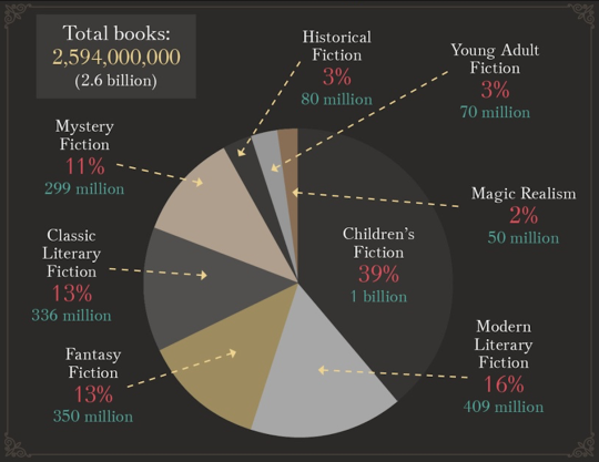
If it were to include to other genres, the distribution of genres would also be vey different with classics constituting only 13% of the total(Source: https://ebookfriendly.com/most-popular-book-genres-infographic/).
Also where did Shakespeare vanish ? He might be the most famous author of all time (Source: https://www.smashinglists.com/ten-most-famous-authors-of-all-time/2/). But, he definitely doesn’t seem to be on the list of many 17th year olds!

Another point of concern is that while SAT scores are descriptive of the whole population, the book recommendations are provided by a pool of ‘Active-On-Facebook’ students only.
Also, there seems to be a disconnect between the color coding on the graph and the genre in the underlying raw table. I wonder if some of the changes to the genre were made by the author. For eg. Lolita is classified as ‘Erotica’ in the above visualization while the underlying data classified it as a ‘Classic’.(Underlying data can be found here-
Assumptions– The author uses an assumption that the SAT score(not EQ or IQ!) is a measure of intellectual capability.
Another assumption that he uses is that when people with high SAT scores(the smart & intellectual ones) read a book, it makes the book an intellectual one which I find quite questionable?!!
Functional- I would expect a functional chart to convey something or answer a question.
So based on the authors analysis , if I were to understand which books are read by “intellectuals”, the top 2 that catch my eye are- hundred years of solitude and Lolita(really?!!)
Beautiful- The chart is very unwieldy and long with font sizes that do not appeal to my eyes.Also, the title- “books that make you dumb” is very misleading. It is just a catchy title and does not convey anything.
However, two commendable things are – the choice of colors(which is soothing) and the fact that the author has the books color coded by genre based on data from LibraryThing.com
Insightful- While the idea of relating books to intellectual ability is not new to the audience, how these play out with college freshers is! Their taste clearly is different from that of the broader group.
Enlightening- Calls for change? The above chart just describes the situation and does not include any call for action per se.
What would have made this visualization more rewarding ?
The analysis behind this visualization has a lot of depth and there is much that can be said. So, I decided to re-create this visualization using the same underlying data to specifically answer some questions that I had.
(I used Beautiful soup to fetch the data from the page and tableau for visualization)
What are the most common genres that students of this age group like and endorse?
https://drive.google.com/open?id=0B0buBv_pWnS4YUV2SG1SdWQyX2c
Which genres have the highest raw SAT associated with them?
https://drive.google.com/open?id=0B0buBv_pWnS4WmpOZGgyYl95UTg
Which genre contributes the most to the top 100 books ranked by SAT score?
https://drive.google.com/open?id=0B0buBv_pWnS4bGFwR2hwN19hdTA
Last but not the least , which books are most endorsed by students ?
https://drive.google.com/open?id=0B0buBv_pWnS4TGl2ZmYwSEZNOUU
Looks like Harry Potter closely followed by The Bible make the top 2!
I strongly believe in the power of focussed dashboards and visualizations, aimed at answering questions than exploratory dashboards where the end-user is left to leverage his own imagination. After all, visualizations main goal is to help people understand what the data is telling them!
Last but not the least, I created a metric that is a mixture of the number of schools that endorse the book (popularity) and the SAT score( the proxy metric for intellectual ability) to recommend the top 10 books in the dashboard below with a call to action.
https://drive.google.com/open?id=0B0buBv_pWnS4d29vaWhXZHpyRkE