Description
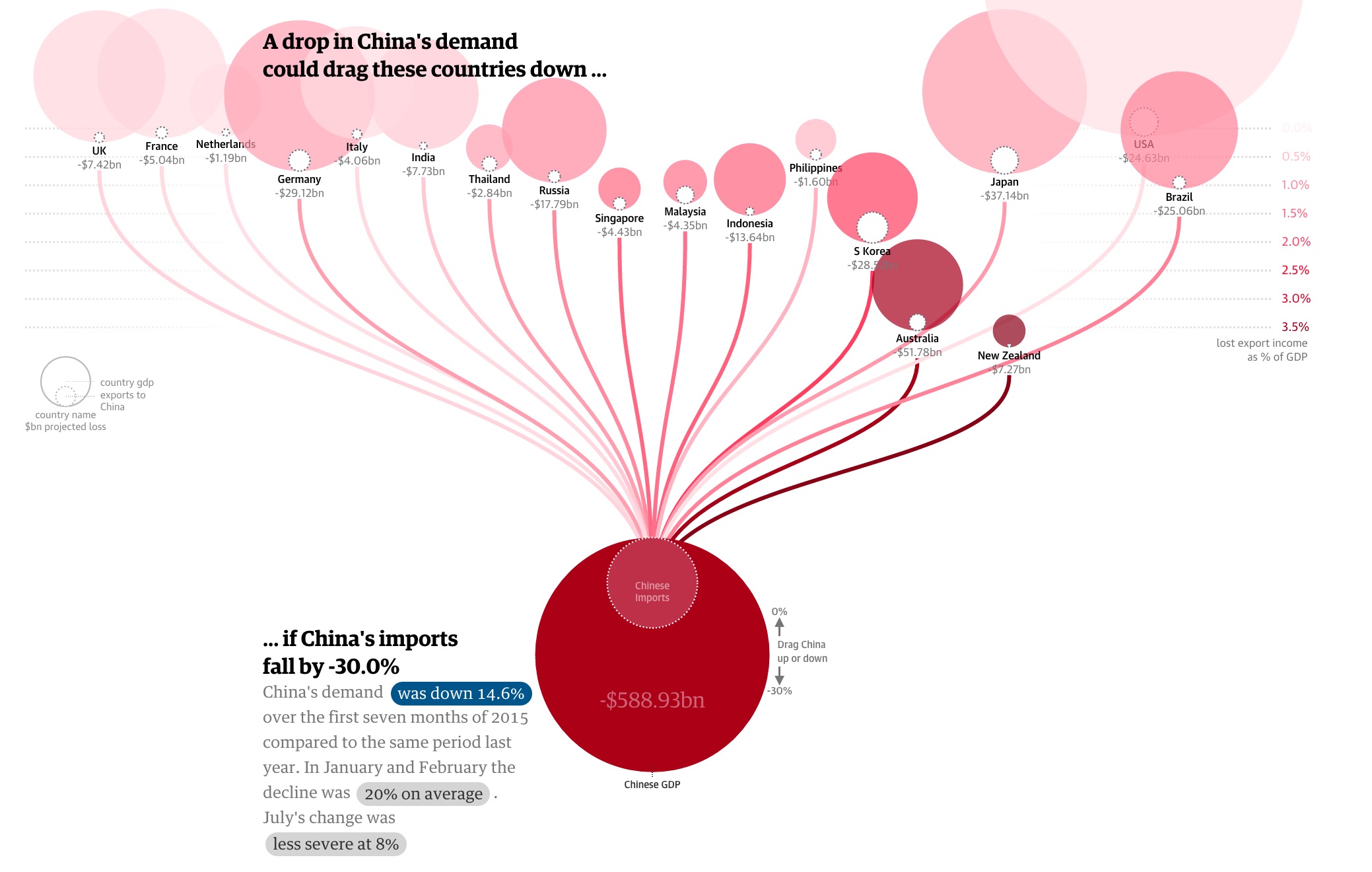
This is an interactive visualization of how 2015 China’s demand on import affects the economy of its trading partners. Indicated below, it is observed that the China’s growing momentum has started to slow down. To see how much China’s economy impacts the rest of the world, this visualization examined the relationship between China’s imports and other countries export.
The big dark red circle at the bottom represents China, and the inner circle represents China’s import demands. The China circle is connected to various trading partnering countries. By dragging the China circle up and down, we can manipulate the data to provision China’s import demand drop, from 0% to 30%, and we can observe the impact the change has on other countries shown by the export loss and its percentage of total GDP.

What I like about this
- I like the interactivity aspect of this dashboard. Users can observe what impact China’s import demands has on its major trading partners.
- The warrant of this visualization is that China is experiencing a slowdown in growth and as a result, its import demand decreases. The graph shows exactly how big of an impact it is to other countries. This is an effective way to show how China not only is a big exporting country but also an influential importing country.
What I don’t like about this
Overall, I think this is a very good visualization. However, there is one thing I find puzzling. The size of circles representing the export loss for China’s trading partners does not change when China’s import demand changes.
To represent the changes the countries experienced in regards to China’s import demands, this graph changed the location of the whole circle (representing each country). The more percentage of GDP loss, the lower the position of the whole circle (notice in the picture how low is Australia and New Zeland compare to others). Also, the more percentage of GDP loss, the darker the circle turns into. However, it took me a while to notice the relationship of the positioning and the % to GDP loss.
A user can also hover over each country, and the graph will show you the amount of money the country loss due to import demand decrease from China. I felt the size of the import loss should also change. For example, when China decreases import demand by 30%, the export loss of the US is at $24.63bn (0.1% GDP) and Australia at $51.78bn (3.6% GDP), but the circle representing loss in the US still remains significantly larger than the one representing the loss of Australia when in actuality, Australia will lose more than half of what the US will lose.
What I Would Have Done
- Make the size of the export loss for each country change according to the amount of loss it will experiences when China’s import demand changes (as mentioned in the “What I don’t like about it” section).
- I will also put a color scale indicator along with the visualization to indicate the darker the color the circle turned to means the heavier the impact because the current scale on the right-hand side looks like it just faded out at 0.0%
References
https://www.theguardian.com/world/ng-interactive/2015/aug/26/china-economic-slowdown-world-imports