The Ice Bucket Challenge, sometimes called the ALS Ice Bucket Challenge, is an activity involving the dumping of a bucket of ice and water over a person’s head, either by another person or self-administered, to promote awareness of the disease amyotrophic lateral sclerosis and encourage donations to research.
It went viral on social media during July–August 2014. The following visualization was trying to show how much money the ALS Ice Bucket Challenge has raised compared to how few die from the disease relative to other diseases.
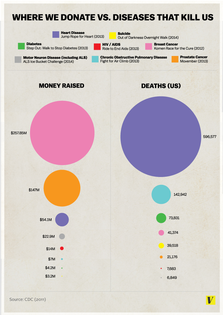
There are 8 different diseases/causes considered, and each one is associated with a color. The sizes of the circles are proportional to the dollars raised for (on the left-hand side) and deaths caused by (on the right-hand side) the 8 diseases/causes. The graph looks pretty at first glance, but it suffers from the following problems:
What I like about it:
The colors are eye catching, and the bubbles are vivid.
What I don’t like about it:
- Similar to pie charts, it is visually difficult to see the relative difference among diseases in the same category (deaths or dollars); readers are left guessing the relative sizes of the circles.
- Because the dollars and deaths are not aligned by diseases, it forces the reader to look at one disease at a time; it is very difficult to spot a pattern between the 2 categories by diseases.
- There are too many colors. I find myself going back and forth to the legend. It shouldn’t be so hard for the readers. Moreover, the colors are in no particular order; not alphabetical, not by deaths, nor not by money raised. This is way too confusing.
- The font could be too small. The labels and number would be quite difficult to read from a distance.

Someone redid the graph, and came out with this dot chart above. It sure is easier to trace the relationship between the deaths and the money raised. But it still make it very difficult to illustrates the difference between the death tolls of diseases and the money raised to battle them.
In efficient visualization, we don’t need to present every detail information. On the contrary, we just need to point out our claim to the audience.
Re-creating the graph:
The simple comparison line chart or bar chart will do a better job. Since we agreed in class that “function first, form follows”. This chart does a better job comparing the 2 categories by diseases than the bar charts with faceting. If we want to make sure that this chart is still functional for color blind people, we can minimize its color choices. “Get it right, Black & White.” I like how efficiently this minimalistic graph is able to convey the relevant information.
https://drive.google.com/file/d/0BwmDkc-M_2qyTjBESklxS2NuNnM/view?usp=sharing
(I uploaded the picture of the chart onto my google drive)
Conclusion:
In efficient visualization, a lot of times “less is more”. The first priority is find out the claim, and leave out the unnecessary information. ” Function first, form follows.”
References:
-
Makeover Monday: Where We Donate vs. Diseases that Kill Us
http://www.vizwiz.com/2014/09/donations-vs-deaths.html
- Redesign: Where We Donate vs. Diseases That Kill Us [OC]
- https://www.reddit.com/r/dataisbeautiful/comments/2er3zq/redesign_where_we_donate_vs_diseases_that_kill_us/