Justin Mungal
http://www.nytimes.com/elections/forecast/president
I remember the night of the 2016 presidential election hauntingly well. Several friends of mine and I gathered at The Hut in honor of its historic closing and in celebration of Hillary Clinton’s imminent win. Beers in one hand and phones in the other, we starred with our eyes glued to the bouncing needle on the NY Times live presidential forecast. We could hardly steal a second to sip our beers because the needle on the dashboard kept bouncing left and right, edging towards Donald then retreating to Hilary, back and forth on “Chance of Winning the Presidency” scale, keeping us in endless suspense. Little did I know that the previous polls indicating Hillary’s soon-to-be landslide victory were as false as the wavering needle of NY Times exit poll data.
Looking back on that night I realize I was being duped and deprived of enjoying my frosty brew, instead stuck to an incessantly moving and meaningless needle. Inspecting the data graphic now, I have no idea what I was even looking at that night of the election. The categories the needle teetered between (very likely, likely, leaning, and tossup) are inherently vague. The needles to the right depicting popular vote margin and electoral votes made sense – they showed numerical data, the needles moved according to incoming county data, and visually account for each incoming vote and their actual impact on the election results. So what then does the category “tossup” mean, how many votes does it take to move from “likely” to “unlikely”, and on what basis does the needle move within a given category? Later in an NPR podcast I would find out that the NY Times does not receive a steady stream of election polls data, which the continuously moving needle would indicate, but rather receives chunks of data from counties at various times throughout the night as their ballot casting centers close and compile the exit poll data. The endlessly wavering needle was false and was programmed to keep viewers in suspense and glued to their app. The true data, the two needles to the right (“Popular Vote Margin” and “Electoral Votes”), moved infrequently and did not require constant attention – offering an opportunity to close the app and put our phones down.
In the dawning era of “fake news” and “alternative facts” the American public needs, now more than ever, media stalwarts of integrity. The New York Times has been known to be one of America’s most prestigious sources of news and must fight to maintain this privileged seat of honor. Ironically, we are also entering an era of data driven news. We have the capacity to collect, analyze, and visualize vast quantities of data quickly, informatively, and entertainingly. In a world where each news corporation has its own spin on every story, data must be reverenced for its undeniable link to truth. For the NY Times to report false and sensationalized data for the purposes of maintaining viewership is reprehensible and unfairly places the burden of discerning the integrity of data on ordinary citizens rather than on highly trained data scientists. Given the dilution of truth in our modern Twitter chatter and Facebook news feeds of lies it is necessary that the historic bastions of reporting integrity recommit themselves to the noble profession of raising the bar for what it means to be an “informed citizen.” In the advent of big data and visualization, the possibility of raising that bar to new heights previously unimaginable has become a reality. We must not turn that reality into a fantasy by creating false data and misleading visualizations. The consequences of such behavior – a president with ties to Russia, the disintegration of universal healthcare, the launching of fifty-nine cruise missiles on Syria, etc. – are indeed grave.
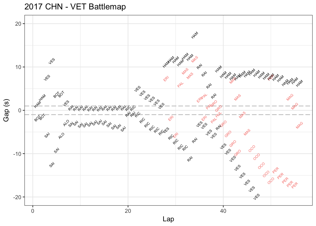 This is Vettel’s race battle map in China Grand Prix in Apr.9 2017. This map shows who’s ahead or behind Vettel and how much the seconds in each lap. The red data represents the players lapped by Vettel.