Bikram Patnaik
Google Play Music timeline
‘What would you do if you want to listen to an old classic country music on Friday evening after a hectic day at work?‘
Generally we turn up to various websites, blogs, TV channels and radio which lists the top 20 music tracks/albums of a particular year but, Google Play Music’s makes it easy with it’s new Music Timeline visualization which gives us a bird eye view of our past musical favorites and gives us a chance to revisit them. It helps us visualize which music has stood the test of time, and how genres and artists have risen and fallen in popularity.
The Music Timeline uses data from Google Play Music users’ libraries to categorize artists by genre, and the genres are then subdivided. What it provides, then, is a rough-and-ready map of the popularity of genres and artists over the years.The X-axis shows us the transition of time from mid-50’s to 2010 while the Y-axis scales the popularity of that particular genre. Here, the visualization uses stacked area chart which are usually used in situations when we need to display some changes in time, when it’s important to show that those values in a sum form a whole. For all the music loving audience there can’t be a better way of representation than this.
UNDERSTANDING THE DATA:
Let’s dive deeper by understanding it’s working dynamics. When you glance across the timeline it gives a soothing treat to the eyes with it’s subtle color combinations. You can figure out straight away that during the early 50’s ‘Jazz’ & ‘Vocal/Easy-Listening’ genre were very popular among people. But as time elapsed ‘Rock’ and ‘Pop’ culture picked up the pace and overshadowed other genre. In the early 80’s ‘Jazz’ along with other genre reached their threshold and people developed a different taste of music. Emergence of new artists like Snoop dog,Eminem and Nirvana resulted in the up rise of ‘Alternative/Indie’ and ‘Hip-hop/Rap’ culture and made it a craze.
Once you’ve drilled down to your selected genre, the timeline takes the form distinctive audio wave showing the flow of popular individual artists/bands and displays a short bio and relevant albums. For example, by clicking on the Pop stripe, we can see the combination from ’50s Pop to ’60s Pop to Adult contemporary within the growth of the overall genre, as well as some of the most popular artists that composed each sub genre. This helps audiophiles to choose the artist of their choice and buy relevant songs.
Another interesting feature is that we can search for a particular artist to see the trajectory of their career through the decades. Let’s say, Michael Jackson who started his music career in 70’s but didn’t hit his stardom until the release of his famous album Thriller and Bad in 80’s after which his legacy still continues till date. The same feature also applies to music albums.
DRAWBACKS:
Now talking about the loop holes in this visualization, the data collected is only restricted to Google Play Music user’s libraries and doesn’t take into account users from other music friendly platforms like Apple music, Spotify,Pandora or Sound-cloud. If we collate the data from all sources, there is a high probability that it might give us a different picture altogether. More ever, the very existence of Google Play Music in 1950 or it’s use by the old generation people, who mostly prefer traditional ways (cassette players and cd-player) of listening to music is questionable. I leave that up to you to decide. But certainly the variety and easy usability of Music Timeline over powers it’s flaws.
FROM A CRITIQUE’S VIEWPOINT:
While exploring a particular genre say ‘ROCK’ and diving deep into it’s sub-genres, if you examine closely the word ‘ROCK’ is embossed in the background throughout the entire audio wave format. This seems to be overwhelming specially when you have multiple sub-divisions each highlighting it’s own name. A color contrast is much needed to distinctly identify the sub-categories. Lastly, the font size needs to be standardized across the timeline to reduce the probabilities of missing out on words/texts.
ALTERNATIVE APPROACH:
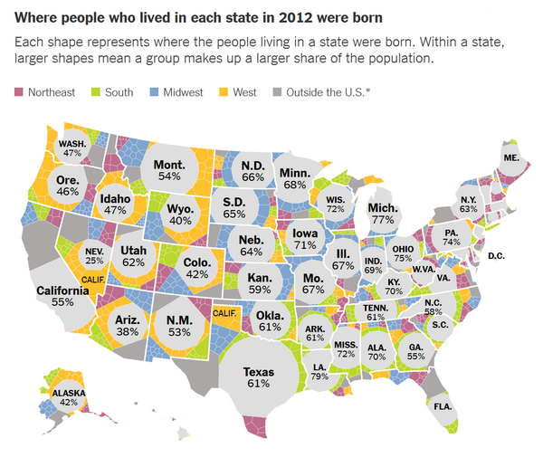
Though it’s visually appealing there are certain hiccups with stacked area charts as well. Ideally one should be able to interpret each individual series by its height, but unfortunately most interpret the curve of the top of the area as indicating quantity ( In line graphs). So, as an alternative I would recommend individual line charts, with an additional line in a stark color for the total or we can use interactivity and gray out series in the background, such as in this amazing visualization of housing prices from THE New York Times
CONCLUSION:
I feel that this kind of visualization is really helpful when we have to organize huge data sets (live data) across a defined time-line. Similar approach/viz can be an advantage for organizations to analyze their product sales along with their respective popularity. It will allow them to come up with business metrics targeting valuable customers.
Reference:
https://www.theguardian.com/music/musicblog/2014/jan/17/google-play-music-timeline-punksoul