Why not use to 3D graph and multiple colors

http://www.businessinsider.com/the-27-worst-charts-of-all-time-2013-6#wow-multicolor-3-d-cylinder-bar-charts-are-a-really-really-bad-way-to-articulate-relatively-simple-data-19

The above graph wants to see the trend of mortality rate in a relationship with epoetin dose and hematocrit group range. Within each hematocrit group, as the epoetin dose increases the mortality rate trend is increasing and the highest mortality rate being for hematocrit group range of <30%. Within each epoetin dose quartile, there is an increasing trend in the mortality rate as the hematocrit group range decreases.

Issues in the above graph:

1. Use of 3D chart: The use of 3D charts is confusing as well as deceptive to our human’s eyes. 3D graphs misrepresent the data which makes it difficult to determine the correct value. Analyzing the 3D charts requires additional brain processing which shouldn’t be the case. It’s not easy to understand the trend or insight of the mortality rate with respect to epoetin dose and hematocrit group. In more than 39 hematocrit group bar, Q2 and Q4 seem to be same.

2. Multiple colors: Use of multiple colors is distracting. Adding more colors makes it hard to read the graph.

How can be the graph improvised:

1. Convert 3D to 2D: Using bar graph, it helps to determine the values correctly as well as understand the trend of the mortality rate in a relationship with hematocrit group and epoetin dose. Deception about values for Q2 and Q4 for “>39%’ being same is eliminated.

2. Use one or two colors.

https://drive.google.com/open?id=0B_RLPSpuvXY1LUREek1vaG41Yjg

Data Visualization: A HIT OR A MISS!

Data visualization allows us all to see and understand our data more deeply. That understanding breeds good decisions. It can be a great way to drive numbers home and give them a visual weight mere statistics don’t have. At least, that’s what happens when they make sense. However, sometimes visualizations may look good but are simply unnecessary and miss the point completely. To take an example, we have the following visualization from the Washington post article, showing 100 years of hurricanes hitting and missing Florida.

https://www.washingtonpost.com/graphics/national/one-hundred-years-of-hurricanes/

The above visual aims to depict every single hurricane over a period of 100 years that had hit or missed Florida. Each line in the above visual represents a hurricane.  However, it is unclear as what is it that the visual is trying to achieve as it doesn’t show the number of  storms that missed of hit Florida over the past 100 years. Let’s analyze the given visual on two main visualization criteria that it completely fails on:

CLAIM: All visualizations must answer a question, make a claim or provide some insight that wasn’t available or accessible without the visual representation. The article using the above visualization claims that Florida is the landmass of choice for storms. However the visual doesn’t provide any support for the claim. It doesn’t tell the number of storms that have hit or missed Florida and nor any correlation with time or location.

VISUAL AESTHETICS:  From a customary look it simply looks like a child was let loose with a pen in his hand and was told to have a go at it. “Florida” which is the center of the discussion is not even visible with the white base and white lines demarcating Florida and its neighbors. The lines depicting the path each hurricane followed are all overlapped and do not provide any helpful information to predict the path of any future hurricanes. The darkened line depicts the latest

A Better Depiction… “Tracking the Paths”

http://pparker.org/hurricanes/hurricane_history.htm

The above visualization depicting similar information regarding storms  that have hit Florida over a period of time and the path they followed, despite being visually unappealing is still much better than the previous one as it provides useful information that can be acted upon to make certain decisions. The above visual clearly represents the year of the storm (category 3 and above) and the path it took. The highlighted region in the center of the map depicts the counties most affected by the storms and thus provides useful information. For example, while developing evacuation plans the counties highlighted can be prioritized.

In conclusion, while it is important for the visualization to be appealing with pretty colors, fancy charts, and cool pictures in order to capture the interest of its audience, but if the visualization doesn’t give quick insights that aid decision making, it’s not really very effective and defeats its very purpose.

The cost of healthy eating – A comparison

This is a graph from the New York Times in May 2009 that was published to substantiate a claim that healthy food options were growing more expensive while junk food options were growing cheaper. It uses change in price of items relative to overall inflation  as the measure to substantiate this claim.

http://www.nytimes.com/imagepages/2009/05/20/business/20leonhardt.graf01.ready.html

As we all know, the visualizations beauty is in the eyes of the consumer!

The following are some keen observations from the end-users/consumers perspective.

Who is the end user of this visualization and what is the intent?

The end user of this visualization is the reader of the newspaper to whom the author is trying to convey a trend that the food industry is moving towards. The author uses the consumer price index as a proxy for measuring the cost and compares it relative to the overall inflation. The author does a good job at conveying that healthy foods are growing expensive more rapidly (higher slope) than the unhealthy options that are growing expensive at a “less-rapid” pace. (smaller slope).

However, please do not let the visualization fool you into believing that beer is growing cheaper 😛 Even if beer rises at 0.85 times the inflation, its price is still increasing, not falling!

The snippet in the top also states that the cost of unhealthy food has fallen in the last few years and can be misleading.

How does he do it?

The author uses a trend line to show the upward movement in the cost of healthy options in food choices and downward movement of the unhealthy options used.

The authors choice of graph to describe the year over year growth is good. However, his choice of point of comparison -overall inflation in goods is a little hard to perceive unless the person takes the time to understand the metric.

What makes a good metric ?

Since the consumer of this information is anybody who reads the news, the metric would be easier to assimilate if it was simple and stupid. So rather than contrast the value in comparison to overall inflation, the author could have used the absolute increase in prices as the metric.

It is because of the same reason that there might be a tendency for the consumer to perceive the downward slope as a drop in price rather than a less steeper increase in price.

What could have been done better in the visualization?

Trend rather than plot the absolute values: Rather than show the trend line, the author could have focused on the overall trend that shows whether the cost is moving up or down. This would have conveyed the same meaning and would have been simpler to understand.

Consistency in what you are representing : Comparing fresh fruits and vegetables to specific items in the “unhealthy” list provides a good comparison but, its clearly not an apples-to-apples comparison. Ideally if you are comparing two objects, we need to make sure we are comparing identical objects. In this case the comparison is between a basket of objects(fresh vegetables) and a single object like butter etc.

Also, the fresh fruits option had a percentage while the remaining items did not contain the percentage making it inconsistent.

Choice of colors: The choice of colors goes a long way in creating certain associations in a persons mind. Colors like green and shades of yellow are usually associated with positive things while colors like bright shades of red are associated with caution and danger. The choice of colors that have been used in the graph is consistent with what the author tries to prove using his argument.

Conclusion:

While the graph does  a good job of proving the point, when we look closer it is not conclusive to prove that healthy foods are getting more expensive and unhealthy foods are getting cheaper. The author could have done a better job simply by opting for a simpler metric to report and comparing similar objects.


Discover beer and say cheers!

– Ekta Ratanpara

I am very fond of beers and like to try out different kind of beers. While doing some research on which beer I should try next, I came across “Beerviz” site which is created by students of UC Berkley.

Chord Graph showing similarity relations between beers

The site displays interesting Chord graph showing similarities between different brands and types available throughout the world. It also has some graphs displaying how the data is distributed and top five beers by type i.e. Dark, Medium and Light. While I loved a lot of features they incorporated in the visualization but few factors are misleading as well. Below image shows the high-level analysis shown on beer popularity.

High level analysis of beer popularity
High-level analysis of beer popularity

I will try to summarize what I believed works well and what could be improved.

What works well:

  1. Choice of the graph to display similarities between beers: Chord graph works pretty well when inter-relationships between values of multiple types of data points needs to be visualized. It makes easy for the viewer to see relationships between different types of beers and their popularity.
  2. Categorization and Filters: Two level categorization of beers is really helpful to narrow down the exact kind and type of beer you want to explore and its similarities. The website asks the user to select the malt of beer and type of beer is shown in the legend for a user to identify which color is related to which type. And to further narrow it down, they have given filters as attributes of beer like appearance, taste and aroma of the beer.
  3. Graphs showing high-level analysis of data: In addition to showing similar beers in chord graph, they also have few graphs showing ratings by attributes, popularities, and top beers which adds further value to the overall analysis by providing user instant choices and help explore the similarity graph.

What can be improved and how:

  1. Factors to decide popularity: Instead of only number of ratings, a combination of number of ratings and average rating should be used based on which user can make an informed decision. There are a couple of problems when showing popularity based on the number of ratings or average rating. This post on xkcd website sums it up best (click here). For example, beer A has 10,000 ratings but average rating is 1.5/5 and beer B has 5 ratings but average rating is 4.9/5. In both cases, using only number of ratings or average rating will lead to an incorrect conclusion. In this case, if number of ratings is used, beer A is better while if average rating is used, beer B is better. Instead of this approach, I would use a weighted average in addition to adding smoothing factor or a constraint of having a minimum number of ratings that can reduce the misleading factors of a ‘5-star’ rating system.
  2. Top 5 beers based on a combination of the number of ratings and average ratings. In the “About the Data” section, the top 5 beer graphs are based on a number of ratings. As I mentioned in point 1, number or ratings can not be a deciding factor to identify popularity and the same alternative can be applied here as well.
  3. The size of chord graph: Some of the names on the graph are not displayed in full and is cut in the UI which creates the negative user experience. When doing testing, this issue should have been resolved or a drill up – drill down approach should be taken where on selecting a beer, a new graph will show relations of only selected beer with other beers.

Overall, the visualization is quite attractive but if above-mentioned things are implemented, it can drastically increase the usability of the dataset and information provided through the graphs.

Reference:

  1. Beerviz | Discover Beer & Say Cheers!
  2. Beerviz – Work Report 
  3. XKCD Comic on Problems with averaging star ratings

Are you interested in Infographics or Artifacts?

Nowadays many visualization enthusiasts are coming up very innovative graph and charts to depict data to their targeted audience with the right information at right time. But a question that arises is, are these viz enthusiast trying to compress lots of information into a single viz that looks like an artifact rather than an infographic.

To better understand this, let me introduce you to a viz which looks super sexy and appealing to the human eye.

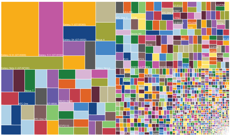
Image 1.0 – Android phone Release and Sales

What’s the first impression one get’s by looking at this chart? Wow! that really looks cool. A famous idiom “A picture is worth a thousand words“, which tells complex ideas can be depicted using a single image. Any clue what does image 1.0 depicts?

The viz is a snapshot of Android phone release and their sales. The treemap depicts multiple things, by going from right bottom to left top of image 1.0 the size of each rectangle indicates the market share of an Andriod phone model, that signifies the dominance of a specific model and company which has several phones in the market.

Background on Treemap, this is a type of information visualization which is used to display hierarchical data using nested rectangles.

The best part of this viz is that a layman can a understand that Galaxy s3 was having lead in the market but there were many android based phones which cover at least half of the market. If we try to show the same information in a pixel perfect report it would have occupied at least ten pages.

To be very honest, without any description or brief about the viz it would be quite difficult to digest as it has lot’s of information compressed. To better understand or viz this data I would first try to understand who are the audience? How much data do they want to see? What is the granularity at which they want to analyze? Once we have all this question answered, we can decide what is a suitable chart or graph to represent data. For an instance, let’s say a sales guy from Andriod team wants to use this data. Now, we can start thinking what would be the best way to show data.

For an instance, let’s say a sales guy from Andriod team wants to consume this data. Now, we can start thinking what would be the best way to show data. I would create three buckets of all the Andriod phones and classify them as small, medium and large segments and assign a market share of <10%,>15%,>30%. By using this technique a user can better analyze the data which is present in the right half of image 1.0.

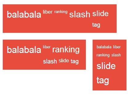
Now we can viz these buckets in many ways, First way: Use word cloud for all the three buckets and portray in a single frame. In this viz all the major companies each segment can be evidently showcased.

Image 1.1 – Sample word cloud with three segments

Second way: Using bar charts and the same concept to split data into three segments. These

Image 1.2 – Sample bar chart by splitting data into multiple segments

As we discussed before, more information in a single viz which cannot be digested easily doesn’t solve our purpose. So, it’s better to enable drill downs to navigate to more detailed information from a main viz.

To conclude reports or charts like image 1.0 are visually attractive but they don’t fulfill business needs and decision making information.

So, Now you can comment whether you’re interested in Infographics or Artifacts?

Reference Article for Treemap (Image 1.0) – https://www.theguardian.com/news/datablog/gallery/2013/aug/01/16-useless-infographics#img-6

Paradox of Choice

Pooja Kotian

Excellence is never an accident. It is always the result of high intention, sincere effort, and intelligent execution; it represents the wise choice of many alternatives – choice, not chance, determines your destiny.

-Aristotle

In today’s world, options are not something we lack. Years of research and ever growing technology have given us the luxury of doing complex things in just a few clicks. The same applies to data visualization, multiple tools have been built to help us create charts which were a tedious task in earlier times. But is more actually less? Lets take the below figure as an example to further discuss this:


The above chart uses the dual-axis combo feature that tableau provides.Tableau makes data visualisation a cake walk. It provides many features making it easy for users to build charts , graphs, etc. But making the right choice is the key.

What is interesting about the chart is how it clearly distinguishes its data. Reading into the chart will tell you what it’s trying to tell you. It answers the two of the main description question : What (furniture, office supplies, Technology) and When (year 2011 to 2014) and explains how much sales were or discounts given for those products over time. However, is this the right choice of presenting the data?

While the graph tells us quite a bit, some pieces still remain unknown leaving the viewer puzzled. It fails to answer us ‘Who'(which company) and ‘Where'(location). All we can say is that the company sales were x dollars in a particular year and discount percent in that year was y%. Also the time axis seems repetitive, simply using different colours for different products would make it simple and precise.

There are many more ways of representing the data in a more effective manner. But what to choose will always remain the question. When we have technology by our side we often tend over complicate stuff. In the above example, a simple method of having two graphs (one for sales and one for discount) side by side would do the trick.

In conclusion, I would like to say that there may be multiple solutions to a data visualisation but what we choose must serve the purpose in the most effective way. The data visualisation must be truthful and functional while being beautiful and insightful and most importantly be enlightening. The audience must be the key factor of our decision making process.

Sleep Habits of Geniuses

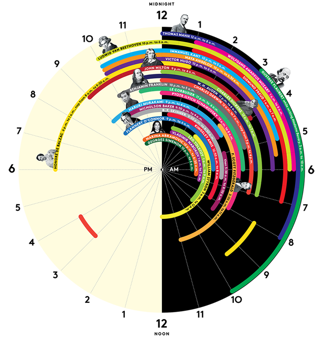
Usually any visualization or an infographic is created with intent to give the audience a one-shot view of the subject matter, then the content associated with it elaborates the first level view. However, some charts fail to communicate the information effectively. The chart considered for this blog is an example of such infographic.

The above chart depicts ‘sleep schedules’ of geniuses. In terms of my comments, I would start with things I like about this graph, then things I didn’t like as much and ways to improve it.

Some of the things I like about this visualization are:

  • The color distinction of black and white for the AM and PM times is very apt, that way audience can quickly notice the change in time.
  • The round shape resembles shape of the ‘clock’, this shape helps quickly visually associate the numbers with hours.
  • This visualization is insightful, gives out new set of information and combines it in one visualization

Things I disliked about this visualization are:

  • I would say this visualization is not aesthetically pleasing. Though the color selection of hours is good, the schedules shown have many colors and in some cases, the same color is used to depict schedules of two different people which creates some confusion. For example, one may think that there might be some link between those names.
  • This visualization can’t be termed as Functional, it contains a lot of information but it’s not conveyed effectively. Additionally, this visualization does not intuitively show any comparison between sleep habits of these people and doesn’t help readers infer anything.
  • For few people, faces are attached the information while few people just have names written which creates some visual inconsistency.

Better Way of Representation:

I believe, a better way of representation could be the one where differentiation or variation in the sleep times is immediately visible. A timeline chart/ Gantt chart may be a right choice here. (currently, as there is a lot of information reading the various rings is very difficult). Alternatively, in a timeline or a Gantt chart, Every column  would be associated with an hour in a day and every line item would correspond to an entry of sleep schedule of a person in hours. Every line item would also show Name of the person on the side. This way a clear association between the name and hours will be established and this chart would intuitively bring out comparison in sleep habits of different people .


Reference: http://junkcharts.typepad.com/.a/6a00d8341e992c53ef01a3fd25a481970b-pi

Small Talk, Big Data

– Krithika N.S.

http://hiase.com/uber-no-boys-club-tech-companies/

Silicon Valley tech companies often occupy meaningful positions in annual “best companies to work for” lists. They’re known for their young workforce, inclusive and liberal work culture, and great pay. But, one aspect that even these tech companies struggle with is gender diversity. In recent years, a number of these tech companies have begun addressing this issue by quantifying their gender diversity data. Google released its data in 2014 shortly followed by other companies such as Facebook, Twitter, LinkedIn, Apple etc. The most noticeable aspect of this data across all of these companies is that women are significantly under-represented in engineering and leadership roles.

Uber went through a lot of turmoil several weeks ago when a female ex-employee wrote an explosive inside story about how women were treated in the company. This led to a series of efforts from Uber to correct their management of internal issues related to gender.This also led to Uber releasing a detailed report about the gender breakdown and the racial make-up of the company. The above article goes into Uber’s gender breakdown report and discusses one aspect of it. The chart in the article illustrates the percentage of female employees in major tech firms. It presents Uber as having a slightly greater percentage of women employees than other valley firms but, broadly matches their trends.

From analyzing the chart, the following come to one’s immediate attention.

  1. The chart is represented as a 3D bar chart. While a 3D illustration may give the chart more sparkle, it often gives a distorted view of the data. It wasn’t necessary to do it here as the dimensions of the data did not require an extra axis. A simple 2D chart would have done the job for the reader.
  2. Communicating what the chart represents is a key aspect of data visualization. The labels in the chart occupy a significant part of this. The chart under consideration has three labels, namely, “Series 1”, “Series 2” and “Series 3”. Very little effort is made to explain what those labels mean. While this may make sense to the more data-driven audience, often times, readers are outside of this demographic and this labeling appears confusing to an outsider.
  3. The chart in the article does not appear to take any chronology or timeline into consideration. Absolute time adds a lot of meaningful information to visualized data and the reader is deprived of this information.

Doing It Right

While researching data sets related to gender diversity, I stumbled upon another very elaborate, thorough, and functional graph that is presented in the link below. Doing the above analysis correctly would correlate with the below graph in a lot of ways.

http://www.informationisbeautiful.net/visualizations/diversity-in-tech/

Some of the ways in which the data has been interpreted and presented better are,

  1. The percentage of men and women in the workforce has been illustrated in a stacked bar which appears easier to understand for comparison.
  2. The graph appears easy on the eyes making the important data simple to decode.
  3. The demographic information has been clearly labeled by year which does not require additional effort from the reader to decipher.

References:

https://pxlnv.com/blog/diversity-of-tech-companies-by-the-numbers-2016/

https://www.gooddata.com/blog/5-data-visualization-best-practices


Behavioral analysis of social networking users

Since data visualization is a powerful tool and we all like to see our curiosities about some topics into a visual reality. I wanted to explore data available on social media. Social media has proved itself very influential in one’s life, politics, entertainment, media, economy, terrorism, e.t.c. While exploring on some interesting charts, this one caught my eye as it looked very beautiful to me and instantly because of these vibrant color, I was able to relate it to Social Networking because it totally illusion a so-called “COOL” factor. But think of these marketing managers who are striving hard to beat their competitive companies and cutting out budgets for deciding an appropriate campaign for such big industry.

http://visual.ly/global-map-social-networking-2011

About the chart:

This chart on visually is actually showing results from analysis of behavioral data which was gathered through some detailed questions to differentiate among users basis on how they use Social Networking. This dashboard is published by Global web index who collected number(millions) of active social networkers from all markets(Countries worldwide) and segmented them into three categories. It differentiates users on how they use social media among 3 categories below:

1. Messages and mailers
2. Content Sharers
3. Joiners and creators of groups

The chart shows a global map of social media usage in 2011, which could help marketing managers to make strategies accordingly for different markets as the each market has users who use it differently, Author quotes an example of established markets US/UK whose users are more focused on messages instead of content sharing unlike growing markets like Indonesia/China whose users are more focused on content sharing and groups.

Why the chart is winsome:

1. A very important feature of this chart is its objective, which is fully justified from the dashboard. The designer has tried to fully justify the need for a marketing manager. Moreover, the use of a world map gives a whole view of the solution and here I mean by this additional bar chart showing global social network penetration. This bar chart enables us to easily figure out the potential of active users in each country and we can simply locate the target.

2. This Dashboard is beautiful to my eyes as it is not very clumsy and complex to understand. In addition to it, the author has used good colors to catch audience eyes. Use of horizontal bars to compare three categories is also very visionary as this makes the comparison easier.

3. However, the chart is not explaining the reason of how this is affected but it could be easily used as the prescription to figure out the potential of users.The chart enlightens me on how the usage could be differed and can make an impact as most of us use social networking regardless of thinking what exactly we are using or how we are using it.

Why the chart is off-putting:

1. As my first impression of the chart was a beautiful world map, I instantly assume that the circles representing each country are located on their actual location. However, this is deceptive here!
India, HongKong, France e.t.c. are not at their place which arises a question on the need of a world map chart.

2. Even the size of the circles is misleading, I presumed that the circle size is related to the market establishment/market size but it is the number of active users which made me feel that this information is presented redundantly. There is no information which can talk or compare the market establishment as the author mentioned in his statement.

What do I want to change in this chart:

1. I feel that circles must represent the market establishment (e.g. for US/UK) so that the audience can potentially mark the growing markets which are a very important metrics for marketing people.

2. Also, I would prefer a bar chart showing countries on Y axis with three horizontal bars comparable among each other and also with other countries. For example, a direct comparison among mailers category between China and Malaysia would be easier that way.

3. Although, we just started the course in the dashboard but I would like to have interactive charts for such cases which could be more insightful and could use filters to focus on certain metrics separately to catch more attention from audiences.

References:

http://visual.ly/global-map-social-networking-2011

Number of locations of In-N-Out V/S McDonalds

Introduction

McDonald is one the largest fast food chain introduced in 1940. Though it might be the largest, it’s not as popular as In-N-Out which was introduced in 1948. In-N-Out is located in most of the western part of United States and is not likely to expand towards eastern part sooner. Personally if I have choose between McDonald’s and In-N-Out, I would always give heads up for In-N-Out. They deliver the best burgers without using any preservatives. It’s fresh, cheap and employees are customer friendly.

Explanation: Business and Marketing Operations

First, all In-N-Out branches are private family owned and not franchised. This helps them maintain control over food quality and cleanliness. Second, they follow the policy of Make-To-Order and have no freezers and microwaves ensuring quality food is delivered to customers as and when the orders are placed. Serving only fresh food minimizes the kitchen equipment reducing the capital expenditures. They have limited menu and can entirely rely on fresh ingredients reducing wastage. Customization of orders are respected which means they never say no to customers. Third, every store is located within 500 mile radius of patty making facility and distribution center. It’s not unusual to say that, the taste gets inconsistent but the quality always remains consistent! Even the employees are paid better, $10.50 per hour and are provided with better benefits.  These are some of the factors which explains the reason behind lesser locations.

On the other hand, McDonalds follows franchise model. They have a wide range of menu with Make-To-Stock policy and very few common suppliers. With Make-To-Stock policy the process of delivering food becomes faster. To be precise, it’s lesser than a minute as they do not entertain order customizations. Employees are paid around $9 per hour. These are some of the important factors which explains its number of locations.

How visualization could be improved?

The whole idea of visualization is that it should convey more in less. The visualization shows the number of locations In-N-Out and Mc Donald has in two different bar graphs. To make it more effective, I would join the two bar graphs and compare the number of locations state-wise. The circular graph is redundant, even though it depicts number of locations city wise marked in same color if they belong to the same state. Instead, it could be better to incorporate these cities in bar graph. Also, geographically, Mc Donald’s locations should be shown along with In-N-out. Depending on the number of locations every state has, it could be shown by different sizes of circles. For example, if a state has bigger circle it means there are more burger locations.


References:

Visualization can be found at: https://www.linkedin.com/feed/update/urn:li:activity:6256732224734011392/

http://www.huffingtonpost.com/2013/02/25/lynsi-torres-in-n-out_n_2759920.html  

https://rctom.hbs.org/submission/in-n-out-the-freshest-friendliest-fast-food/

https://www.linkedin.com/pulse/in-n-out-burger-tableau-dashboard-nick-manley

https://www.bloomberg.com/view/articles/2014-10-02/in-n-out-doesn-t-want-to-be-mcdonald-s

http://www.triplepundit.com/2014/02/n-can-pay-lot-minimum-wage-cant-mcdonalds/

http://www.businessinsider.com/why-in-n-out-burger-wont-expand-east-2015-4