MVP Debate


If you are interested in who is going to make teammates shooting better in the regular season, this picture may give you some clue. X-axis shows the usage rate and Y-axis shows the true shooting percentage. Evidently, Curry does much better than other key players.


This picture also shows Curry, James and Westbrook have big influence on their teams, while Harden and Leonard does not. After you reading those two pictures, do you really want to change your mind for voting Curry but not Harden?

Data is not deceivable, but the man who made it is deceivable, because he must have the “Goal” or “Point” before starting drawing the picture, the title of the article is “The case for Curry the MVP”, also you can find another article called “The case for Harden the MVP”. And so on so for. If you really want to make a “fair” decision on voting the MVP, you may need couple of days or weeks to research huge amount of data, analyze them from varieties of angles and make conclusion. And even if you can do this, do you really hope every fan would do the same things as you? Impossible. In fact, Fans get used to easily understood data such as raw data (points, rebounds, assists) to pick up MVP, that’s the domain they agreed (At least most of them). Althrough these reports are really good, telling stories from different angles, they are not convincible to different groups of audience. I like those reports and you can say I am the audience of the article, but not all of us. That’s what I want to say,  certain analysis report only suitable to its certain audience.

Source: https://fivethirtyeight.com/features/the-case-for-stephen-curry-mvp/

The Case For James Harden, MVP


What happens in an Internet Minute?

I still remember my childhood days that were full of joyful moments coming without any smart phones or similar technical appliances. Yet, it is hard to believe how soon technology has captivated the world over. Not a single moment passes by when we aren’t hooked on to our iPod or lazing around with an X-box or even chatting over the phone.

This visualization depicts just how expeditiously social media has surrounded everything we know about. Data shown here only goes on to prove the basic claim of how majority of our time is spent over the wire. This visualization shows all popular social media platforms and their impact on us. One can easily feel the current numbers to have increased at a rapid pace and even though they increase day by day yet it is impossible for anyone to foresee or predict such numbers for the future.

What I really like in this visualization is how quickly it gives you a glimpse of 16 popular applications and how vast they have become today. Most of us have been using such apps for quite some time now while forgetting just how much everyone around us are equally hooked onto them as well. Hence, talking about such huge numbers enlightens us to see the impact internet in general has over us.

Despite getting the message loud and clear it still lacks a few fundamentals. Firstly, there should be additional numbers to show the percent increase in users from last year that goes on to help us understand the pace of change. Moreover, it could also have shown the country where each app is most popular in, giving us an insight as to how different apps are favored by different cultures and what may become a trend for the future. These numbers are certainly the average usage of each app computed in a minute however, it could have been more useful had they differentiated it with respect to different times of the day just to follow what time suits most people the best. Also, real-time updating of these numbers, even though it is quite a tough task to achieve, would have given a new depth to this dashboard.

To conclude, we can see how visualization concepts and tools can be used to depict anything in a powerful manner. Users should not only be able to make sense of the message being delivered but also use different measures to extract meaning out of each dashboard.

http://www.onlinecollegecourses.com/2009/12/07/50-excellent-scholarly-literary-criticism-blogs/

Christmas Chaos

This infographic is designed to convey information about shopping and gifting trends over the holiday seasons in the years 2004 to 2015.

http://visual.ly/christmas-and-new-year-holidays-around-world

The entire infographic is full of badly executed visualizations, but I am going to pick one bar chart in particular to comment on – “Per Person Holiday Spending” which shows the average per customer spend over the years 2004 to 2015.

I liked a few things about this chart –

  • The title is bold and clear, the user understands immediately what the chart is about. To that end, the designer has made all the titles bold to make them pop out and be effective.
  • The x and y axes units are uniformly scaled with 1 year increments and 20$ increments respectively.

Things I didn’t like about the chart –

  • COLORS – The colors are neither uniformly used nor visually pleasing. The designer has used 4 different colors in no particular sequence. On first glance, you think that a certain color (red for instance) means something in terms of year or amount being spent when it has no meaning at all. The colors have been randomly placed for each year.
  • 3D BARS – 3D representation of this bar chart was unnecessary. If you look closely, the top of the bars are not uniform – the viewer’s perspective is skewed. Although this does not affect any information being communicated, it is an eye sore and adds to the overall visual chaos that this chart is.

Visualizing “Disasters” through the lens of interactive dashboards!

Mishita Agarwal

Dashboard: https://www.fema.gov/data-visualization-summary-disaster-declarations-and-grants

Introduction
This interactive dashboard presents visualizations of federally declared disasters in the United States since 1953. It also visualizes the disaster assistance and preparedness grants from Federal Emergency Management Agency (FEMA) released in these disasters since 2005. All the information is provided for national as well as state level.

What is most appealing….
Interactive dashboards are the best way to showcase visualizations when huge amount of data is to be shown across wide span of regions.
The most appealing feature of this interactive dashboard is its user-friendly interface. It provides the right amount of information at every step without overcrowding the page by letting viewer click for additional more granular information. It enables viewer to filter the information based on categories and sub-categories by just one click.

The highly interactive nature of this dashboard makes very easy to dig deep inside the data and to observe pattern of disasters in various states, which otherwise can become very complicated to observe in static dashboards. Overall, this feature can simplify search to a great extent and can make a user experience very pleasant.

Geographical map given on the top is a very good way of showcasing states. One could select a state and visualize the disaster patterns. It also makes the visualization of disaster easy across regions such as I could find the disaster patterns in the Eastern most state or Northern most state, which otherwise could become difficult if I were to select a state from a drop-down list.
Bar-graph is an effective tool to visualize the disaster type and the frequency of each disaster in a selected state. It makes visualization furthermore easier by providing information of declared disasters across counties in a state.

As we select any state, the line-graph chart of declared disasters across years gets updated automatically. Line-graph is a very effective medium to analyze the temporal pattern of disasters.
Finally, when the viewer scrolls down, the information of grants provided in the disaster categories is shown by the bar-graph through which one can easily analyze the amount spent in every category such as fire incidents, preparedness, etc.

But still there is a lot of space for improvement……
I think the data provided in the excel sheets does not match the visualization numbers. For example, as per the excel sheets 2820 Fire incidents were reported nationally, however, visualization shows only 989 Fire incidents. Similar differences are there for other categories also.

Next, as states acronyms are not provided on the map, a person who is not aware of USA map has to move the cursor around the map to find a desired region. Supplementing map with state acronyms would make the filtering process easier and quicker.

Also, I found that though each category of disaster was divided into subcategories, which helps us to know more in detail about the type of a disaster, the description given of that sub-category given is very complex, and it does not give us any information about the actual reason of that disaster. For example, the disaster “Fire” is further segmented into “Angel Fire”, “Eighty-two fire”, etc. It seems that all these terms are tied with some special characteristics like place of an incidence, type of resource etc. But the visualization does not give a clear picture of reasons behind a disaster; such as Fire incidents can be “household-fire”, “human-caused fire”, etc. Tying incidents with their cause can be very useful for preparing to work on the root cause of the incidents and prevent their occurrence in future.

The year wise map becomes very cluttered when we keep on clicking on “+” sign to go to a more granular level such as quarters and months. So, there should be a separate bar graph to show the month-wise pattern of disasters. The benefit of this would be that it would help FEMA to identify if there is any relation between any type of disaster and particular month. For example, the very high frequency of non-severe storms in any month would alert the agencies to take immediate measures to prevent any major disaster to take place.

I also feel that the visualization could have been better if colors were used to depict certain properties. In general colorful visualizations tend to be more attractive and effective than black-n-white ones. For example, the five types of grants could be shown with different colors on the bar graph that plots yearly total grants with each bar containing five color regions corresponding to the five grants and the length of each region proportional to the amount of the grant. That would help a viewer to compare all the five grants with each other for a particular year on a single plot.

Though the disasters are given from 1953, the grant data is available only since 2005. So, does it means that FEMA, which was established around 34 years ago, started providing grants only from last twelve years. This is important to know because there could have been several states which were most vulnerable to disasters but did not receive grant in any segment.

Conclusion:
Overall this interactive dashboard is very useful and provides a complete story of disasters and the grants. The icons used at the end are effectively conveying the message of supporting the community’s emergency management efforts. However, the weaknesses should be addressed to make it more effective as this dashboard is from a government website, and lot many people refers to visualizations posted on their websites.

“A disaster is a natural or man-made event that negatively affects life, property, livelihood or industry often resulting in permanent changes to human societies, ecosystems and environment.”

Screenshots to visualize some errors and plot of additional visualizations:

https://docs.google.com/a/scu.edu/document/d/1OoptzYIJp6VE1zDJtxiVI_TDjI6pBPl-j5Y3-UZKRNw/edit?usp=sharing


NFL Ratings Graph

This graphic is a bar chart designed to show the NFL viewership trends over the past four seasons. This chart shows the combined number of viewers of the first eight weeks of the 2013-2016 seasons of the four major networks (Fox, CBS, ESPN, and NBC) for three different age demographics: 18-34, 18-49, and 25-54 year old adults. The point of the trend is to illustrate a few general, big picture points. First, that NFL viewership really has been going down as of late. Second, this trend is actually not a new trend, and has been going on for at least three seasons (which means that certain controversies that occurred right before the 2016 season are not solely to blame for the drop in viewership.) The graph also shows that the NFL appears to be struggling with the age demographic considered to be the most valuable (18-34 year olds). The graph is also designed to lead into several more detailed graphs that are placed later in the article. The graph on it’s own is not trying to give arguments as to why less people are watching the NFL, and is designed to supplement the main article, which does provide some possibilities.

Before I go on, let me address some immediate questions that might come up while looking at this visualization. This graph is only focused the viewership by age groups, and does not break things down by other factors, such as gender and race. However, this is because this and a separate article do feature bar graphs that focus on these factors. However, I will only be focusing on the first bar graph.

One thing that the graph does well is that it remembers to start the y-axis scale at 0. From what I understand, one of the main mistakes that bar graphs do is to start the scale at something other than 0, which can make things look different than they actually are. For example, if the graph had started at 3000 viewers, then the 18-34 viewership bars would be super short, which would give the impression that this demographic is not important (even though it is)

One of the things that this graph does well is that it has visual clarity. I like that the viewership numbers are not all on top or inside each bar. Instead, the graph stacks the numbers, which prevents the numbers from crowding one another out, and keeps things clear. By having the numbers, it also makes it much more clear that the numbers are actually declining. For example, if the red and green bar in the 18-49 portion did not have numbers, one might think that viewership did not change. I also think that the graph, for what it’s trying to do, does convey it’s information well enough. It makes it clear that for every age demographic, less people have been watching in each consecutive season (although only using the first eight weeks, where the games might not be considered as important, could make the graph not as accurate as it wants to be).

The most obvious criticism of the graph is that there is an overlap between the first and second demographics, and an overlap between the second and third demographic. This adds some confusion to the graph. If the graph is trying to compare the drop in viewers by age group, then this graph is not clear. In addition, as mentioned before, this graph does not do a good job at letting the audience draw any conclusions as to why viewership is down.

If it wanted show this, it would make sure the age groups were separate, without an overlap. I also question why the visualization is not a line graph, as the point is to track a trend over four years. The line graph could have three different color lines for each age demographic (no overlap), and the weeks of each season on the x-axis. I would also try to compare the viewership totals for other sports, so that there is some comparison point for the NFL. If NFL viewership is still much higher than that of it’s competitors, than the drop in viewership might not be as much of a problem


The NFL’s ratings are down – but just who exactly isn’t watching anymore?

Blog 1: “Tips & Tricks to Avoid the Crowd”: Data for Introverts

https://salankia.shinyapps.io/satRday2016DataViz/

This Dashboard was a part of a visualization challenge called SatRdays, a part of a regional Europoean Conference (http://satrdays.org/).

As an introvert, there may be several factors that influence decisions you make when you travel.

This dashboard has a couple of different visualizations to help the traveling introvert guarantee that he or she will have the least amount of crowd interaction. The designer has highlighted 3 main areas where one may encounter crowds when traveling through airports (direct flights from Belgium):

  • traffic to connecting airports
  • utilization of planes
  • seasonal impact to travel

This data could also could be useful to anyone interested in optimizing travel time.

———————–

(entire viz cannot be seen in screenshot, visit: https://salankia.shinyapps.io/satRday2016DataViz/ for the complete view)

Images didn’t insert into the blog, use link below to view:

https://salankia.shinyapps.io/satRday2016DataViz/

———————–

This dashboard presents a lot of data. As a user, I can pick an airport that is less crowded, cross check my selection with plane utilization, and then see how  seasonality would further impact my trip. The data is separated on different tabs and filters can be made independently which allows for independent analysis. The user is presented a lot of good information that could help influence decisions, such as average number of people on planes leaving Belgium as well as trends to destination cities from Belgium.

——————————

It is up to the user to keep track of all selections. A way to improve this would be if filter values (or user choices) were global—if one selection is made, it changes everywhere.

For example if I made a selection on the connecting airport tab then it should show me corresponding utilization.

The data could be shown all on one tab, displaying all data at once providing the user with all the information at once in one place. The user wouldn’t have to keep going between tabs.

The designer also could also be more consistent with color, it is hard to tell just by looking – it looks like it is based on value, but assigning color to specific countries might make values easier to spot even if the layout of the data is different.

—————

Taking this a step further looking at traffic at origin airport (Belgium) , terminals, airports and additional factors could be examined for crowd factors.

Just save the pies for desserts

The charts are there to help us to understand more about the data. But it’s so easy to design a bad visualization. In general, the point of charts is to make it easier to compare different sets of data. The more information a chart is able to convey without increasing complexity, the better.

The primary strength of a pie chart is the part-to-whole relationship, however, pie charts only make it easy to judge the magnitude of a slice when it is close to 0%, 25%, 50%, 75%, or 100%. Pie charts visual attributes is hard to compare.

Here’s a pie chart of the party breakdown of the European parliament:


Can we really compare the slices to figure out the distinctions in size between each and every pie slice? The only thing that is obvious to us is that the EPP and S&D are bigger than any other pieces. And the color of each individual slices are very similar, make it very hard for users to match the label to each slice.


Moreover, people love dressing up their pie charts today. Adding a third dimension of depth to the picture, throwing in some lighting effects and contoured edges. It’s pretty and eye-catching, but is it more meaningful or easier to interpret? Actually, by adding depth to the pie and changing its angle, we’ve made it more difficult to interpret. People do this all the time, and that’s because an angled 3D pie chart is an excellent way to lie to you.


Looking at this chart, S&D — the red party — appears to be roughly even with EPP, the teal party. It looks greater than it actually is, because of the depth that’s been added. The slices are now more difficult to compare, because the angle skews their appearance.

If we take out each individual slices, will that make it easier to compare each individual slice and figure out an ordering from largest to smallest? The reality is, humans aren’t very good at comparing slices of a circle when it comes to size.

Dashboard is to present information in a way that can be quickly read and easily understood. Bar charts makes it better to compare the magnitudes of each part.

Here is a bar charts of the same date. You can compare each and every party to each and every other party.  You’re just comparing the length of rectangles in order to understand what’s going on.

If a bar chart is doing its job, you shouldn’t have to struggle. Just save the pies for desserts.

Reference:

http://www.businessinsider.com/pie-charts-are-the-worst-2013-6

The Worst Chart In The World

https://www.perceptualedge.com/articles/visual…/save_the_pies_for_dessert.pdf

Save the Pies for Dessert

Blog Post 1: Paid Paternity Leaves across countries.

Source

Description:

This visualization was part of a Forbes article- Why Paternity Leave Is Just For The Rich. It is relatively a simple visualization which attempts to show the number of paid paternity leaves across different countries with USA being in center. And noticeably, there are no paid leaves granted to new fathers in the US.

It can be called variant of a pie chart with slice sizes being indicative of the number of leaves; more the leave duration, bigger is the slice size.

Critique:

Things going well:

  • Clarity: With country names and leave duration clearly mentioned, the visualization is quite clear in conveying the information it intends to.

Things not going too well:

  • Consistency: It misses out on consistency with respect to following aspects:
    • Leave duration: Some leave duration are in months, some in weeks and the rest in days.
    • Country representation: The purpose of putting US in the center of the graph and all other countries around it is unclear. Does it mean that the US provide no paid paternity leaves?
    • Color scheme: It could have been per country instead of duration. UK, Denmark, Australia, Venezuela, and Kenya seem like part of one country.
  • Completeness: There is no mention as to why only these specific countries are present, this makes the information seem incomplete.

Redesign:

https://docs.google.com/a/scu.edu/document/d/1z8GG1ZDTENt-xmmc2cfFNu2yZydmGPUBCBSic7LeqSM/edit?usp=sharing

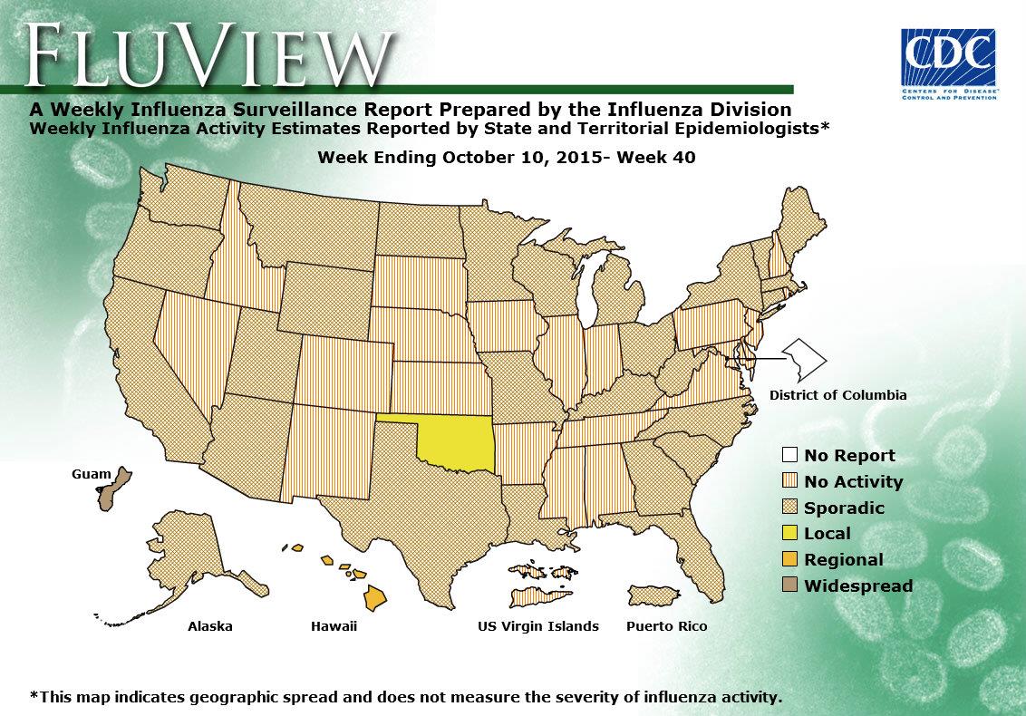
CDC FluView

https://www.cdc.gov/flu/weekly/WeeklyFluActivityMap.htm

CDC chart shown here is to show the spread of flu at a given week over USA territory state by state. It has various levels of spread from no activity to widespread. Washington DC is the only one entity that has no data reported. I think in general this visualization does what it was made to do however there are  few drawbacks.

  1. Presentation of the chart itself: if you have noticed the chart dates back to week 40 of 2015, why is this particular date? Well it is simple that is the chart that you get when you click on the link of the smaller current chart named “View Larger”, so instead of current spread levels you expect you will always get this chart (week 40 of 2015). And if you not careful you will take this chart as being current.
  2. Colors and patterns: they look a bit confusing some are patterns some are colors and they represent levels (a scale which is better represented by commonly accepted standards green to red or light to dark) , without reading the legend it is hard to understand and after reading the legend it is hard to remember which means what. With that being said even reading a legend and remembering doesn’t help much if you look at the chart from the distance (graph presented on projector), it is hard to tell sporadic from widespread in some situations.  Also when looked up-close on the monitor patterns create some kind of visual artifacts that causes eye discomfort.
  1. Explanation of various levels of spread are not clarified on the page where graph appears and requires some link clicking and navigation to find.
  2. Usefulness of the visualization; the graph does what it says it should do but is it as useful as it can be? It repots spread levels by state, but it is not very realistic viruses don’t stop on state borders and in real life the spread is more of a gradient rather that level shift along the state border. Also this map is not very informative when levels are local, regional or sporadic. For example: California is pretty big and prolonged state so having local flu spread in San Diego and having no activity in Eureka is more than possible. So knowledge of local activity is not very useful for people within the state, and CDC probably does have this data.

So instead of doing state by state they can do a grid and use hotspots, but then it will be a different visualization.

Flight Patterns

We will not be able to make sense of this endless ocean of information, unless we pay attention to the basics of handling data and presenting them in aesthetically pleasing ways. Aesthetics is what makes this visualization stand out.

However, designing this visualization is not as easy as it looks. Ample amount of experiments and researches have led to the visualization that we see here.

The Flight Patterns visualizations are the result of experiments leading to the project Celestial Mechanics by Scott Hessels and Gabriel Dunne.Here is an example of beautiful visualization that can be produced using the processing programming environment.

Flight Patterns

It’s easy to forget just how many planes are in the skies above us but this visualization reminds us of exactly that and effectively maps the traffic between the various cities of United states. Data from the US federal aviation Administration is used to create animations of flight traffic patterns and density. FAA data is parsed and plotted using the Processing  programming environment. The frames were composited with Adobe After Effects and/or Maya.

The visualization shows flights as glowing dots on a black background and its interesting to see how the geography becomes visible as more flights paths are drawn. This visualization allows us to see the frequency, connections, and opacity of the trails that the flights leave behind as they crisscross around The United States of America. At the very glance the traffic density in and around United states can be captured through this visualization.

However, there are some fundamental problems with this visualization. To start with there is no text or legend representing what the visualization is about. There should be a mechanism to measure or differentiate on the basis of color, thickness, and degree of shading of the connecting lines. Secondly further details regarding the aircrafts or the altitudes etc. cannot be figured from the visualization. The goal here is to facilitate reading and you are forced to justify all your options so as to make it sensible for the viewers.

So, dashboards hold a lot of promise to make sense of the world around us, but only if we think through what data goes into them and how the visuals we are building need to grab our audience. A highly efficient visualization should provide real-time updating, interactivity, and collaborative features. User should be able to decompose charts, drill through measures, zoom in or zoom out on time lines and reveal new things.
References:

http://insights.wired.com/profiles/blogs/lost-in-visualization#axzz4eA6OxVBc.

http://users.design.ucla.edu/~akoblin/work/faa/index.html