From Clutter to Clarity…

Visualization is a powerful tool that can help tell a story, simplify a complicated data set and make it easy to identify patterns behind those complicated numbers through visual representation. However, if not used judiciously it can very easily over complicate simple things. Visualization is a means to an end and not an end in itself. The goal is not create a stunning visualization but to create a visualization that conveys the intended meaning and in an effective way. The  key word is: “EFFECTIVE”

Designing an effective data visualization comes down to a lot of small details that can be the difference between an effective or a lousy visualization. Attention to detail, identifying and understanding your audience and making sure the various elements are aligned and consistent are some such details.

http://s32.photobucket.com/user/nsrivastava/media/Blog2_image_zpsypuxv39s.png.html

figure 1. Viz_1

The above example can perfectly describe the meaning of overuse of visualization tools available at one’s disposal. The above image intends to show the number of paid paternity leaves guaranteed to people in a given set of countries relative to US, which has none.

However, there are multiple issues with the above visualization which makes it ineffective. Let’s examine the following three major issues:

  1. Clutter

Clutter means over complicating things when there is no need. In the above example the different sized pie chart pieces do not add any value to the visualization as they do not provide any new insights that are not otherwise available. Its just adds to confusion diverting the audience’s attention.

  1. Color

Color can be used in a number of ways to convey a point, provide emphasis or compare and contrast different data points. It can also be employed to direct your audience’s eyes to where you want them to go. Color should be used strategically to drive across your point and  not to simply beautify the visualization. In the above example, the color instead of making things simpler is complicating it. On first glance, the orange color representing Australia, Venezuela, Kenya and Denmark makes them look like a single country. If one goes by color, it looks like there are only 6 countries being compared.

  1. Consistency

The data points regarding the guaranteed paternity leave changes from days to weeks. For half the countries the number represents weeks and for the rest, the number represents days. This inconsistency can lead to confusion. For example what does the zero in the center of circle with map of US indicates? Is it 0 weeks or 0 days? Also, representing US as a circle in the center while the rest of the countries are represented as pie chart pieces also indicates inconsistencies. It may confuse the audience into thinking that US is not a country or that it is in some way different from the rest of the countries. However, all that the visualization intends is to represent the numbers relative to US.

Following is an attempt to solve the above issues with a different interpretation of the same data.

http://i32.photobucket.com/albums/d27/nsrivastava/Blog2_img2_zpswgfbq5ip.png

Figure 2: Viz_2

This second visualization better represents the data for the following reasons:

  1. Distinct color for each country and a clear legends allows the audience to clearly distinguish each country
  2. The sorted bar graph clearly indicates US at the lowest level with 0 days of guaranteed paternity leaves with Iceland leading the pack with the highest number of paid leaves at 90 days
  3. The paid paternity leaves are represented in number of days for all the countries so that the information is consistent across the visualization making it easy to compare.
  4. The numbers on the bars clearly indicate the actual figures leaving no place for ambiguity or confusion.


References:

https://icharts.net/blog/data-expert-spotlight/data-visualization-essential-info-industry-thought-leader

http://viz.wtf/image/158594346945

http://www.flexmanage.com/2017/03/15/5-ways-for-powerful-data-visualizations/
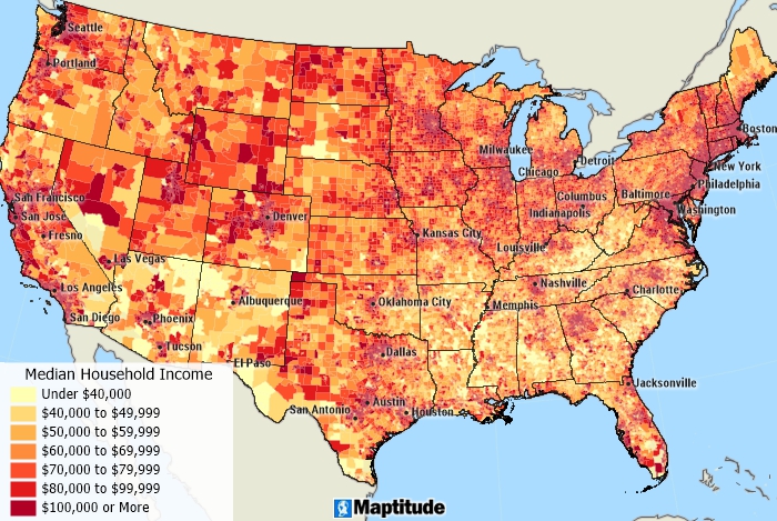
 

200 Years that changed the World

Bikram Patnaik

Visualization Link: Money buys Life

THE RICH LIVE LONGER EVERYWHERE, BUT FOR THE POOR GEOGRAPHY MATTERS’

Did it ever strike to you that the place our ancestors called their home could have been a matter of life or death for them? Today, everyone knows that rich people generally live longer than poor people because they can afford money to leverage hi-tech medical  facilities, but what about people 2 Centuries ago?

We will try to find answers to these questions and discuss if our main claim holds good by exploring this amazing interactive visualization.The visualization which we are about to discuss reviews data from 200 countries and compares life expectancy vs wealth for the past 200 years. The vertical axis shows the average life span in each country ranging from 25 – 85 years, where high up= long lives= good health, to the bottom= shorter life=sick. The horizontal axis shows the average income per person (GDP per capita) expressed in dollars per person per year, where the right=rich and to the left=poor. It’s interesting to see the usage of bubble chart for this, which is primarily used when you represent data that has three or more data series (In this case income, life span and size of the population) and each containing a set of values.

UNDERSTANDING THE DATA:

Let’s explore the visualization and understand it better. On the first look we can figure out that each country in the world is a bubble,the size of the bubbles represent the population size,color represents regions of the world (see on top right side). We start with circa 1800, all the countries had life expectancy less than 45 years and an income less than $4500. We can see that the United Kingdoms & Netherlands were among the richest countries but people in there had short lives. Underdeveloped healthcare systems and poor sanitation attributes to some of the reasons why all the countries had shorter life span and most importantly these acts as a warrant to our claim.

Now as we click ‘play’ the years start to roll in the world. Slowly income start to increase mainly in Europe and North America because of industrial revolution. As a result, they pulled away from the rest of the world. BUT, surprisingly health didn’t get much better. In 1900, only western countries were getting richer and richer and became healthier and healthier. Between World War I (1914) and WWII (1945) the difference between the rich and poor countries increase and it’s only after the WWII that most countries started to change in terms of wealth. The Arab countries became the richest and countries like China and India prosper as a result of their emerging economic growth.

Now in 2017, we observe a continuous world with high income countries (Qatar,Norway,USA) having a high life span and low income countries (Ethiopia, Niger, Liberia) have a lower life span, but interestingly all the countries are estimated to have more than 45 years of life expectancy, which only happens to be the maximum life of people in 1800. Though the difference between high income countries and low income countries are huge but their respective citizen’s longevity have come up significantly.

DRAWBACKS:

Undoubtedly the visualization is amazing in itself, but there are few snags which can alter the statistics if taken into consideration. First, the data collected are only with respect to inter-countries. But what it doesn’t include is the scope to look at the differences of incomes within the regions of a given country which would give insights to it’s growth/downfall. Second, while talking about population size of any country we only take into account it’s current citizens but there is a significant inflow of immigrants in these country every year contributing towards the economy. So there is a high probability that it might give us a different picture altogether.

FROM A CRITIQUE’S VIEWPOINT: 

The number of different parameters presented on the interactive dashboard are overwhelming. For a new user it becomes hard and confusing, instead a simple drop down could be introduced to give the audience the flexibility to play around with their desired set of parameters. The vertical lines on the chart needs to be even spaced and the text for year should be at the top to avoid any kind of visual conflict. Also, while toggling on the ‘Map’ tab, it gives us an elliptical view of the globe and the bubble of each country doesn’t sync very well with their respective geographical location. This can be eliminated by displaying a flat world map view and being accurate about the geographical locations.

ALTERNATIVE APPROACH/MODIFICATION:

Though it’s visually appealing there are certain hiccups with this bubble charts visualization as well. It can be further enhanced and made simpler by adopting certain techniques.

  1. The bubbles are opaque in nature creating a problem to clearly figure out countries with smaller population size. So, as an alternative I would recommend to use translucency and highlighting the boundaries of the bubble. These are powerful tools for dealing with over plotting, as you can see this in below visualization.
  2. As we discussed earlier that the visualization doesn’t show the differences within a country, It can be modified by introducing an additional feature in which by selecting a country say United States, it will give you an overview of all the data values for the 50 states along with an appropriate color contrast. The modified version looks like the below visualization

CONCLUSION:

I feel that this kind of visualization is really helpful  when conveying a large amount of numeric information quickly to your audience but at the same time ensuring that viewers are visually literate. An important part of bubble chart visualization is to make sure that it is clear what each element of the chart means – color, circumference, how it fits on the scale otherwise the whole meaning can be lost. Similar approach/viz can be an advantage for organizations to analyze their financial sales with respect to their customer base. It will help them to come up with business metrics and promotional plans for their consumers.

Reference: Harvard Gazette, The New York Times 1The New York Times 2, MIT News

Smart City.. but not so Smart Dashboard

“Smart city” is no more a buzzword. With the advancement in technologies and devices communicating with each other, thereby generating huge volumes of data, we can render insights to help build a smart city. I came across such a smart city dashboard with feeds showing the current health of London.

http://citydashboard.org/ 

London City Dashboard

The dashboard shows obvious stuff, like weather information, pollution level and tube status. There is also a feed from twitter showing whats trending in London. There are chunks of other data like the air pollution level and the FTSE index. Now all these data looks good on a 10,000 ft level, but to better understand why this dashboard was conceptualize, we need to ask two important questions:

  • What goals are we trying to achieve by measuring all kinds of data?
  • What data will be most useful to citizens? And how to cater relevant data to right audiences?

The obvious answer to first question would be to have a common platform which provide its user access to important data. To be successful in its purpose, the portal needs real time feed of data. And I have observed several lags in providing real data feeds. As all these machines produce more data, how do we ensure that it can be readily understood and reused by all audiences.

Now let’s look at the other question. The essence of any dashboard lies in identifying its audiences. If the dashboard is used by the regular commuter, the subway data might be useful. They already know when and which train to catch, so even the running status should work fine; but for a tourist this data is useless. They would seek detail information about the subway service. I am also not sure how the FTSE index will be a good information. Below are some more limitations in the dashboard:

  • Too much information are presented in a small space and has ended up looking extremely cluttered and distracting.
  • Not all information are relevant to every group of audiences.
  • The color theme is quite distracting and serves no real purpose and this draw focus away from the data itself. Aesthetically the dashboard is not pleasing.
  • There are so many variations in the visualization style. There are boxes, line chart, temperature widget all in the same place.
  • There is no clear focus on any aspect. Audiences are actually seeing a lot of different numbers without getting much insights.

What can be done to make this better:

  • Identify what data is relevant and deliver it back to the relevant audience. One way of doing it is by giving the users to customize the dashboard as per their preferences.
  • Present some historical trends that could potentially help users when the dashboard is unable to get any live feed.
  • Improving the look and feel of the dashboard by using pleasing color, use of uniform visualizations and removal of unnecessary widget.
  • There should be a note to state briefly what each component do. This improves the overall usability of the application.

References: https://www.opendatasoft.com/2016/10/05/smart-city-dashboards/


Google search in China

Google has revolutionized the way we can search the content on internet. Offering a variety of services like Search, Maps, Apps etc. Google has made life easy for most of us. “Make Google your friend” is the favorite quote used by many. Though Google is well accepted name and a big brand company, its use and acceptance is restricted in China. There are many reasons (including political reasons) why Google has not succeeded in China. Recently I came across a blog where market leaders(in terms of revenue) in China for “Search” were shown. Author wanted to show how Google is NOT the leader in China. Here is the picture.

Google Search in China

What I like about this visualization

1] Clear numbers showing “Baidu” has 79% market share. Google is far behind (only 11.9 % share)

What I did not like about the visualization

1] No context – This shows the value in Q3 of 2014. However no information is published why 2014 is taken as a reference/context. Readers like me are kept in dark about Google’s performance over a period of time. Is it increasing or decreasing. Similarly what is Baidu’s performance over years ? Just one year’s data does not give us a whole picture. I feel this is incomplete information.

2] Is this Exploratory / Explanatory visualization – This diagram forgets one of the core principles of visualizations. User does not get any idea if this diagram just explores the data or it explains Google’s presence in china

3] Color selection – Red color indicates alert, alarms or bad things. Here “Baidu” which is market leader is assigned red color (which is surprising). After lot of thinking, I came to conclusion (which may be wrong)  – Since China’s flag has red color, and the owner of this visualization wanted to show strong presence of Baidu in China. Hence he kept same color as flag.

4] What does the ring shows –  Maybe larger rings shows higher importance. But in that case larger rings should be placed at bottom with smaller one’s on top

5] Inefficient use of space  – Reader knows that the blog is about China. So why to again show its flag? I think this is waste of space

I found one more bad visualization of the same data, which is shown below

Circle – Still not the perfect visualization

The above visualization has following problems

1] Shows the figures only for 1 year. No comparison over years.

2] Becomes difficult to compare values. Lot of space wastage (circle is empty in the middle)

How will I create this visualization

1] Data speaks a 1000 words – I will strongly prefer a comparative graph showing Google/Baidu performance over years. So my context will be stretched over a number of years. This will clearly show the increase/decrease in market share of different companies. See the below bar graph. User can clearly understand the performance of Baidu and Google over years. This clearly shows that Google is losing the market from 2012 onwards (16.2% in 2012 to 12% in 2014)

2] Less Space , more information – Use the available space wisely !

3] Color combinations – Use of standard color combination (clear distinction between Baidu and Google). I would still not prefer “yellow” for Google, but its much better than the above graph


References for blog- http://visual.ly/baidu-statistics-and-trends

References for blog – https://www.chinainternetwatch.com/7375/china-search-engine-market-q1-2014/

References for core principles of visualization -https://www.tableau.com/blog/stephen-few-data-visualization

State Tax Ratings

Justin Mungal

Tax is a powerful tool for implementing effective public policy.  Few legislative mandates share its efficacy in shaping, seemingly overnight, corporate behavior.  Inextricably, it is tied to the notion of the common good insofar as it pools society’s financial resources for funding that vision of social welfare and human well-being.  Aside from technological innovation, it stands as one of the greatest formators of our modern economy.  For that reason, there is large vested interest in shaping tax code and many a think-tank has arisen around the D.C. metropolitan in order to have a voice at that table of national discussion.

The Tax Foundation recently released its 2017 State Business Tax Climate Index.  Their visualization shows a map of the fifty United States of America color coded as blue for the ten worst business tax climates, orange for the ten best business tax climates, and grey otherwise.  Also, the individual rankings (1-50) are printed in white on each individual state.  The visualization’s goal appears to be to create a KPI based on the results of their study in which they rank states according to 100 variables grouped into the five categories of: corporate taxes, individual income taxes, sales taxes, unemployment insurance taxes, and property taxes.  The stated goal of the KPI is to enable tax policy makers to compare their state’s tax system to other American states.  The rationale for comparing state tax systems is that most business decisions to move based on tax incentives are intrastate decisions rather than international ones.  Thus, the ability to retain business stakeholders is based on the relative favorability of one’s state tax structure to another state’s.  Furthermore, by ranking every single state according to 100 variables, states can build themselves a roadmap to improvement based on the differences of tax structure in higher ranking states.

While the visualization is the poster child of the Tax Foundation’s report, I find it exceptionally uninformative.  Directly below the visualization they have printed the numerical rankings of each state.  This tabular representation of the same data is much more straight forward and easier to digest.  For example if I were a tax policy maker from North Dakota, ranked #29, I would have difficulty finding the next best state (i.e. #28) from whom I could learn how to improve my state tax structure.  Indeed, one must scour the map until finally locating #28 on the state of Mississippi.  Contrast this to the tabular data with its column of overall ranking, where the next best state is easily spotted (loading the table into Excel and filtering the data according to overall rank would make it even easier).  Indeed, I find no benefit to studying the visualization over the table, as the mapping of the data essentially scatters the physical location of data whereas the table organizes it.  The only benefit of the mapping is that it adds eye-catching color to the eighty-page report.

What I find most disappointing about the Tax Foundation’s visualization is that the report itself is very well done and informative.  However, skimming the internet for similar visualizations, I find the Pew Foundation’s:and Wallet Hub’s: maps of state tax data.


The Pew Trust Foundation’s map has more interesting bins by which states are colored and Wallet Hub’s visualization delivers a heatmap; both maps working interactively to show the individual state ranking when the cursor is place over the state.  While the Pew and Wall Hub reports cover different domains of data, they point out that a unique perspective on visualizing state tax data rankings is possible.  Comparatively, the Tax Foundation’s visualization falls short as it does not offer any new perspective on the table of data immediately below but rather obfuscates those same results for the purpose of soliciting “eye candy.”

Given that the Tax Foundation’s report is high quality, I believe there is room for optimistic hope that their visualization can be improved.  Moreover, I personally think that the table of results below the visualization is well organized and sufficiently summarizes their findings.  That said, I would add on top of that data another data set that would make the visualization illuminating.  For example, the map could be color coded to indicate the hottest states to which businesses relocated to due to tax incentives, with the original report rankings either being numerically printed as they have now or interactively projected as in the Pew map.  This layering of data in the visualization would build upon the table and create a convincing argument as to why a state may want to change their tax code and which state’s tax code they should be modeling theirs after.  Such a visualization would give state tax policy makers a clearer roadmap to economic success.

Resources:

<https://taxfoundation.org/2017-state-business-tax-climate-index-released-today/>

http://www.pewtrusts.org/en/multimedia/data-visualizations/2014/fiscal-50#ind0 and

https://wallethub.com/edu/best-worst-states-to-be-a-taxpayer/2416/

Belief in Evolution Vs National Wealth

Akshar Takle

From Calamities of Nature comes this bizarre graph relating national wealth (Gross Domestic Product) and belief in evolution, with each dot representing a country (Countries in same region have same color dots).

X-axis: GDP per capita

Y-axis: Share of people believing in the evolution theory

But this “enlightening”  graph  is probably enlightening us in a misleading way. The visualization lacks the story and hence its motive or goal.

What does the chart convey?  Does being rich make you believe in evolution theory?

The relationship needs to suggest that countries that are wealthier, and whose inhabitants are doing better, have less impetus to be religious and hence less rejection of evolution theory.  The missing links that could form a story would be: GDP per Capita -> Percentage of people who are educated -> Percentage of people adhering to scientific discoveries or evidences than religious beliefs -> Belief in Evolution.

We are not even talking about the elephant in the room – acceptance or condemnation of a person’s religion / dogmas to the evolution. There can be a sizable amount of people who are poor, not much educated and still believe in evolution because their religion / dogmas has nothing to say about that.

The graph does not show a robust picture. Most of the countries shown in graph represent the Abrahamic religions. What about the other countries? There are more than 100 countries with GDP less than 10000$.  It would be interesting to see how it applies to the rest of the world.

There are also some doubts about that data- in specific how it was collected ?  what was the sample like? what age groups?  Younger people would be more acceptable and open towards the evolution as compared to their previous generation.  Also in one of the studies conducted by Pew Research and NRK shows that 60% of Americans and 80% of Norwegians believe in evolution theory. That places USA (which is currently an outlier) between Sweden and Netherlands.  A poll conducted by global research company Ipsos for Reuters News finds that four in ten (41%) identify as “as ‘evolutionist’s’ and believe that human beings were in fact created over a long period of time of evolution growing into fully formed human beings they are today from lower species such as apes.”  Three in ten (28%) global citizens refer to themselves as “creationists and believe that human beings were in fact created by a spiritual force such as the God they believe in and do not believe that the origin of man came from evolving from other species such as apes”.  Almost one third (31%) of the global population indicate they “simply don’t know what to believe and sometimes agree or disagree with theories and ideas put forward by both creationists and evolutionists”.  This makes us seriously question the data itself.

While the correlation is really interesting and fun, it doesn’t really get to the point.  Many of us would love to take away that accepting evolution theory would make us rich.

References:

http://www.calamitiesofnature.com/archive/?c=559

http://www.pewforum.org/2013/12/30/publics-views-on-human-evolution/

http://www.ipsos-na.com/news-polls/pressrelease.aspx?id=5217

Drink More Water, Save Some Money

Introduction

Three California cities including San Francisco, Oakland, and Albany, were under debate last year, on whether to pass a penny-per-ounce tax on sugary drinks (a fact update, in November, 2016, the Proposition passed in all three cities). The tax would have impacted various sectors including consumers (higher income vs. lower income), beverage companies, and the government. Below visualization was done by The Pew Charitable Trusts studying the percentage movement on sugary drinks and water in Berkeley (where soda tax was imposed previously) versus SF/Oakland.

Soda % Change In Comparison to Last Year Berkeley Oakland/SF

Impression

One of the biggest principles that I have learned thus far in the class is there is always an argument of what you want to achieve with the data, and with different audiences, you have different objectives.

I believe this organization (The Pew Charitable Trusts) had a stance of pro-soda tax. Knowing the organization’s perspective on this issue, this visualization is fairly effective on conveying its believe. The chart clearly shown that in the five months after Berkeley passed the soda tax, sales of sugary drinks decreased when compared to the same time previous year. The only drink experiencing growth in sales is water.

Improvement

In my opinion, this graph conveys effectively in general. However, we can incorporate other aspects of the data set to target the needs of these two groups: the beverage companies and the government.

Beverage Companies:

In this article, it pointed out the increased on soda tax would impact more on lower income households because price tends to be the deciding factor on which product to buy. As a matter of fact, Berkeley saw 21% drop in sugary drink consumption in the month after the tax was implemented.

Another concept we learned from the class was it does not have to always be 0 or 1 (e.g. global warming or not, to pass the soda tax proposition or not). In this case, beverage companies could not only focus on opposing the proposition, but to think how to lose the least amount over this proposition.

From Berkeley’s stats, we know lower-income households consumption might decrease significantly after the soda tax. I would revise the graph and analyze data from each store and identify data locate in lower income neighborhood. We can then compare the historically sales in those stores and come up with strategies accordingly.

Government:

The purpose of the tax was to increase government income. However, with people shifting to buying water (no tax), the government might not get much out of this proposition. Therefore, for the government, the analysis could be a prediction of SF/Oakland’s tax using Berkeley’s historic performance as a baseline.

References

http://www.pewtrusts.org/en/research-and-analysis/blogs/stateline/2016/10/17/sparring-over-soda-tax-cities-set-referendums

https://ballotpedia.org/San_Francisco,_California,_Soda_and_Sugary_Beverages_Tax,_Proposition_V_(November_2016)

Blog 2: Immigration Truths

Immigration was perhaps the most complex, debated, and controversial topic of the 2016 United States Presidential Election. In fact, “over 60% of registered voters reported that immigration was an important factor on how they voted” (https://ballotpedia.org/2016_presidential_candidates_on_immigration). Donald Trump, in particular, used the topic as a center piece for his presidential campaign and took a drastic stand on the issue. Ultimately, Trump set forth on a plan to cut down the number of immigrants allowed into the US, particularly from Latin America, and aims to do so by building a wall across the southern border of the US.

In his arguments, Trump continuously stated he would fix the “lax regulations” currently implemented under the Obama administration, and reverse the “sky-rocketing” number of illegal immigrants coming to the US from Mexico. Trump based his viewpoint on popular belief and negative connotations rather than real data and scientific facts, as I will discuss below.

When researching immigration during the 2016 election, I came across a very interesting and useful article that essentially disproved Donald Trump’s arguments on immigration. The article includes two very powerful graphs which relay clear and concise conclusions on actual immigration numbers in the US.

Admittedly, at first glance this graph does highlight the spike in immigration numbers from Mexico to the US (although during the 90’s and not Obama’s administration). This graph is what most Americans saw during immigration debates and what Trump used in his arguments on how numbers are sky-rocketing.

One could simply argue Trump with only this graph, because it is clear that even though there was a jump in immigration, the numbers have already decreased over 3 –fold and continue to decline. However, a better opposition to Trump is the following graph that the article made which adjusts immigration rates by percentage of population rather than simply raw numbers.

The graph above gives viewers a more accurate impact of immigration numbers. By adjusting for population, the “sky-rocket” numbers are insignificant compared to other immigration waves we have had in the past. The number of immigrants today per population is only about .5%, which gives viewers a much different feel than raw numbers of 3,000,000. By showing both visualizations, the author has created a simple, yet conclusive analysis of the real immigration situation in the US. The wave already smoothed out by the year 2010, therefore proving drastic measures which Trump is proposing are completely unnecessary.

I chose this source for the Blog post because I found these graphs to be very successful in their presentation. It is amazing how simply changing the metric from sum to percentage the results can change so drastically. In addition, these graphs convey results that contradict the most powerful people in our country and half our population. It is so easy to fall prey to misconceptions of data when the topic is so controversial.

http://metrocosm.com/animated-immigration-map/


Uber and alcohol related crashes

Introduction

The above chart was featured on the Economist early this month. The above talks about the impact of Uber on the number of alcohol related crashes in New York City. The chart claims that it shows these numbers in contrast to other counties.


Some of the key takeaways from the above charts are that alcohol related crashes have reduced since the time Uber was introduced(indicated by the red line in the time line). The graph does a fine job of showing the drop in crash rates in all the counties except Staten Island.

However, the representation does not do full justice to the point that the author wants to convey. Some key questions that I would consider before creating a visual representation like this would be –

  1. What is the key point I am trying to convey?

The author wants to convey that something led to something. So, one of the key ways to prove this point in this case would be to show the negative correlation between the two parameters. There is no mention of an increase in Uber adoption leading to a drop in accidents from the time Uber was introduced. The other problem with the visualization is that it talks about the number of accidents and not specifically about the accidents related to drunken driving.

2. Is it possible that if I sliced this data across a different time duration, I might be able to prove otherwise?

While the drop in accidents is certain and definitive, there is also a visible hockey-stick like trend visible after 2012 in Brooklyn and Queens.So if I was to prove that the authors claim is wrong , all I will have to do is zoom in on 2012-2013 and show the increasing trend.

3. Why break by counties when you are talking about NYC as a whole?

The fact that the author has diced the geography by county creates a question about the consistency of this trend at the overall level. When rolled up at the overall level, it might be possible that this trend is not quite accurate.

4. Why 3 month moving average?

The metric of choice for representation in the graph above is the 3 month moving average. As we know, moving averages smoothen out any spikes in the trend. However despite the fact that it smoothens out values, there are spikes that are visible indicating high variance. So rather than visualizing the moving average, the author might have been able to make a strong case by simply visualizing the absolute number of accidents every year.


What could the author have done better?

To begin with, the author could have defined the metric more specifically around instances of alcohol induced  accidents rather than just simply accidents.   In addition to that, showing the negative correlation in Uber adoption versus the number of alcohol related accidents for starters(the scatter plot creates a stronger impression when we talk about correlated events despite the fact that correlation does not imply causation) would have gone a great deal further in explaining the point the author is trying to make . He could have also swapped the metric of choice-3 month moving average of number of crashes with the absolute number of crashes caused by drunken driving rolled up at the year level. Had he added these elements, I am sure he would have gone  a great deal further in convincing people about the claim he/she is trying to make.

Email Security

Cyber security is the buzzword today. Institutions are getting more and more cautious about how should they secure their applications. The above dashboard comes from a company which provides malware protection.

A dashboard according to me is supposed to convey critical information that’s important for the intended audience. There are few things that are good about this visualization and few things can be done better. Following is my take on this visualization.

Things I like about this:

  • One of the graphs above shows an array of threat vectors which gives good first level view of the kind of threats they saw on the accessed network.
  • The source countries are depicted from high to low flow in the form of a bubble chart with country’s flag which quickly helps identify these countries and the scale of the attacks coming in.
  • Both the above factors (Threat Vectors in first case and attack flow from different countries in second case) show comparisons between different elements.

There are few things which could be done better in this visualization

  • A good dashboard should demonstrate a story, by combining and linking different data elements. In this case, this dashboard just gives out lot of information and the reader on its own has to make interpretation of the data.
  • Information that 58 Un-reviewed, 9- Discovered and 25 Quarantined gives the first level information and then the user would expect more details on total number of threats detected/Total events seen and the associated breakup. But the following graph just mentions 220 threats in last 7 days and the graph associated  does not intuitively give out any information or breakup of that initial level information. If this is done, it would link the two elements as Total Threats Vs breakup on threats detected on each day.
  • The next two graphs on severity and threat type depict incomplete information. The threat type graph just gives types of threats and depicts ‘no numbers’ for each type Vs the total number of threats detected to get an overall picture. The graph on severity gives out severity numbers but the components on X axis for which this severity is depicted are completely unknown. Additionally, as there is no known benchmark to compare these values against, this graph doesn’t help take any actions.
  • Overall, this dashboard lacks a drill down of information and more explanation on each of the element mentioned.

With current information available, a better way to demonstrate this visualization could be,

https://drive.google.com/open?id=0Bzau8FgD0T1AVHRSalNXY0x2V2M

Threats severity graph with details on severity numbers and names of components against which severity is marked would give detailed insight to the audience.

Overall the above dashboard links the elements better, compared to the original dashboard.

Note: ‘Threat Type’ numbers and ‘Total Threat’ break up numbers are dummy numbers assumed just to demonstrate in the visualization above.

Reference: https://blog.threattrack.com/cso/wp-content/uploads/2014/03/ThreatSecure-Dashboard-Threat-Landscape.jpg