This beautiful chart could have been perfect, if only….

The chart below gives an overview of the top ten global brands in the years 2006 to 2015.

The chart’s data sources are from interbrand.com who state that they use financial data, brand role and brand strength to come up with the ranking. Let’s take a closer look.

Audience – This data visualization is aimed at a general audience of internet users, particularly those who are interested in business trends – business people & the curious.

Action – The chart does not provide any actionable insights / they are not apparent at first glance (or even after a few glances).

Key Takeaway – The different brands that have been ranked the top ten globally in the years 2006 – 2015.

What I like about the chart –

Color – The overall choice of color is good. The chart is visually pleasing and the color palette doesn’t throw off users by distracting or misguiding their focus. The brand names are also clearly visible within the circles, care has been taken to make sure the font colors are in contrast to the surrounding circles to enhance readability.

Readability – The chart as a whole clearly communicates what it aims to present to the audience. There are no unnecessary elements like 3D shapes to deter readability. The brand legend on the right and the year scale at the bottom are clearly labelled. The bottom scale is also uniform with one year increments. The lines between the circles also add to the readability by helping the audience map the brand’s journey in the top ten ranks through the different years.

What I don’t like about the chart –

The metrics that are used to rank the brands aren’t stated on the chart.

Although this chart is thoughtfully designed, it lacks a number of communicative elements that could have made it much better. Although it is not apparent at first sight, some of the brands have completely dropped out of the top ten while others have emerged only in the middle. Some brands have reemerged after a hiatus only to gain a top position after having dropped out at a much lower rank.

After admiring the chart for its aesthetics, one is left with more questions than to begin with when one shifts focus to the trends/data.

Redesign –

A part of the chart’s audience is business users / inquisitive general users. And as such the chart would provide more value to the user by highlighting important turning points in a brand’s journey through hovering tooltips or content filtering. Selective / optional communicative depth means the chart would better cater to its users – business, inquisitive and casual. Inquisitive users would be able to focus on a brand of interest, delve deeper into the brands journey and possibly gain useful business insights.

I made a rough redesign concept based on the above pointers. You can view it here.

In the redesign, Toyota’s turbulent journey has been highlighted. Users can drill deeper into the whats and whys of how Toyota remerged in 2012 in the top ten and went on to get a hold of the 6th place in 2015.

Interactivity on this chart allows for a more rich and holistic contextual experience while hiding away that level of detail from less interested users.

Source : https://www.reddit.com/r/dataisbeautiful/comments/686l51/top_10_global_brands_20062015_oc/

References : http://www.scribblelive.com/blog/2012/08/06/interaction-design-for-data-visualizations/

http://interbrand.com/best-brands/best-global-brands/methodology/


Is a fancy Viz required to convey simple message?

Visualization has been a key to depicting lot’s of information by occupying limited space. But, is it been used incorrectly and unnecessarily? Did you ever come across fancy visualizations which convey simple information?

Recently, I came across an article about Drinking ages in Canada and found a viz which portray states with their legal drinking ages. The bar(Image 1.0) has provinces on X-axis and age on Y-axis, we can clearly see that apart from B.C, Alberta, and Quebec rest of the provinces drinking age is 19. This information was explained in a one liner statement. So, the question is do we need a Viz or how can we show it in a better way?

There are multiple flaws in this viz, let’s discuss them in detail. The Y-axis tick label which refers age have a scale of 0.6, usually all the legal permits are made to a certain age which is an integer rather than a running age. Secondly, age will not be in the base of 10s and a year forms from 12 months. In order to rectify the scale, we need to modify the chart to show age in integers like 17,18,19 etc.

Image 1.0 – Drinking age

Coming to grid lines used in the chart(Image 1.0), they are not necessary. The data we are showing is not varying in decimal values and doesn’t fluctuate and we need to keep in mind that age usually doesn’t vary a lot.

Overall, there are only three provinces which have legal drinking age 18 and rest are 19. Therefore, a bar chart to depict this is a wrong choice or not alt all needed.

What are the ways by which we can improve this chart? If you have any ideas please fell free to add it to comments.

I have a couple of ideas to address this issue, Image 2.0 is an example to show regions, which can be replicated for our requirement. We can denote the legal age of 19 as Orange regions and rest in blue for the legal age of 18. In this chart, the regions are quite clear and the names on that can easily be highlighting.

Image 2.0 – Region Plotting

The second option would be to use a simple table which will be easy to read and understand.

Finally, did you reach to a conclusion to use a viz or not in this scenario? Let me help you, first try to analyze data and do some profiling. This will help you to decide to take a call for viz or no-viz. Secondly, a better understanding of data you have so that you can plan better. If you plan for a chat then the choice of the chart and the way it has scaled should be taken care because it will have a great impact on readers. Else, a table is always a good choice.

Reference – http://www.parklandonline.com/drinking-age-will-remain-19-in-saskatchewan/

How quitting smoking changes your body

Introduction

We all are aware of the negative implications of smoking on our system. Smoking is one of the habits known to reduce the life expectancy. It causes cancer and numerous other health complications. A common belief is that longevity of chain smoker is less than that of a non-smoker. Cigarette smoking attributes to 443000 deaths each year in United States. One of the claim is that, the younger you are when you quit, the greater the health benefits. And quitting at any age adds years to life.

What I appreciate about the visualization?

The visualization does an amazing job at convincing what happens to our body at every phase after last puff. The whole idea of this visualization is to persuade smokers to think of benefits when they give up on smoking. The color scheme equipped with human anatomy and brief description gives handful of information at first sight. It does a decent job in explaining how the system improves by hours to days to months and years.

What I don’t appreciate?

It is a very generic visualization and doesn’t target any specific group of smokers to prove the claim. There are no numbers which can explain what population of the smokers saw this change after their last puff. While it provides details on overall risk factors, it fails to consider fertility aspect which is one of the growing concerns in both male and female population.

How it could be improved?

It’s essential to visualize the changes in the human system targeted to different age groups, gender, nicotine dependency and medical background. A smoker who is 25 years with no other health complications might respond differently than a smoker with asthma who might take longer time to return to normalcy.

To support the claim, visualization should include numbers on how far people went on to live after they quit smoking as per age group. And what are the health benefits they witnessed over a period of time.

References:

http://www.huffingtonpost.com/2014/12/05/effects-of-quitting-smoking_n_5927448.html


The Art Of Depicting Data


Intriguing! Isn’t it? The above chart is a representation of the results of a year long quantified self project of diabetes control. It plots the blood sugar levels of Doug, who conducted the experiment, the day for the year 2012 and also shows us the miles ran on that day. At the first glance I couldn’t say that something this pretty could actually mean something this serious.

Doug has been a diabetic patient for 32years now, 2012 as he claims was the healthiest year of his life and he proves it through the results of his experiment. He tracked every blood sugar readings, every insulin dose, every meal and all my activity data. He certainly in his visualisation has covered the dimensions of data visualisation. To list a few : The chart is visually appealing to the audience and hence has the beauty dimension covered, it contains his personal experiences and hence insightful and his results definitely encourages other patients to work towards blood sugar control and hence enlightening.

Getting into the details, the chart answers your describe questions : What? Blood sugar level and miles ran, When? Year 2012, Who? Doug. Also answering you the explanatory questions: Why ? To control diabetes, How? By self tracking and exercise. It hasn’t stepped back from predicting that this procedure helps you lead a healthier life and prescribing self tracking and exercise to diabetes patients. Not only has he plotted his test results and miles ran, but has noted the important life events helping us get a better understanding to his story he is trying to tell us through his chart.

What amazes me the most is that this chart contains the data from 91,251 blood sugar readings.The month initials in the inner circle is really helpful to track the time period. Having said all the positive reviews that had me awestruck at this piece of art,I however can spot a drawback. While the choice of colour is what makes this chart art, the choice of having white is what creates a problem.It makes it difficult for the audience to connect the warm and cold colours and hence not easy to know the minimum and maximum  blood sugar per day. A smoother transition would be more effective.If i were to redo this it would be the only thing I would change about the visualisation.

A picture is worth a thousand words, indeed! However today we see data visualisation done as modern art. Many times the main purpose of the visualisation is lost, the chart is now beautiful but means nothing to the audience other than an appealing visual to your eye.The chart above shows us that we can use the tinniest dimension such as colour and create art while also telling our story. The chart should catch the audience’s attention but must have the content to keep them wanting to know the story.

Please do visit the site to get a better view of the images : http://databetic.com/?p=304


Washington – An expensive city to live in, really ?

One is planning to move to another city, the first question in anyone’s mind is the new city going to be more expensive compared to current one. Will my income suffice to the average expenditure which includes housing, utilities, transportation, taxes etc? Recently, when I was looking for datasets and articles for my group project on which city is best place to live, I came across this article: Study says Washington is expensive than New York. The article made me wondering is that really true that Washington is expensive than metro cities such as New York and San Francisco. And most interesting about the article is the visualization used to draw the conclusion.

Here is the visualization:

The above visualization is a simple bar graph that shows average annual expenditures on various household items of selected cities.
Y axis – Selected cities
X axis – Categories of Household items & those are 1. Furnishing & Equipment 2. Housekeeping Supplies 3. Household Operations 4. Utilities 5. Housing

The best part about visualization is that it’s so simple. It shows the expenses of various categories with respect to the cities. For anyone who looks at the graph, it’s easy to come to the conclusion that Yes, Washington is expensive compared to all other major cities. Whichever city that has the biggest bar is the expensive one. But is that actually true? Does this visualization do justice to need or answer to the question i.e. Which is the expensive city to live in? And, I don’t think so.

Firstly, what is expensive? How you define your needs? If the income is high and people can afford to spend, does that make a city expensive? This logic goes with the above visualization. People in Washington have high income and spends major part in housing, but that doesn’t imply that Washington is expensive to live in. And also, above graph just tells us what people are spending on. What people are spending is no way correlated to an expensive city.

Secondly, I think data collected wasn’t enough to answer the need ( Which is the expensive city? ). Having or considering the data of expenditure on various household items can’t only be the determining factor in deciding which city is expensive. The data doesn’t give justification to the claim. It would have been better if the data was collected on following:
1. What is the various taxes of the selected cities?
2. What is the median household income?
3. What is the salary by profession or salary for the common profession?
4. What is the school & education cost?
5. What is the transportation cost?

After collecting data on above factors and many other ones, then it would be better to draw a visualization and draw a conclusion. Better would have been to compare and contrast the data on the above-mentioned factors. Comparing charts on various factors of various cities as shown here : SF versus NY helps in better understanding of which city is expensive.

This visualization made me understood how collecting limited data and how a simple graph could lead to a misleading conclusion. It is very important to define our needs correctly in correct context. Also, collecting enough data from multiple resources is also important. Validating the visualization to the question we want to answer is critical. It’s crucial to determine that have I drew correct visualization or not. Additionally, having evidence to support the claim makes it better visualization.

References:

Washington Post, Datausa.io

Beer Belly of the USA!

The visualization below is part of an article-cum-experiment – “Where Bars Outnumber Grocery Stores” authored by NATHAN YAU posted to a site – Data Underload.

DESCRIPTION:

Author built this map to verify a claim made in an older article claiming the central-western region of the country can be called the “beer belly of the country” since the bars outnumber the grocery stores in and around that area.

This map is made with a help of a two-category (number of bars and number of grocery stores) map picked up from the Google Places API. The nice thing about the Google Places API is that businesses are categorized and searchable. Pulling the count of bars or grocery stores in each area of the country is particularly easier. To build this visualization, for every 20 miles, the author searched within a 10-mile radius for bars and grocery stores and got the ratios.

Basically, the more bars, the darker the brown and the more grocery stores, the darker the green. And as per the older claim, it can really be seen that high bar concentration in Wisconsin, whereas the rest of the country has significantly more grocery stores.

Positives:

The need for the visualization is clear – to find out where in the country bars are outnumbering the grocery stores and verify that central-western region of the country is really the “beer belly of the country”.

Data picked is accurate since it checks out when compared to that of the older article which made the initial claim. (comparison below)

The calculation done for pulling out ratio is also quite clear and sensible. The factors considered are very precise while plotting in the map giving it a great clarity.

Negatives:

Although the need for the visualization is clear, the interpretation of the visualization will change with the audience. The conclusion can vary from – “people in the state with more bars must drink a lot” to “people just prefer bars over restaurants” to “bars serve food too” or “people in states with lesser bars just drink at home”. Theses variations arise because of insufficient factors being taken into consideration for this analysis.

First off, the definition of “beer belly” is place where alcohol consumption is maximum, but there is no consideration of that in data collected. There are so many factors which ideally should be taken into consideration to call a place the beer belly, like:

  • Alcohol production vs consumption
  • Pubs (only liquor) vs Restro-bars (serves food too)
  • Profits and growth of bars

The data considered is not enough to justify this claim. The accuracy of the data can also be questioned since we are completely depending on one data source – Google places API. Government records (considered of the highest accuracy) might not necessarily tally with these.

In conclusion, I think the visualization is not the problem, the process of getting to that map is. Data does not do justice to the needs.

Sources:

Article: http://flowingdata.com/2014/05/29/bars-versus-grocery-stores-around-the-world/

Author: http://flowingdata.com/about-nathan

Site: http://flowingdata.com/category/projects/data-underload/


Visualizing causes of death over age

According to a leading newspaper, out of the 56.4 million deaths worldwide in last decade, more than half (54%) were due to the health diseases. Heart disease and stroke are the world’s biggest killers, accounting for a combined 15 million deaths in 2015. These diseases have remained the leading causes of death globally in the last 15 years.

The visualization below shows statistics of people died between 2009 and 2014 with causes of death in terms of categories of diseases. The graph shows % of people died due to a cause at a particular age. They have also segregated the data based on gender and ethnicity. The Centers for Disease Control and Prevention classifies the different causes of death into 113 causes, which are grouped into 20 categories of disease and external causes for make it less complex.

Causes of death over age

What I liked:

The stacked area chart shows data based on gender and ethnicity like White, Asian Etc.  As shown in image below, when you click on the different color band/area on the graph, it displays the age and percentage of people affected by the disease.

Showing a specific disease by clicking on the area

This makes it easier to see the impact of a disease group as age progresses. The graph also has an option to move to next and previous section using buttons and back to normal graph using show all button. Filters of gender and ethnicity are well thought to provide insight for a targeted group.

What can be improved:

  1. As mentioned earlier, the chart show data from 2005 to 2014 but if we look at the chart and hover around, it is difficult to say what percentage of people died, at what age due to a specific disease group.
  2. The chart shows combined data between 2005 through 2014. An additional graph showing the trend over time period would be a good enhancement that can indicate which type of disease is causing more deaths over time.
  3. If we want to compare the cause of death between different ethnicity or gender is it not possible in this chart. To see the cause of death in men and women, a filter needs to be applied but if we want to compare the causes of death between men and women, it is not possible to do in given graph.

How to improve to derive better insights:

  1. Tooltip can be added to existing graph that shows exact percentage and age for a specific cause. This will help users who are not only looking at trends but seeking precise facts. This example of Texas Oil Rigs(Click Here)shows how tooltip can be used to extract precise information from a chart.
  2. Add functionality to compare trends between gender or ethnicity. This can be achieved either by adding a multi-select filter in the existing graph or creating additional graphs showing comparisons between male – female and between different ethnicities.
  3. As mentioned in the second point of above section, the trend over the period of time is not shown in the graph. It would be a good idea to add time series animation to see trends over a time which is inclusive of percentage, age and year. This example showing Wealth and Health of Nations (Click Here) shows how time series animation can supercharge analysis when two dimensions other than time are more important.

The stacked area chart being a good way to visualize given problem, looking from a different perspective, it can be improved in many ways as mentioned above to give better insights to a viewer. Sometimes, looking at the same data from different perspectives can expose hidden facts residing in data as we can improvise above visualization by adding trends over time.

References:

  1. https://flowingdata.com/2016/01/05/causes-of-death/
  2. Wealth and Health of Nations http://goo.gl/9nPEUC
  3. Using tool-tip https://public.tableau.com/en-us/s/gallery/texan-oil-rigs
  4. Using multi-select filters https://public.tableau.com/en-us/s/gallery/ice-melting (Years drop-down is multi-select)

Blog 2 — Vehicles are in fatal crashes

This is a very cool graph, which is in the calendar view of the amount of car fatal crashes in 2010. On the left side of the graph, the rows indicate the month of the accident. The column indicates the actually date. Also, the difference between the shade tells how many vehicles are involved in fatal crashes.

The author doesn’t have a clear statement of his claim. I’m confused whether the author wants to claim that the vehicles involved in fatal crashes have the close relationship with data. For example, we can see from the graph that most vehicles involved in fatal crashes happen on weekends. Or he wants to claim that on the festival there will be more vehicles involved, such as New Year’s Day.

Also, although the author uses the validate data from the National Highway Traffic Safety Administration, the author still needs some other conditions besides date to convince the audience. These conditions could be weather, geography or unpredicted disasters. For instance, heavy snow in December may increase the amount of vehicle is involved in fatal crashes. However, in December, Boston will have the heavy snow, but California may not have the snow in that season. Therefore, the evidence of the graph can’t convince the audience very much.

Besides that, the author does a good job on showing the distribution of amount of vehicles involved. It’s very easy to see that the darker square has the largest number and the white square doesn’t have any vehicles involved.

Overall, this is a good visualisation. What I really like this graph about is that the calendar view is very creative and the idea is very new to the audience. The audience will be interested and easy to get the author’s idea. The author will be able to change the audience’s thought on viewing the amount of vehicles involved in fatal crashes based on date.

Reference:

http://www.coolinfographics.com/blog/2012/1/11/calendar-visualization-of-fatal-car-crashes.html

The 25 Top Causes of Car Accidents in the US

Western Movies with Bewildering Plots

The Western is a movie genre which tells stories set primarily in the later half of the 19th century in the American Old West, often centring on the life of a nomadic cowboy or gunfighter armed with a revolver and a rifle who rides a horse(Citation from Wikipedia)An article in The Hollywood Reporter on February 28, 2017 (http://www.hollywoodreporter.com/heat-vision/shadow-superheroes-westerns-are-quietly-popular-971841) discusses the resilience of the Western genre across six decades starting from the 60’s to current day. In the article, the author publishes a plot of the year-by-year count of the number of American produced Western films with data drawn from Box Office Mojo(shown below).

This stylised stacked bar plot is hard to comprehend from direct inspection and requires additional effort in understanding what the plot is trying to convey. The ways in which this plot is confounding are,

  1. A stacked bar plot is used when the total in each category and their composition are relevant. It is great for visual aggregation of each category. In the above plot, however, all the stacked bars visually aggregate to the same total but are numerically different. In addition, each bar represents a particular year in each decade( the first bar represents year zero in all decades, the second bar represents year one etc.) which is not the information relevant to the article.
  2. The labels at the top of the plot appear to indicate the starting point of each decade but only hold true for the first bar. There are bars associated with a particular label that begin even before the labelling threshold.
  3. There is no effective display of information. It takes any user a little extra effort from their side to interpret the information being presented. Users expect a quick shot of the visualisation.
  4. The colour palette used in the stacked bar is a collection of small variants of one colour which makes it difficult to distinguish the composition of each bar.
  5. The time dimensions in the stacked bar graph has years of different resolutions changing in different dimensions, that is, years are increasing in single units vertically and in decades horizontally. Having one measurement unit increase in multiple dimensions at different resolutions only adds to the confusion.

Re-creating the graph: 

  1. Elimination of stacked bars: Grouped bars are preferred to stacked bars in this case because the aggregate information is not relevant to us. On the other hand, grouped bars allow us to compare data within a decade and across decades which is more useful.
  2.  Clear Labelling: The decades are represented with crisp differential colours which make it easy for the user to quickly observe data of the decade they are interested in. This information in the plot is represented in a slick while detailed manner, with the labels on the data points making it more accessible.
  3. Time in one dimension: By grouping the bars, we are also ensuring that time as a measure stays in one dimension with changing resolutions(single years are represented as being parts of decades)

References:

  1. http://www.hollywoodreporter.com/
  2. http://1010wcsi.com/how-to-fix-each-of-the-7-mistakes-that-ruin-a-good-infographic/


The World’s most dangerous cities!

Visualization Linkhttp://www.economist.com/blogs/graphicdetail/2017/03/daily-chart-23

I came across this article while researching for my Individual Project. I was intrigued by the visualization and decided to read and understand it better. However, when I attempted the visualization without reading the article, I found it hard to get any valuable insights. On reading the article a couple of times and looking back at the visualization then, I understood what the author wished to convey.

To explain this visualization in brief, the legend indicates that homicides are measured per 100,000 population and this measure is called Homicide Rate. The regions are color coded with each region given a color. Latin America and Caribbean region and all countries and cities that fall under this region are in red color, similarly, the African region is given yellow color and North America is given blue. The visualization gives the Homicide Rates for the most dangerous cities and the corresponding ten most dangerous countries to which they belong. On the left we see the ten most dangerous countries listed with their time progressive Homicide Rates indicated in the 10 small graphs one below the other. On the right side of each small graphs for individual country, we see the cities in those countries placed along the X- axis as per their Homicide Rate which is denoted on the Y-axis. For example, Victoria in Mexico has a Homicide Rate of 60. The black solid vertical line one the X-axis indicates the National Homicide Rate for the country. For example, national Homicide Rate for Mexico is close to 16-18. The size of the circles indicates the range of homicides in the city. For example, Acapulco has between 100 and 1000 homicides. All these numbers are of the year 2016 or latest. I guess this fairly explains the contents of the visualization.

There was something intriguing about the visualization that drew my attention to it. For starters, I like the fact that they have tried to be as thorough as possible in explaining the reasons these cities are considered most dangerous. The article helps quite a bit in understanding the visualization and the reason for splitting the cities as per region – Latin America & Caribbean, North America and Africa. The details of cocaine cultivation and transport gives us a context for the reasons for homicides. Another aspect that I liked is that, they have given us multiple levels of homicide information regarding the cities – the National Homicide Rate, City Homicide Rate in comparison to the national Homicide Rate and the raw homicide count for each city. The reason I feel this is helpful is because, it gives us information in more than one dimension like –How many people died due to Homicides in 2016 and how many 100,00 people did homicide kill in that year. The color coding corresponds with the Homicide Rate with red indicating top contributors and blue indicating least which is in alignment with common color perceptions like red being associated to danger, yellow signifying moderation etc. Using size of circles to indicate the number of homicides in the city is also a good choice of visualization tool as we can easily get an idea of which cities have more homicides than the other.

The reason I chose this visualization for the blog is that, it gives us a lot of information that is useful. But it does not do it in the most effective way. I believe that if not for certain flaws, it would have been a very useful visualization in understanding homicides. The most obvious flaw is too much information in one visualization. For instance, the City Homicide Rate, National Homicide Rate and City Homicide count range is all present in one single line. This could lead to confusion and result in the reader forming wrong conclusions due to misinterpretation. For example, if we see Cape Town, we are immediately drawn towards its big circle, seeing that we might form a biased opinion that Cape Town is more dangerous than say a city like San Salvador. But in fact, the Homicide Rate for San Salvador is higher than that of Cape Town. Thus, number of people out of the population dying in San Salvador is much higher than Cape Town. Thus, presenting information about these two variables (the homicide rate and actual homicide count) together is not a good idea. Apart from this there are few other flaws. For example, the graphs of the countries on the left indicating the national Homicide Rate look incomplete and crammed up to fit the available space. Apart from the first and last graph of El Salvador and Jamaica, none of the other graphs in between have the upper limit demarcation on the Y-axis, the audience is expected to infer that the remaining graphs also have the same upper limit of Y-axis of 100. The graphs themselves being too small are difficult to read, to figure out the Homicide Rate at a particular point in time.

The article mentions that 43 of the 50 most dangerous cities in the world belong in the three regions mentioned in the graph. But if you count the number of names of cities on the graph, you will find that all 43 names are not present. Also, there are some circles in the graph which do not have names, especially if you see cities in Brazil. There are only four city names mentioned but we can see many more circles than four. The reader could have questions seeing this as to whether the additional circles represent homicides in cities not mentioned in the graph or do they mean something else. This is big inconsistency that may lead the audience to feel confused as to what does the visualization wants to convey. Also, the claim that these countries and cities are the most dangerous is not well supported with data. There is no mention of what is the global median Homicide Rate and how high are the Homicide Rates of these countries mentioned in comparison to this median rate.

I believe the entire visualization could have been broken down in at least 3 individual visualization and told as a story with interactive filters.

  • The first visualization could have consisted information just about the Homicide Rates of the 10 most dangerous countries (currently conveyed through the tiny graphs on the left side of the visualization). It could have included details of the time varying homicides in the countries and the reasons attributing to it, thus giving a sense of why the homicide rates are quite high in these countries.
  • The second visualization should have been for the city Homicide Rates in comparison with the national rate. In this visualization, we could simply plot the Homicide Rates of the city and the national Homicide Rate for the country alone without introducing the circles of different shape which cause confusion and potentially mislead the reader. Thus, it would give us the idea as to how each city fares in comparison to its national rate and in comparison, to each other.
  • The third visualization could be a Map Chart with all the cities and their countries and the size of circles indicating the number of homicides in each city. Using the size of circles to indicate number of homicides and the map chart itself to plot these cities and countries would help visualize the authors claim that Latin American and Caribbean regions remain the World’s most dangerous regions. I believe this breakdown would make it easy to understand the individual pieces of information and the story of how these pieces together indicate the most dangerous parts of the world when it comes to homicides.


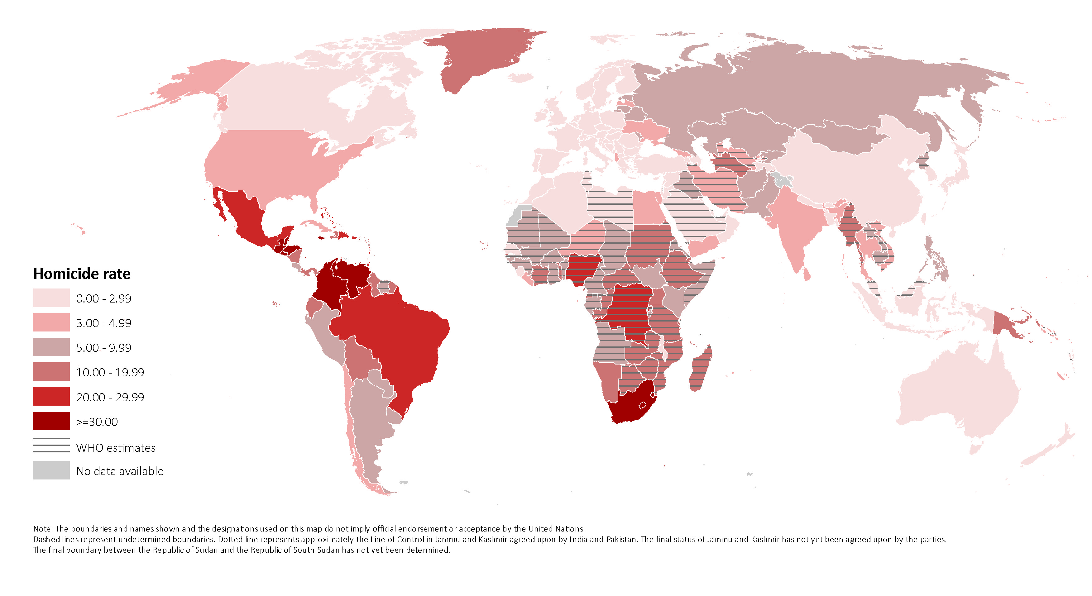
Above is a similar visualization found in a 2014 Huffington Post article gives similar insights on 10 countries with highest murder rates. As we can see using the Map clearly conveys the regional dominance of Americas in Homicides that is mentioned in our visualization as well.

  • Along with the breakdown of visualizations, another improvement would be if there was more information of the global median Homicide Rates, which would have given a clear idea as to how much higher are the rates in these dangerous countries than the global median Homicide Rate.

References: http://www.huffingtonpost.com/2014/04/10/worlds-highest-murder-rates_n_5125188.html