Visualization has been a key to depicting lot’s of information by occupying limited space. But, is it been used incorrectly and unnecessarily? Did you ever come across fancy visualizations which convey simple information?
Recently, I came across an article about Drinking ages in Canada and found a viz which portray states with their legal drinking ages. The bar(Image 1.0) has provinces on X-axis and age on Y-axis, we can clearly see that apart from B.C, Alberta, and Quebec rest of the provinces drinking age is 19. This information was explained in a one liner statement. So, the question is do we need a Viz or how can we show it in a better way?
There are multiple flaws in this viz, let’s discuss them in detail. The Y-axis tick label which refers age have a scale of 0.6, usually all the legal permits are made to a certain age which is an integer rather than a running age. Secondly, age will not be in the base of 10s and a year forms from 12 months. In order to rectify the scale, we need to modify the chart to show age in integers like 17,18,19 etc.

Coming to grid lines used in the chart(Image 1.0), they are not necessary. The data we are showing is not varying in decimal values and doesn’t fluctuate and we need to keep in mind that age usually doesn’t vary a lot.
Overall, there are only three provinces which have legal drinking age 18 and rest are 19. Therefore, a bar chart to depict this is a wrong choice or not alt all needed.
What are the ways by which we can improve this chart? If you have any ideas please fell free to add it to comments.
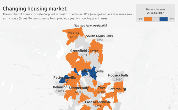
I have a couple of ideas to address this issue, Image 2.0 is an example to show regions, which can be replicated for our requirement. We can denote the legal age of 19 as Orange regions and rest in blue for the legal age of 18. In this chart, the regions are quite clear and the names on that can easily be highlighting.
The second option would be to use a simple table which will be easy to read and understand.
Finally, did you reach to a conclusion to use a viz or not in this scenario? Let me help you, first try to analyze data and do some profiling. This will help you to decide to take a call for viz or no-viz. Secondly, a better understanding of data you have so that you can plan better. If you plan for a chat then the choice of the chart and the way it has scaled should be taken care because it will have a great impact on readers. Else, a table is always a good choice.
Reference – http://www.parklandonline.com/drinking-age-will-remain-19-in-saskatchewan/