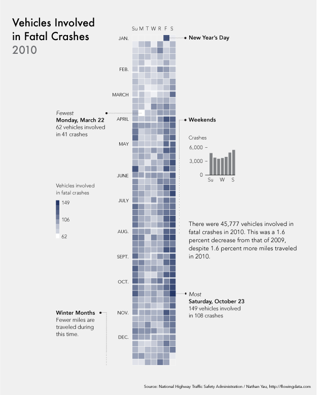
This is a very cool graph, which is in the calendar view of the amount of car fatal crashes in 2010. On the left side of the graph, the rows indicate the month of the accident. The column indicates the actually date. Also, the difference between the shade tells how many vehicles are involved in fatal crashes.
The author doesn’t have a clear statement of his claim. I’m confused whether the author wants to claim that the vehicles involved in fatal crashes have the close relationship with data. For example, we can see from the graph that most vehicles involved in fatal crashes happen on weekends. Or he wants to claim that on the festival there will be more vehicles involved, such as New Year’s Day.
Also, although the author uses the validate data from the National Highway Traffic Safety Administration, the author still needs some other conditions besides date to convince the audience. These conditions could be weather, geography or unpredicted disasters. For instance, heavy snow in December may increase the amount of vehicle is involved in fatal crashes. However, in December, Boston will have the heavy snow, but California may not have the snow in that season. Therefore, the evidence of the graph can’t convince the audience very much.
Besides that, the author does a good job on showing the distribution of amount of vehicles involved. It’s very easy to see that the darker square has the largest number and the white square doesn’t have any vehicles involved.
Overall, this is a good visualisation. What I really like this graph about is that the calendar view is very creative and the idea is very new to the audience. The audience will be interested and easy to get the author’s idea. The author will be able to change the audience’s thought on viewing the amount of vehicles involved in fatal crashes based on date.
Reference:
http://www.coolinfographics.com/blog/2012/1/11/calendar-visualization-of-fatal-car-crashes.html