The visualization below is part of an article-cum-experiment – “Where Bars Outnumber Grocery Stores” authored by NATHAN YAU posted to a site – Data Underload.
DESCRIPTION:
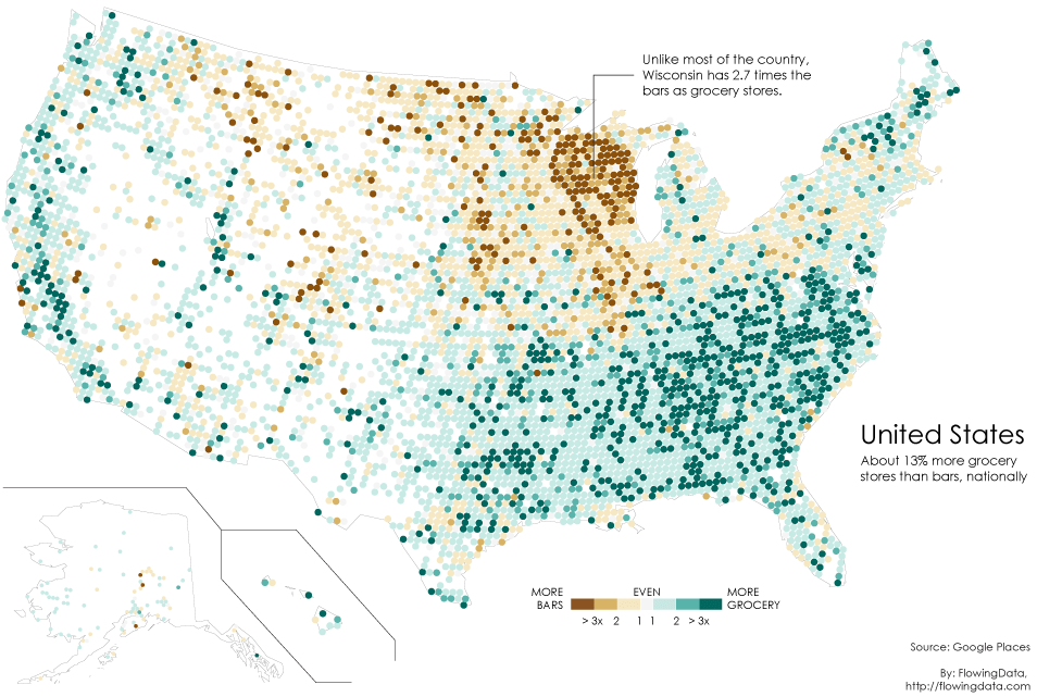
Author built this map to verify a claim made in an older article claiming the central-western region of the country can be called the “beer belly of the country” since the bars outnumber the grocery stores in and around that area.
This map is made with a help of a two-category (number of bars and number of grocery stores) map picked up from the Google Places API. The nice thing about the Google Places API is that businesses are categorized and searchable. Pulling the count of bars or grocery stores in each area of the country is particularly easier. To build this visualization, for every 20 miles, the author searched within a 10-mile radius for bars and grocery stores and got the ratios.
Basically, the more bars, the darker the brown and the more grocery stores, the darker the green. And as per the older claim, it can really be seen that high bar concentration in Wisconsin, whereas the rest of the country has significantly more grocery stores.
Positives:
The need for the visualization is clear – to find out where in the country bars are outnumbering the grocery stores and verify that central-western region of the country is really the “beer belly of the country”.
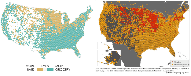
Data picked is accurate since it checks out when compared to that of the older article which made the initial claim. (comparison below)
The calculation done for pulling out ratio is also quite clear and sensible. The factors considered are very precise while plotting in the map giving it a great clarity.
Negatives:
Although the need for the visualization is clear, the interpretation of the visualization will change with the audience. The conclusion can vary from – “people in the state with more bars must drink a lot” to “people just prefer bars over restaurants” to “bars serve food too” or “people in states with lesser bars just drink at home”. Theses variations arise because of insufficient factors being taken into consideration for this analysis.
First off, the definition of “beer belly” is place where alcohol consumption is maximum, but there is no consideration of that in data collected. There are so many factors which ideally should be taken into consideration to call a place the beer belly, like:
- Alcohol production vs consumption
- Pubs (only liquor) vs Restro-bars (serves food too)
- Profits and growth of bars
The data considered is not enough to justify this claim. The accuracy of the data can also be questioned since we are completely depending on one data source – Google places API. Government records (considered of the highest accuracy) might not necessarily tally with these.
In conclusion, I think the visualization is not the problem, the process of getting to that map is. Data does not do justice to the needs.
Sources:
Article: http://flowingdata.com/2014/05/29/bars-versus-grocery-stores-around-the-world/
Author: http://flowingdata.com/about-nathan
Site: http://flowingdata.com/category/projects/data-underload/