For this blog post I picked up this Info graphic because I found it to be somewhat interesting. It doesn’t really have the concrete claim (like aliens are among us or aliens are not among us), but rather tries to inform us on what are people’s opinions on the matter. Is this a good visualization? I think so, because topic itself is a bit hard to think seriously about it is good to have info graphic that has a sense of humor!
PROS:
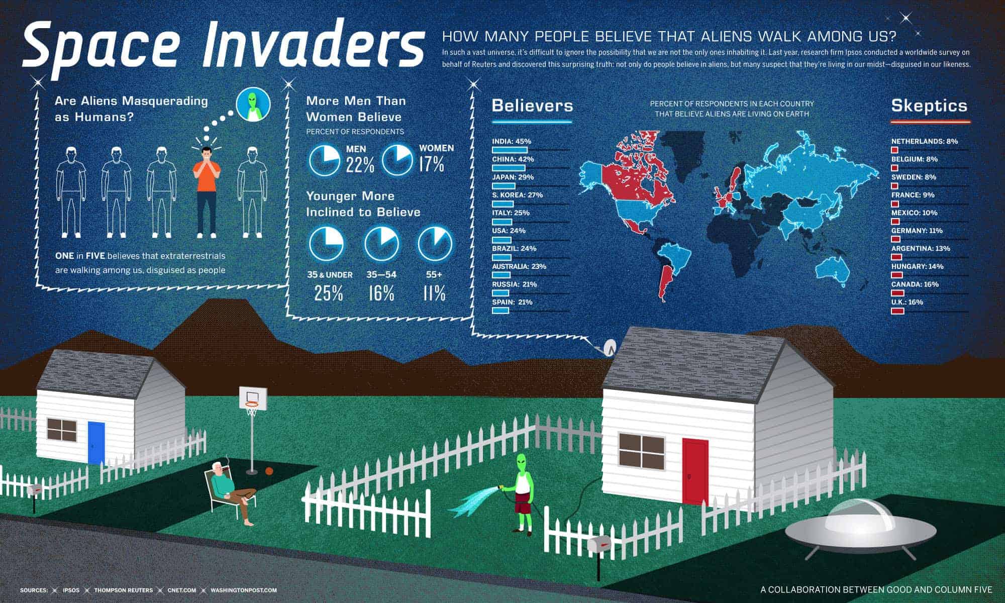
- Visualization has to support the claim, since the claim is such that it just educates people on people’s opinions rather than claiming that aliens are indeed living among us I think it does support the claim very well.
- It looks visually appealing, the graphs and indicators are self-explanatory and don’t need any extra legend. Although some gaps could have been chosen better but I will mention it in cons section.
- Sources and claim are included in the graph itself so it needs no article to go along with it. In addition because graph has claim written on it is virtually impossible for someone to misuse the graph to prove their claim (unless their claim is same as the graphs).
- Believers and Skeptics showed on the map as well as a separate list in declining order. I think map visualization gives an interesting perspective on how neighboring countries have very different beliefs. For example Canada and Mexico are listed as non-believers while USA listed as believer.
CONS:
My main concerns are with data itself and how it was acquired, numbers are show no indication of how survey was taken and what the sample size was.
- One in the five people believes that there are aliens living among us. How exactly did they calculated it? Is it calculated across all of the surveyed countries or is it just based on US numbers. This is unclear and given the huge gap between believer counties and non-believer countries should be taken with the grain of salt.
- What was the exact question and response options? I have a hard time believing that 20% of people think there are aliens living among us. For example my grandmother saw something that looked like a spaceship long time ago but I know she never believed there were aliens on earth. Me personally; I do believe there is life somewhere in the universe, but I don’t think there are aliens living on earth. And defiantly not among us.
- The number of believers compared to age also seams iffy, it would be nice to know the sample size of each group. Also it seems a bit not logical how number of believers drops with age, if you believe in something that is hard to disprove why would you suddenly stop believing? Although I did find another article did show correlation saying that older man did believe less in alien’s existence compared to younger men.
- Pie charts on the info graph a little bit harder to read and compare, I think this graph should have been a bar graph. Bar graphs are much easier to compare to each other especially when differences in numbers are not very big.
- Split between believers and non-believers is not well defined 21% in Spain is not too far form 16% in UK.
http://www.newsweek.com/most-people-believe-intelligent-aliens-exist-377965