Google has revolutionized the way we can search the content on internet. Offering a variety of services like Search, Maps, Apps etc. Google has made life easy for most of us. “Make Google your friend” is the favorite quote used by many. Though Google is well accepted name and a big brand company, its use and acceptance is restricted in China. There are many reasons (including political reasons) why Google has not succeeded in China. Recently I came across a blog where market leaders(in terms of revenue) in China for “Search” were shown. Author wanted to show how Google is NOT the leader in China. Here is the picture.

What I like about this visualization
1] Clear numbers showing “Baidu” has 79% market share. Google is far behind (only 11.9 % share)
What I did not like about the visualization
1] No context – This shows the value in Q3 of 2014. However no information is published why 2014 is taken as a reference/context. Readers like me are kept in dark about Google’s performance over a period of time. Is it increasing or decreasing. Similarly what is Baidu’s performance over years ? Just one year’s data does not give us a whole picture. I feel this is incomplete information.
2] Is this Exploratory / Explanatory visualization – This diagram forgets one of the core principles of visualizations. User does not get any idea if this diagram just explores the data or it explains Google’s presence in china
3] Color selection – Red color indicates alert, alarms or bad things. Here “Baidu” which is market leader is assigned red color (which is surprising). After lot of thinking, I came to conclusion (which may be wrong) – Since China’s flag has red color, and the owner of this visualization wanted to show strong presence of Baidu in China. Hence he kept same color as flag.
4] What does the ring shows – Maybe larger rings shows higher importance. But in that case larger rings should be placed at bottom with smaller one’s on top
5] Inefficient use of space – Reader knows that the blog is about China. So why to again show its flag? I think this is waste of space
I found one more bad visualization of the same data, which is shown below
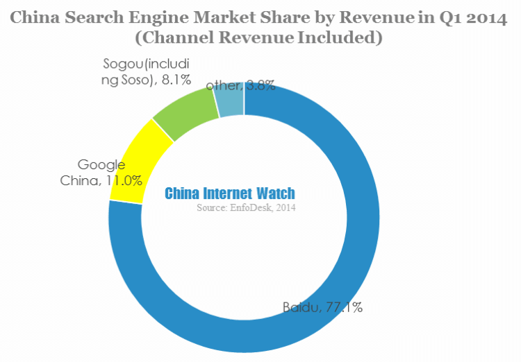
The above visualization has following problems
1] Shows the figures only for 1 year. No comparison over years.
2] Becomes difficult to compare values. Lot of space wastage (circle is empty in the middle)
How will I create this visualization
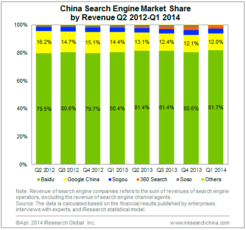
1] Data speaks a 1000 words – I will strongly prefer a comparative graph showing Google/Baidu performance over years. So my context will be stretched over a number of years. This will clearly show the increase/decrease in market share of different companies. See the below bar graph. User can clearly understand the performance of Baidu and Google over years. This clearly shows that Google is losing the market from 2012 onwards (16.2% in 2012 to 12% in 2014)
2] Less Space , more information – Use the available space wisely !
3] Color combinations – Use of standard color combination (clear distinction between Baidu and Google). I would still not prefer “yellow” for Google, but its much better than the above graph
References for blog- http://visual.ly/baidu-statistics-and-trends
References for blog – https://www.chinainternetwatch.com/7375/china-search-engine-market-q1-2014/
References for core principles of visualization -https://www.tableau.com/blog/stephen-few-data-visualization