https://www.cdc.gov/flu/weekly/WeeklyFluActivityMap.htm
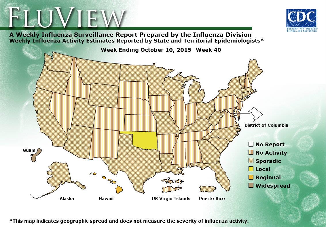
CDC chart shown here is to show the spread of flu at a given week over USA territory state by state. It has various levels of spread from no activity to widespread. Washington DC is the only one entity that has no data reported. I think in general this visualization does what it was made to do however there are few drawbacks.
- Presentation of the chart itself: if you have noticed the chart dates back to week 40 of 2015, why is this particular date? Well it is simple that is the chart that you get when you click on the link of the smaller current chart named “View Larger”, so instead of current spread levels you expect you will always get this chart (week 40 of 2015). And if you not careful you will take this chart as being current.
- Colors and patterns: they look a bit confusing some are patterns some are colors and they represent levels (a scale which is better represented by commonly accepted standards green to red or light to dark) , without reading the legend it is hard to understand and after reading the legend it is hard to remember which means what. With that being said even reading a legend and remembering doesn’t help much if you look at the chart from the distance (graph presented on projector), it is hard to tell sporadic from widespread in some situations. Also when looked up-close on the monitor patterns create some kind of visual artifacts that causes eye discomfort.
- Explanation of various levels of spread are not clarified on the page where graph appears and requires some link clicking and navigation to find.
- Usefulness of the visualization; the graph does what it says it should do but is it as useful as it can be? It repots spread levels by state, but it is not very realistic viruses don’t stop on state borders and in real life the spread is more of a gradient rather that level shift along the state border. Also this map is not very informative when levels are local, regional or sporadic. For example: California is pretty big and prolonged state so having local flu spread in San Diego and having no activity in Eureka is more than possible. So knowledge of local activity is not very useful for people within the state, and CDC probably does have this data.
So instead of doing state by state they can do a grid and use hotspots, but then it will be a different visualization.