Nowadays many visualization enthusiasts are coming up very innovative graph and charts to depict data to their targeted audience with the right information at right time. But a question that arises is, are these viz enthusiast trying to compress lots of information into a single viz that looks like an artifact rather than an infographic.
To better understand this, let me introduce you to a viz which looks super sexy and appealing to the human eye.
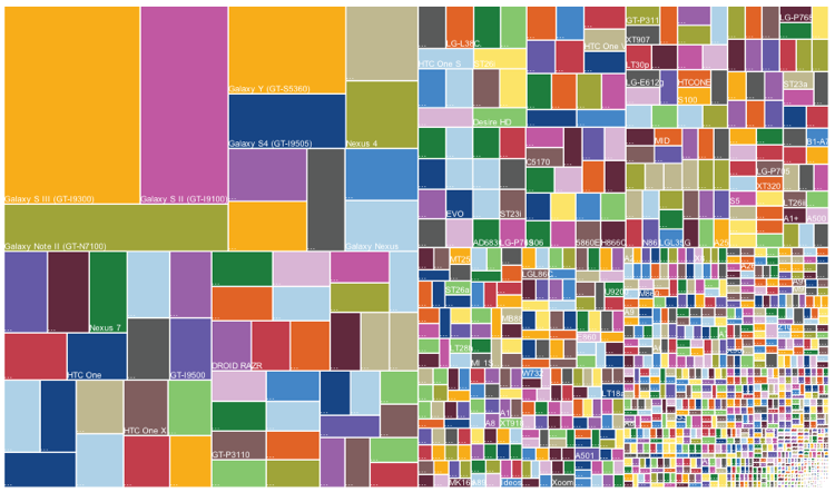
What’s the first impression one get’s by looking at this chart? Wow! that really looks cool. A famous idiom “A picture is worth a thousand words“, which tells complex ideas can be depicted using a single image. Any clue what does image 1.0 depicts?
The viz is a snapshot of Android phone release and their sales. The treemap depicts multiple things, by going from right bottom to left top of image 1.0 the size of each rectangle indicates the market share of an Andriod phone model, that signifies the dominance of a specific model and company which has several phones in the market.
Background on Treemap, this is a type of information visualization which is used to display hierarchical data using nested rectangles.
The best part of this viz is that a layman can a understand that Galaxy s3 was having lead in the market but there were many android based phones which cover at least half of the market. If we try to show the same information in a pixel perfect report it would have occupied at least ten pages.
To be very honest, without any description or brief about the viz it would be quite difficult to digest as it has lot’s of information compressed. To better understand or viz this data I would first try to understand who are the audience? How much data do they want to see? What is the granularity at which they want to analyze? Once we have all this question answered, we can decide what is a suitable chart or graph to represent data. For an instance, let’s say a sales guy from Andriod team wants to use this data. Now, we can start thinking what would be the best way to show data.
For an instance, let’s say a sales guy from Andriod team wants to consume this data. Now, we can start thinking what would be the best way to show data. I would create three buckets of all the Andriod phones and classify them as small, medium and large segments and assign a market share of <10%,>15%,>30%. By using this technique a user can better analyze the data which is present in the right half of image 1.0.
Now we can viz these buckets in many ways, First way: Use word cloud for all the three buckets and portray in a single frame. In this viz all the major companies each segment can be evidently showcased.
Second way: Using bar charts and the same concept to split data into three segments. These

As we discussed before, more information in a single viz which cannot be digested easily doesn’t solve our purpose. So, it’s better to enable drill downs to navigate to more detailed information from a main viz.
To conclude reports or charts like image 1.0 are visually attractive but they don’t fulfill business needs and decision making information.
So, Now you can comment whether you’re interested in Infographics or Artifacts?
Reference Article for Treemap (Image 1.0) – https://www.theguardian.com/news/datablog/gallery/2013/aug/01/16-useless-infographics#img-6