Due to recent discussions regarding immigrants, I wanted to know about the percentage of immigrants in each state and in the due course stumbled upon this 2014 report on mapping migration in New York Times. Here is a visualization that tells us “where people who lived in each state in 2012 were born” through a Voronoi treemap.
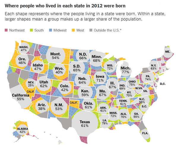
Color represents percentage of people born and living in the same in the same state. For example, 61% of Texans were born in Texas.
Treemaps are a well-known method for the visualization of hierarchical data but are limited to rectangular shapes. Additional challenges with tree maps are zero values and size distortion as the number of pixels (subdivisions) go up. These issues are eliminated using Voronoi treemaps which facilitate subdivisions within polygons and creating treemap visualizations within areas of arbitrary shape.
Critique: The objective is to convey the proportion of different categories of origins of people in each state. This is communicated using of geographical Voronoi treemap. Geographical maps are generally useful to represent spatially intensive data (the variable being aggregated over a region). Since geographic size has no correlation to population, a geographic map is not an ideal way to represent population in general. The current chart however goes a step ahead to show proportions of population origin within state. For example, New Jersey has 10 times the population of Montana though the sizes the states on the map are contrary. I am aware it is not always possible to make each shape exactly the right size, however I think it is misleading to use the state shape and relative area to communicate these results. Also, 2 shades of gray – dark and light is used to represent people born outside US and people born in the state (and currently living in same state) respectively. In my opinion different colors should have been used contrary to different shades of a same color.
How would I change it: From the objective of the chart, we need a visualization that maintains regional relevance along with showcasing proportion of population origins in each state. To indicate population-origin proportions, a tree map with subdivided rectangular area (not Voronoi) works. To incorporate regional relevance with this, each state could be represented with a size proportional to its population with an area cartogram, instead of using the geographical shape of each state. An area cartogram is a map that alters an entire physical location by scaling a chosen economic, social, political, or environmental factor. An example of an area cartogram of electoral results map (scaling factor being elections results of democrats and republicans) is shown below.

If a cartogram is used to represent migration map for USA, the visualization would consist a largest square for California, followed by Texas and smaller squares for other states. Each square (representing a state) would be divided into rectangular areas with size proportional to population origin category. I would use 2 distinct colors to to represent people born outside US and people born in the state (and currently living in same state)
PS : If the objective was to solely visualize population origin category with no regards no geography, bar graph would suffice. I would have the state names along the X axis, the percentage along the Y axis and bar graphs stacked side by side for each state. Thus, each state would have 6 bars (of different colors) representing population origin.
References:
Mapping Migration in the Unites States ( NYTimes, By Gregor A & Robert G, 08/15/2014)